扫码关注,千帆起航,共筑鸿蒙!

HarmonyOSDialog是一个便捷的弹窗,一行代码便可以搞定,无须初始化,便在任何地方都可以弹出,Dialog中也封装了包含常见的弹窗样式,并且支持自定义组件形式。
目前功能项:
九大功能模块,几乎涵盖各个业务需求,【自定义形式】、【时间弹窗】、【城市选择】、【确认&信息】、【底部列表&网格】、【toast】、【popup形式】、【loading形式】,【模态页面形式】、如果还不能满足,莫慌,支持便捷式自定义,想实现什么你就实现什么!
- 1、支持自定义组件弹窗形式,可实现任意视图弹出
- 2、支持信息弹窗样式
- 3、支持确认/取消弹窗样式
- 4、支持底部列表弹窗(可动态修改样式)
- 5、支持底部网格列表形式(如常见的分享)
- 6、支持城市地址选择
- 7、支持各种时间格式选择
- 8、支持Toast提示,可任意修改属性,可设置图片,支持多方位icon设置
- 9、支持任意位置弹出
- 10、支持PopupWindow弹出,可在组件的任何位置
- 11、支持模态页面弹出,可在组件的任何位置
- 12、以上弹窗均支持动态数据更新
- 13、以上弹窗均支持动态样式更新和全局样式统一选择
Api适用版本:>=12
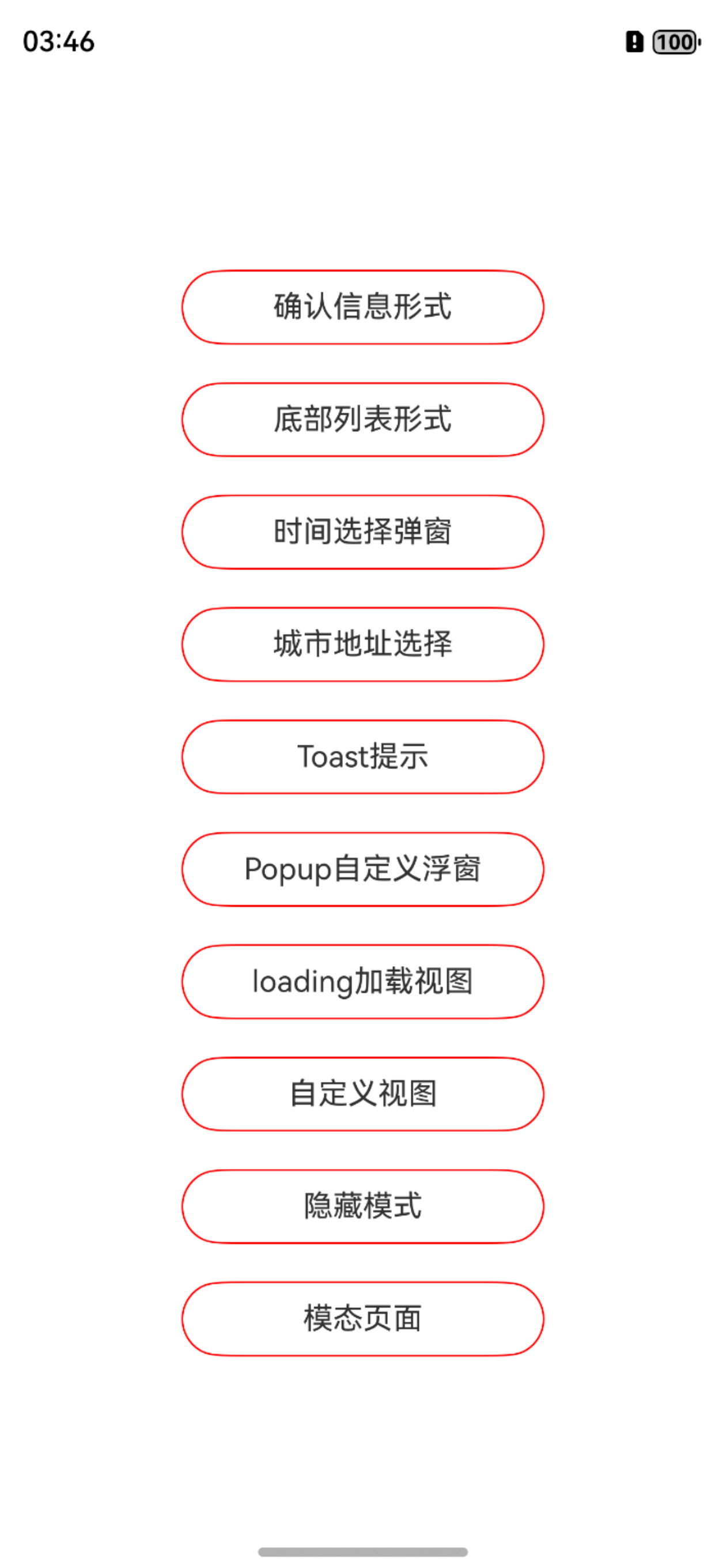
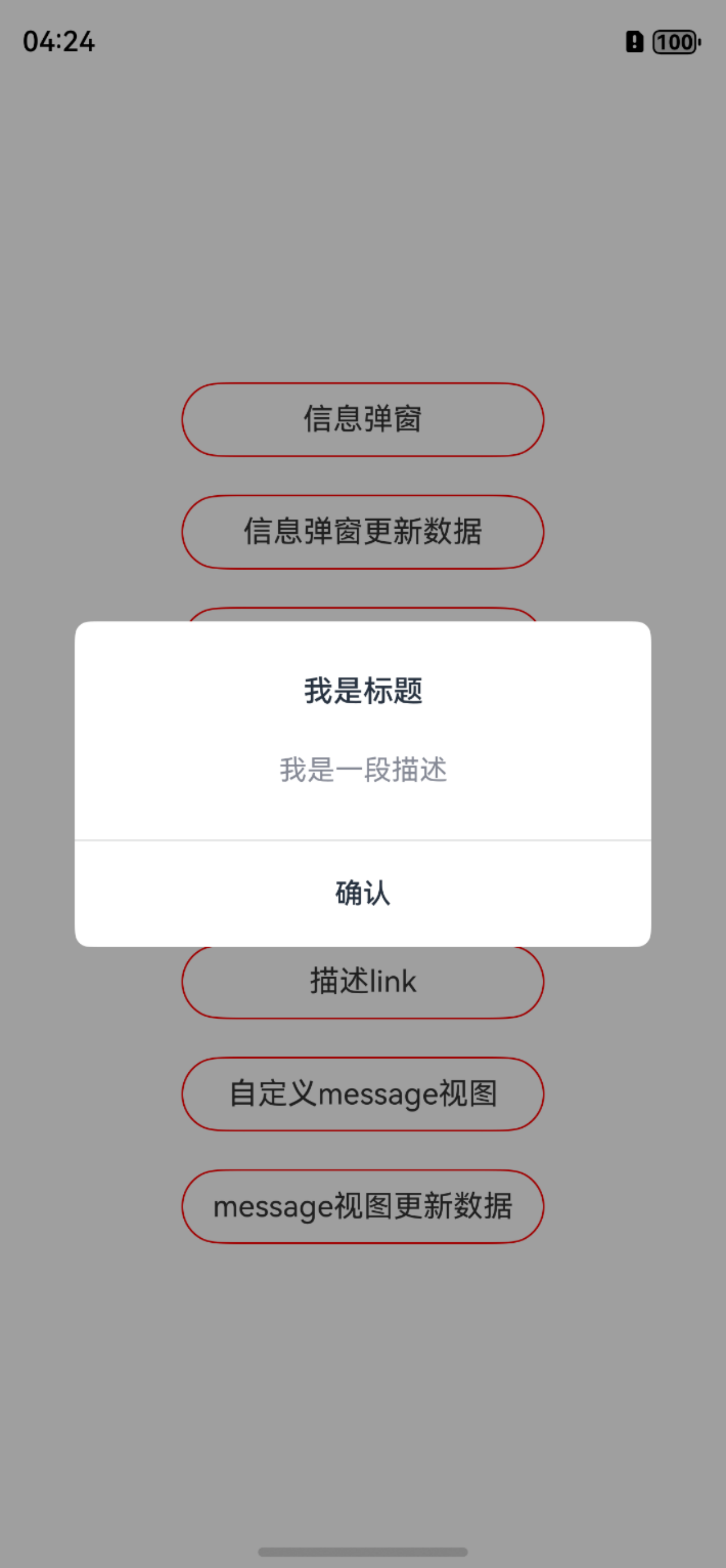
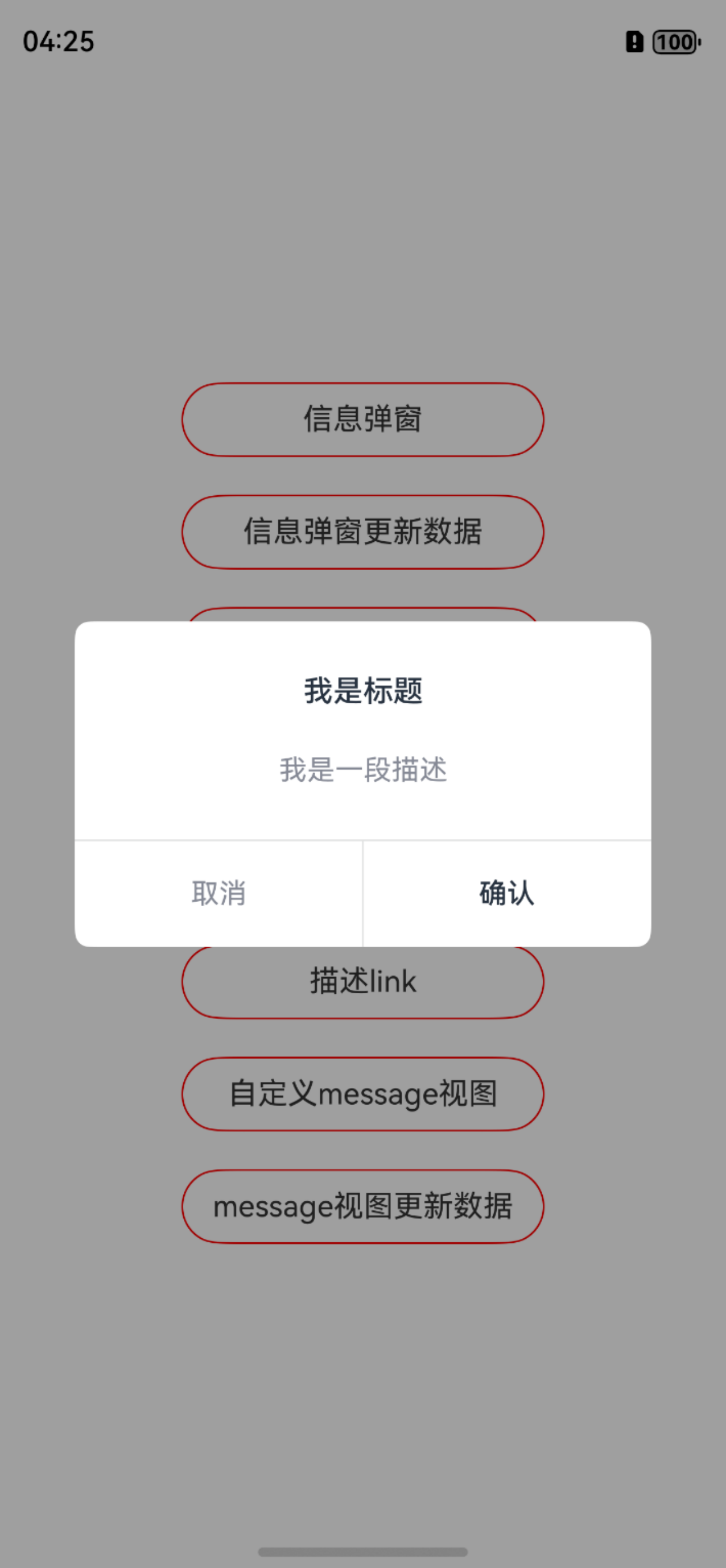
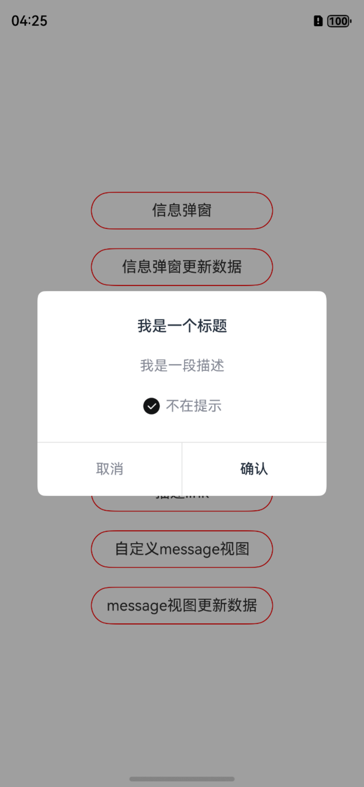
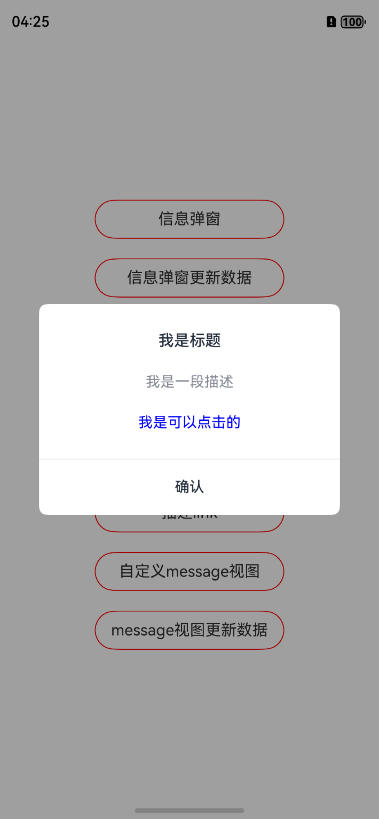
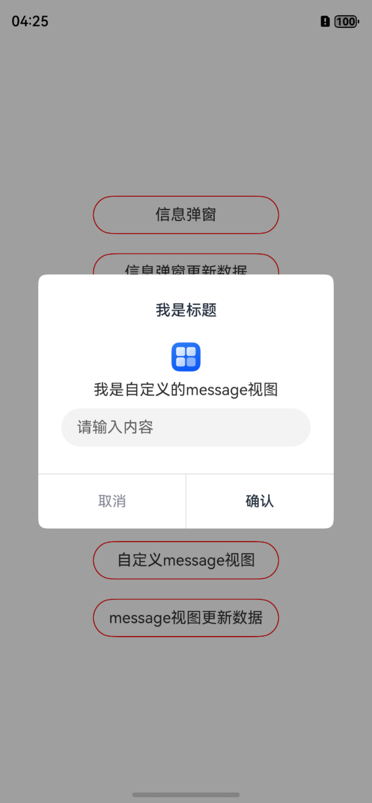
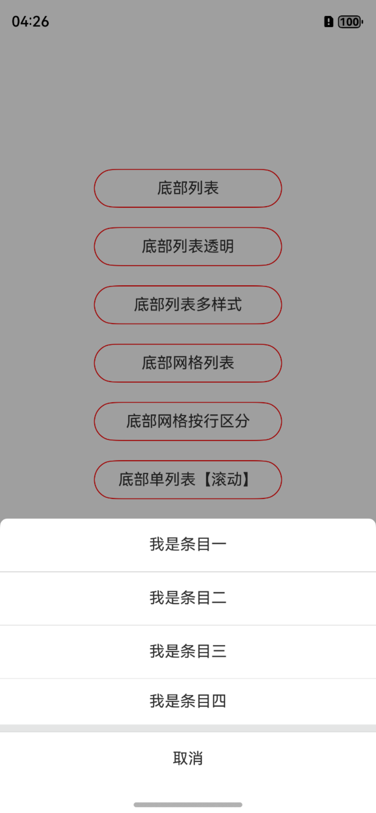
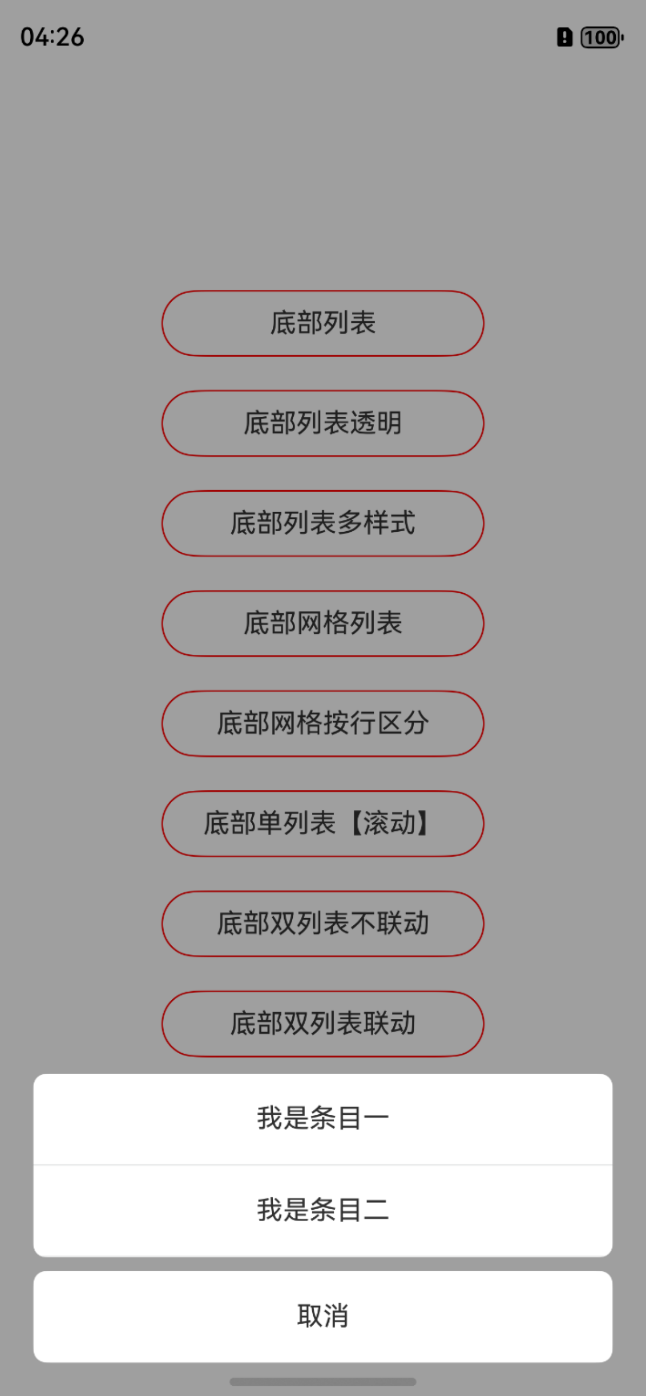
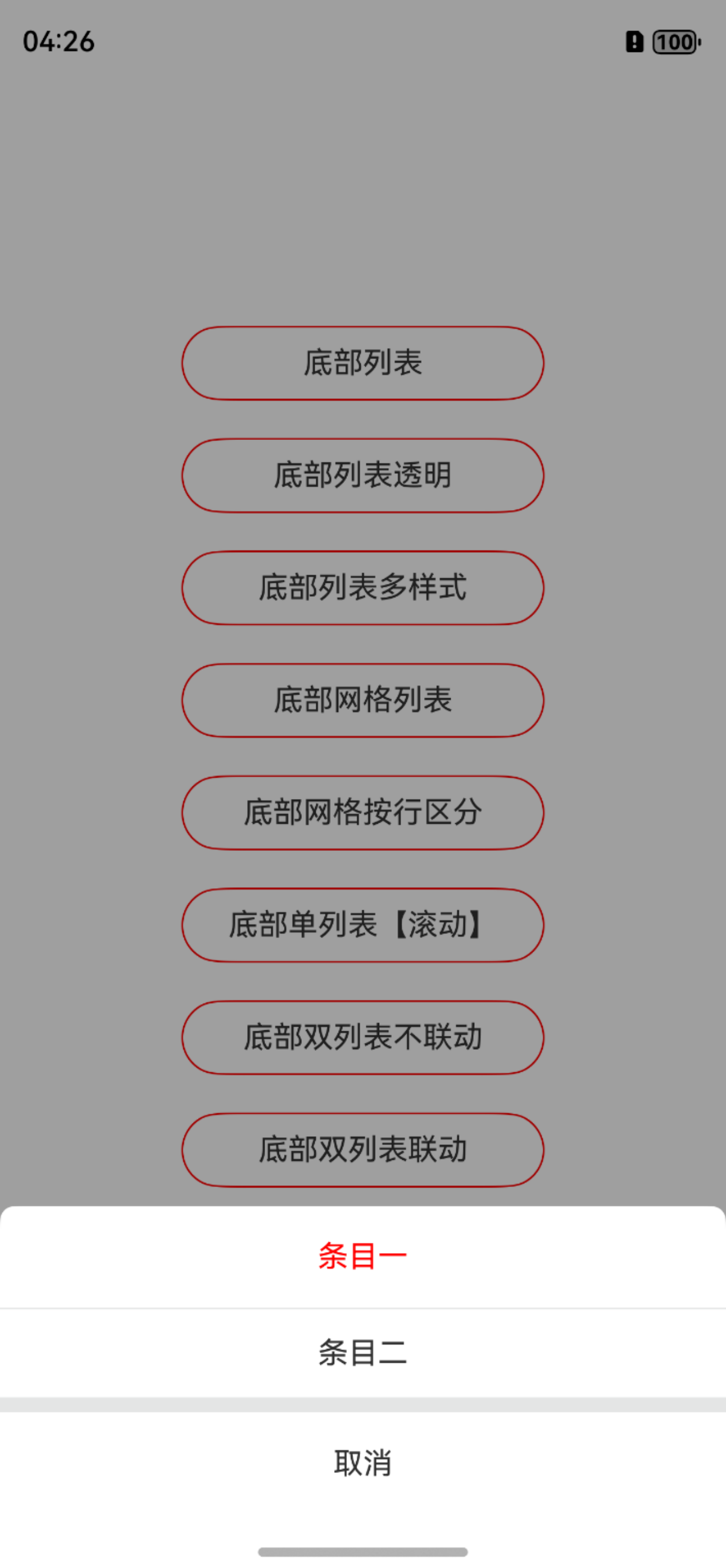
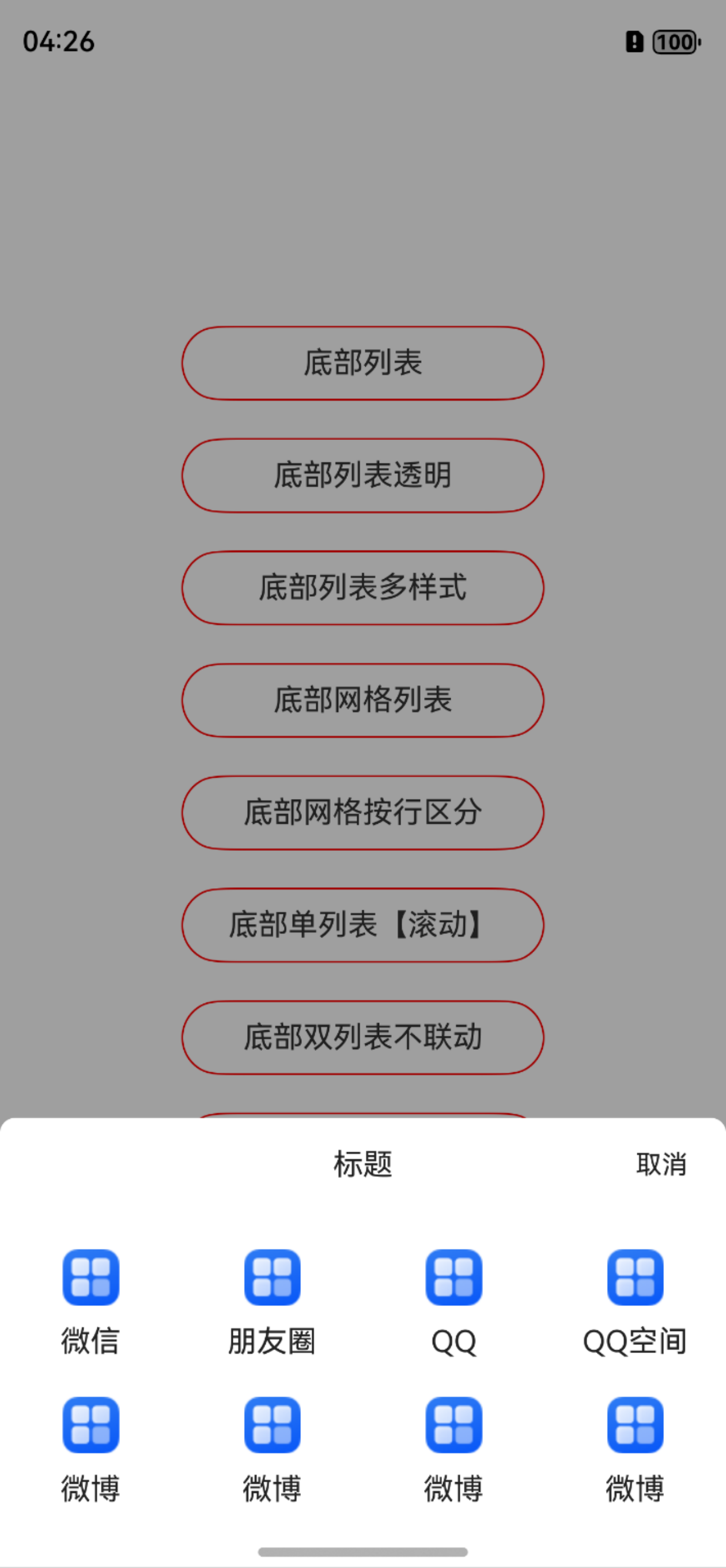
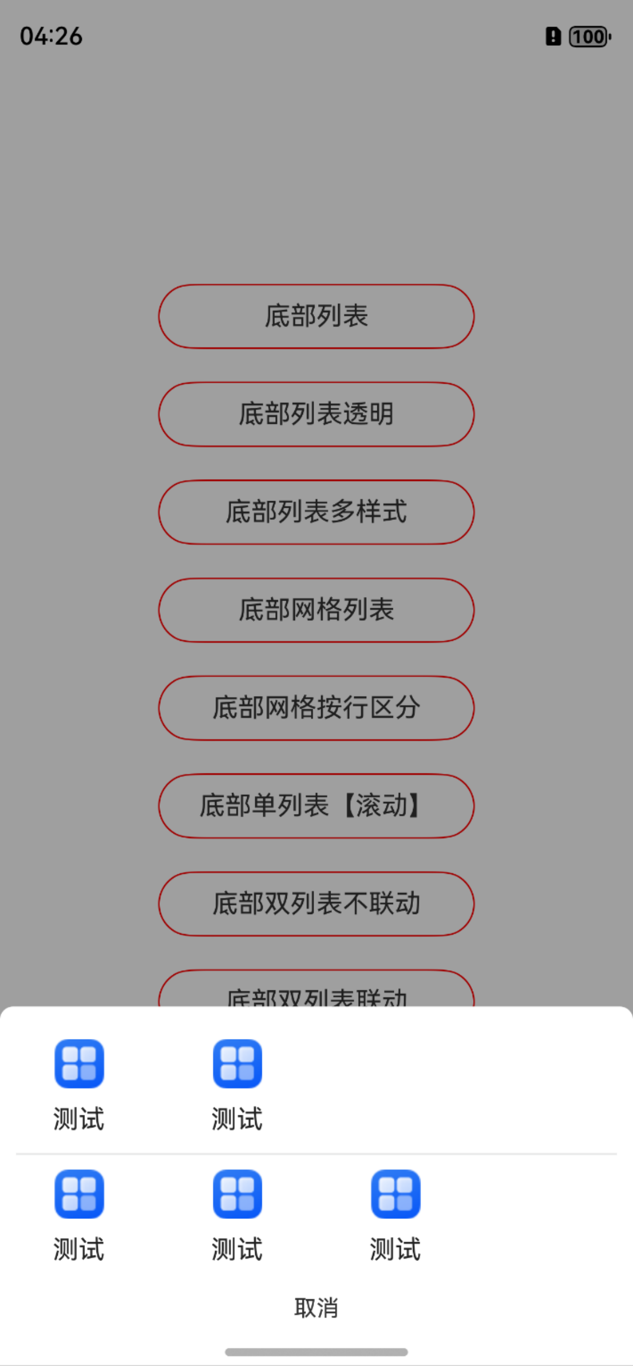
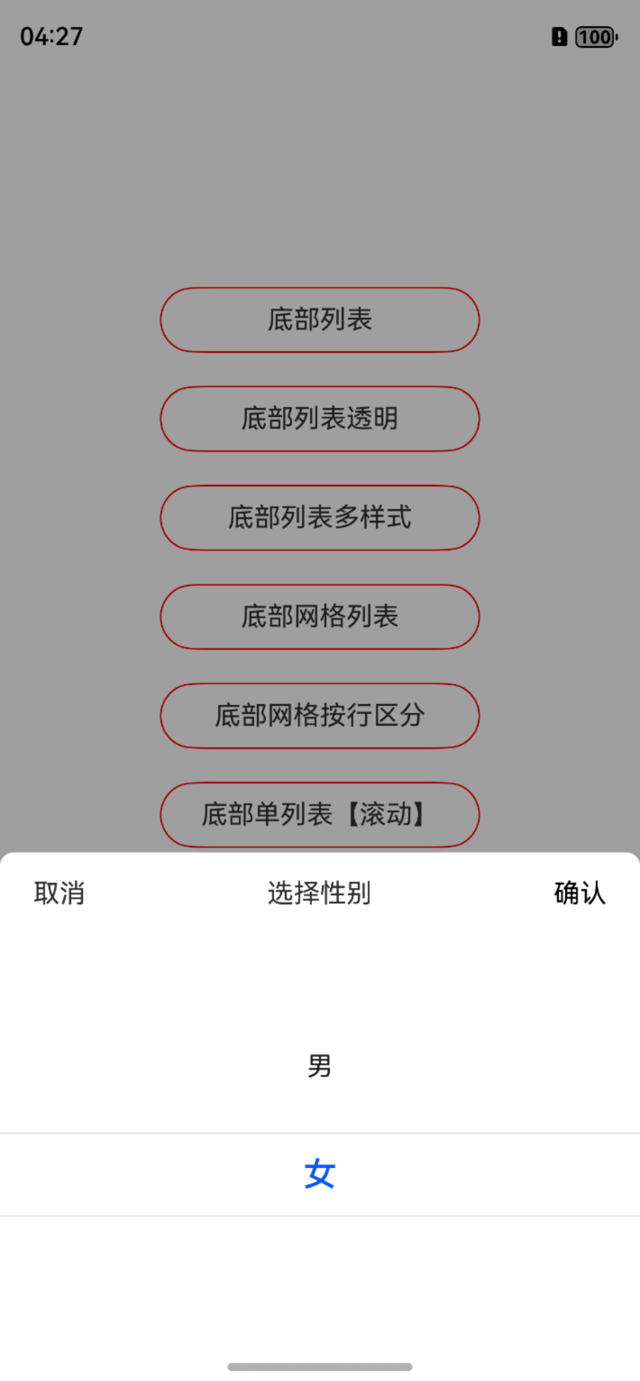
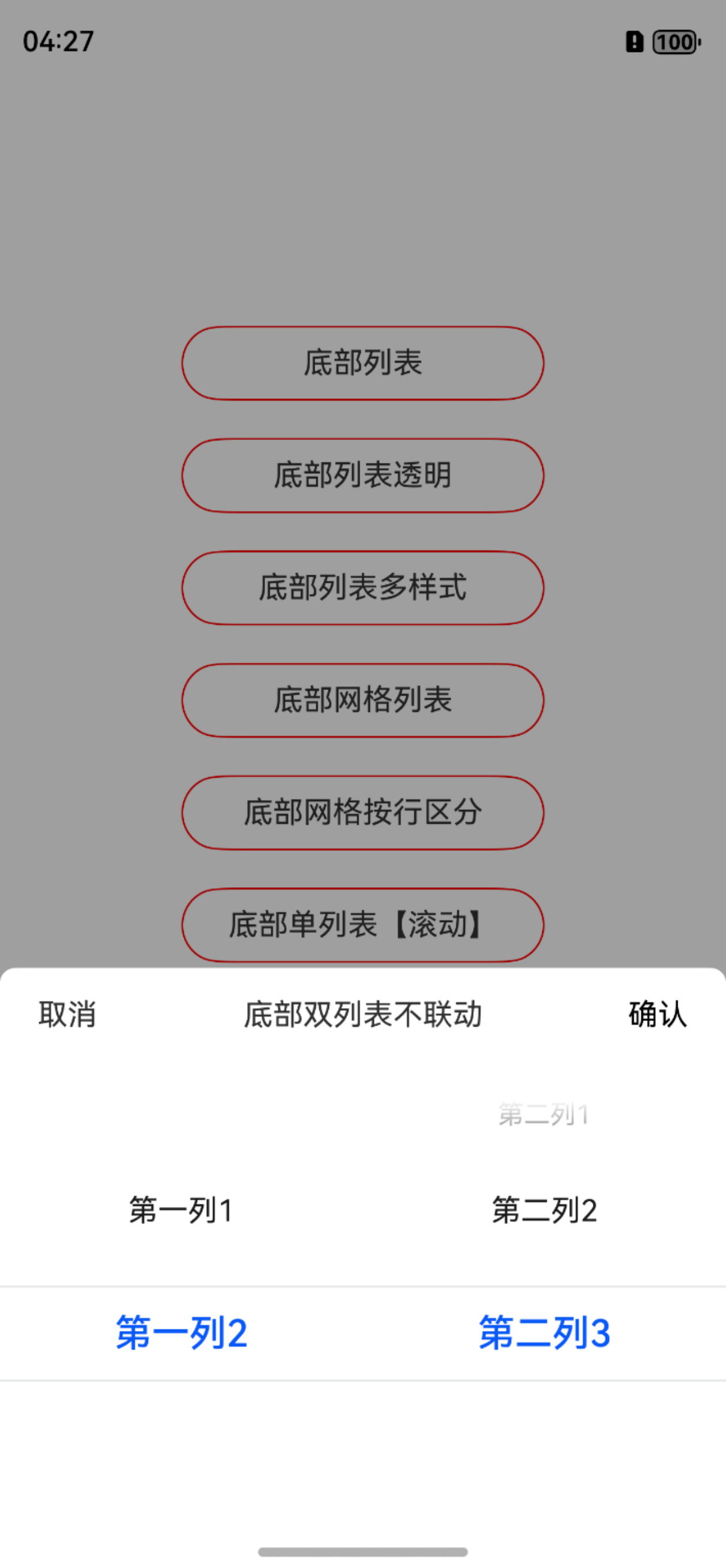
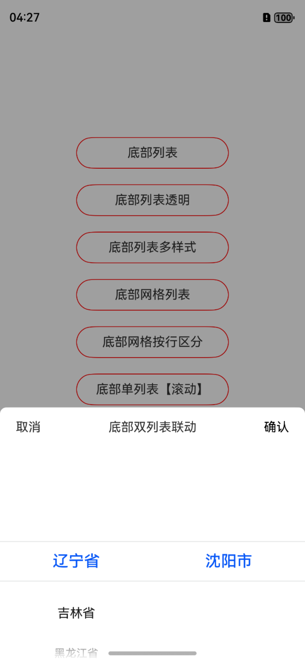
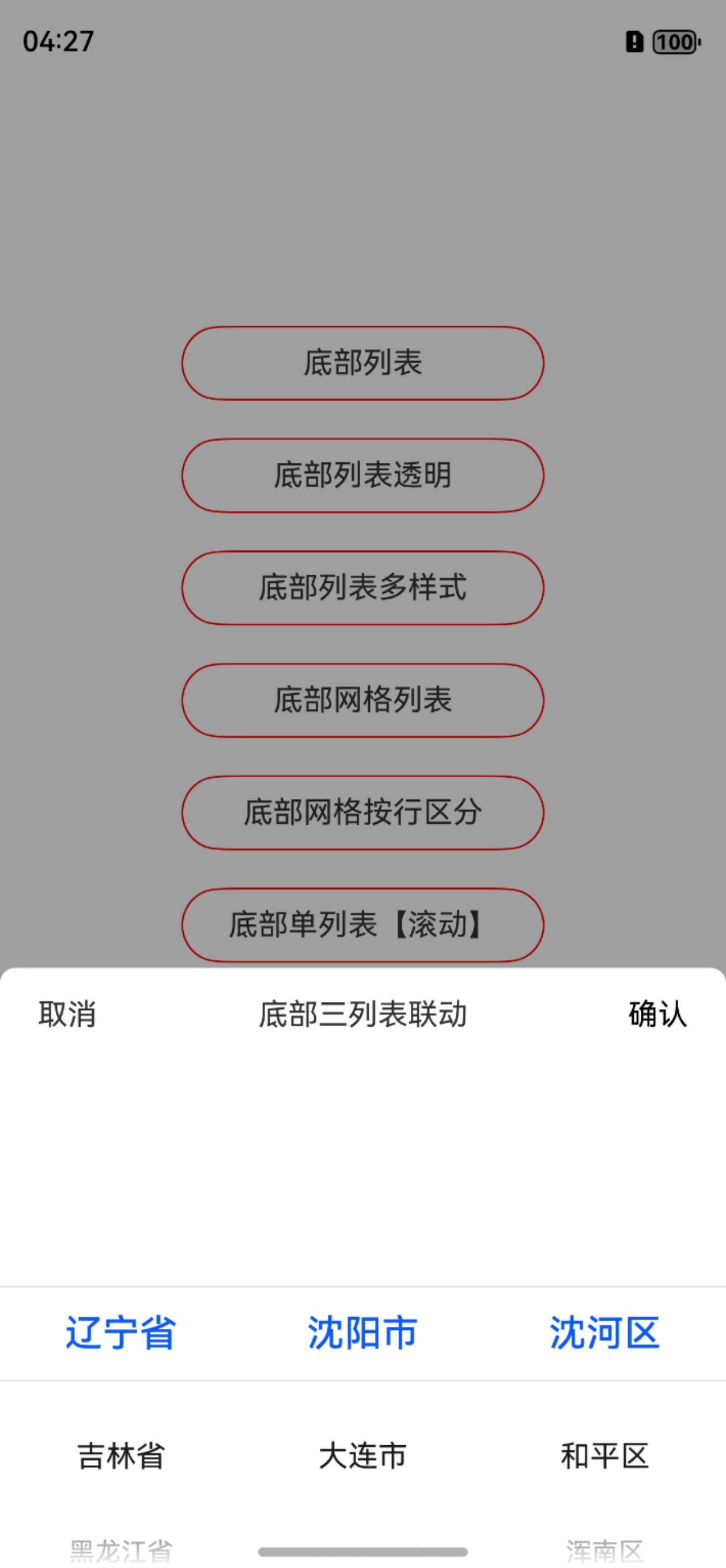
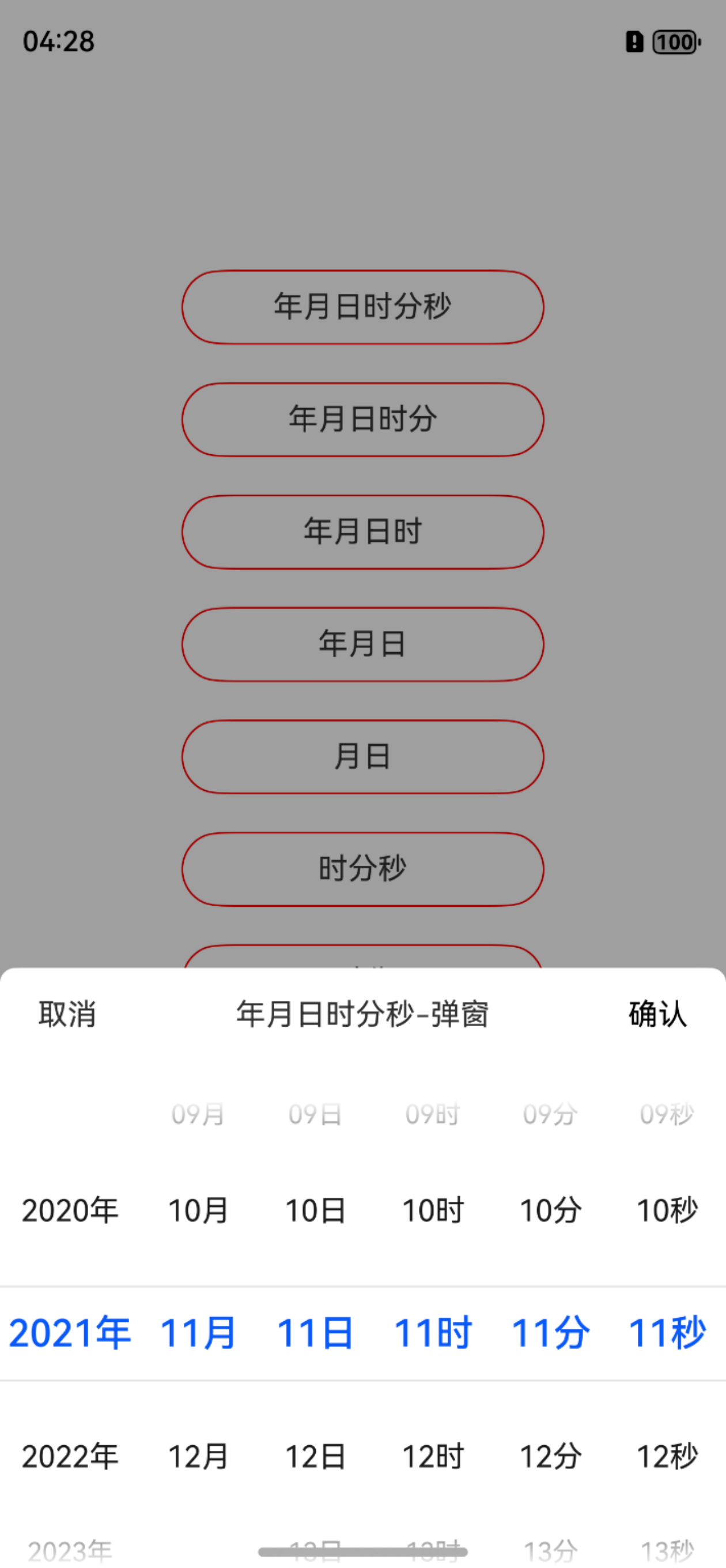
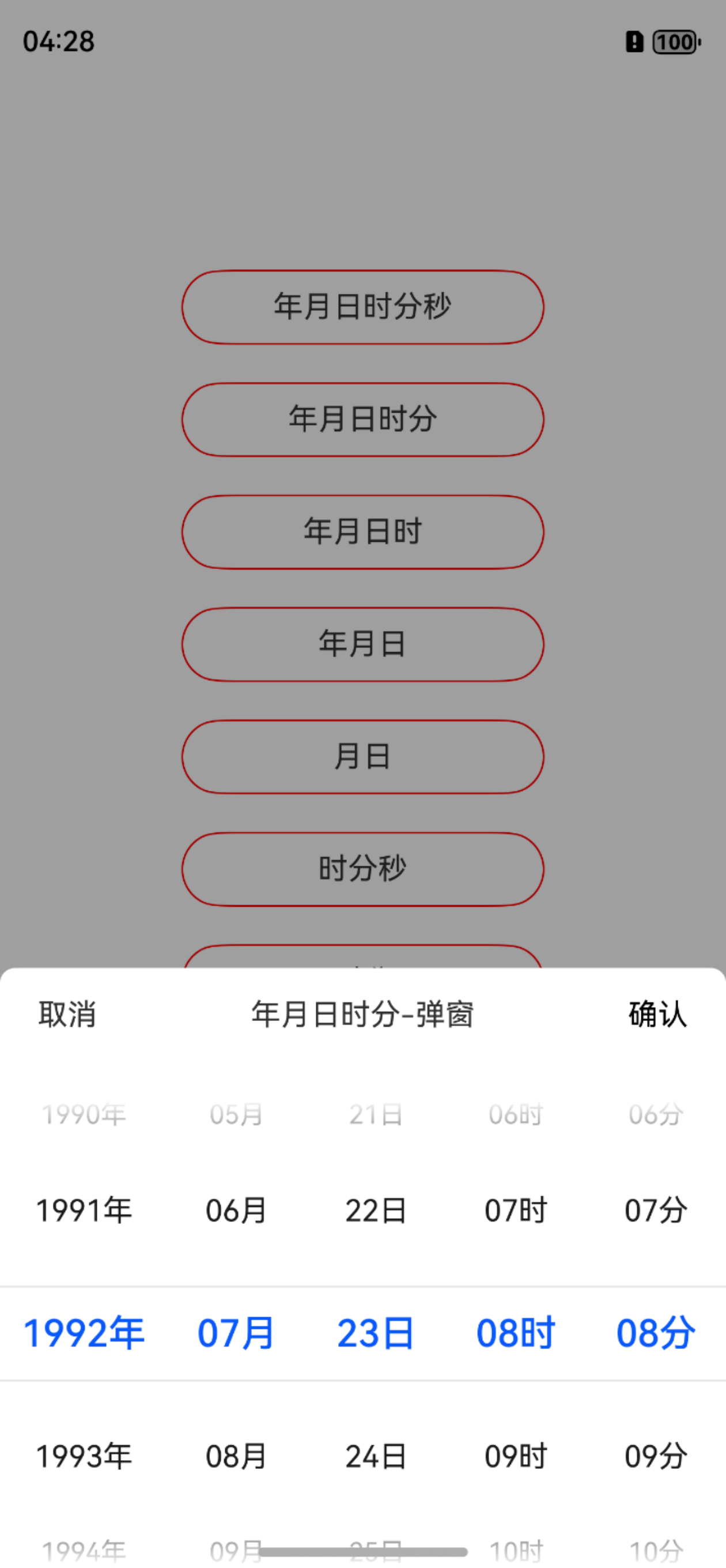
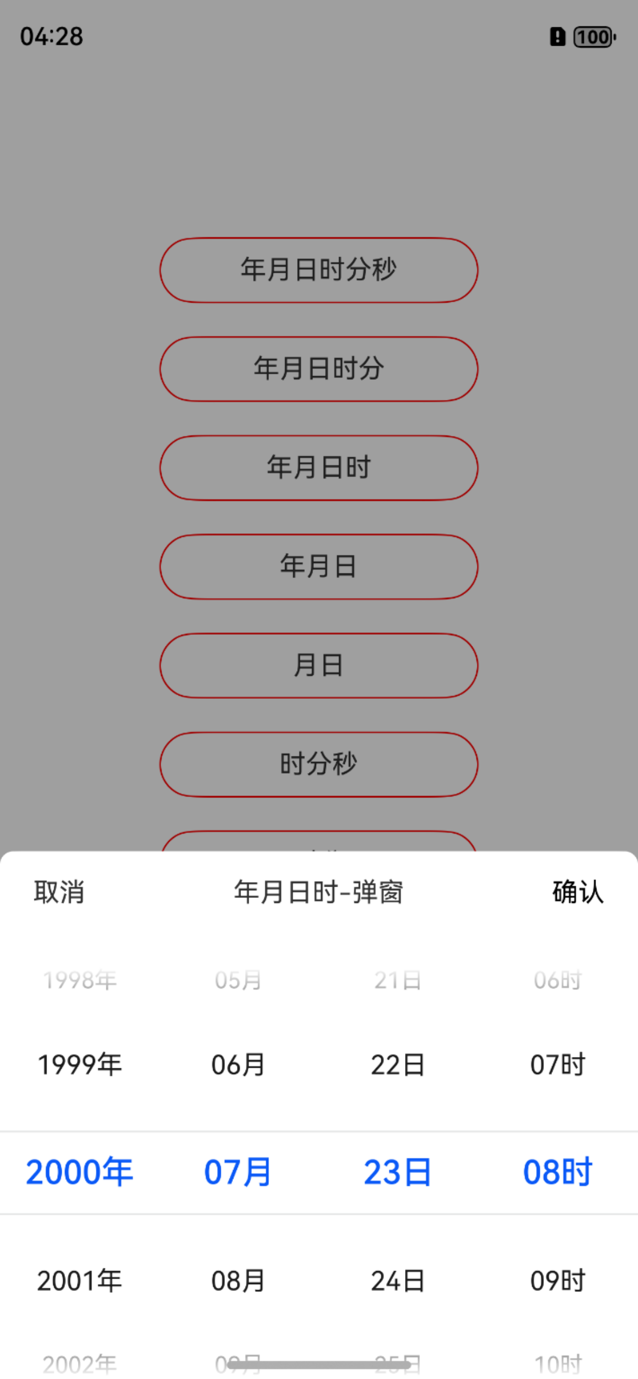
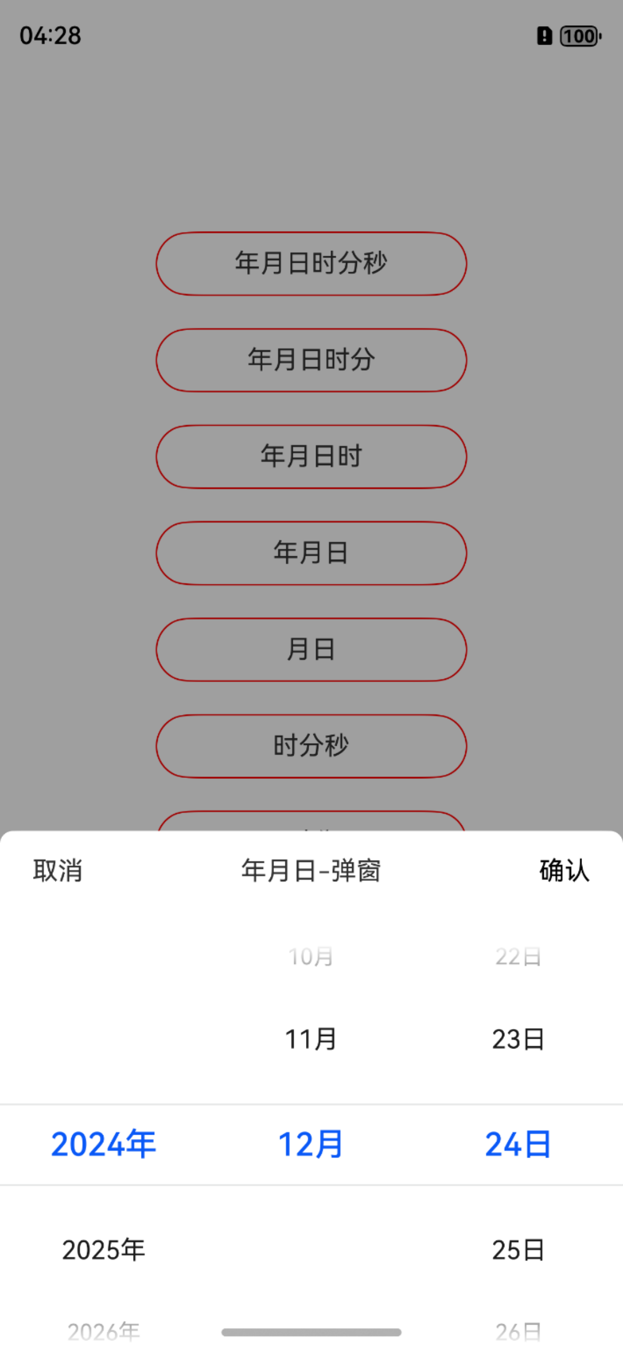
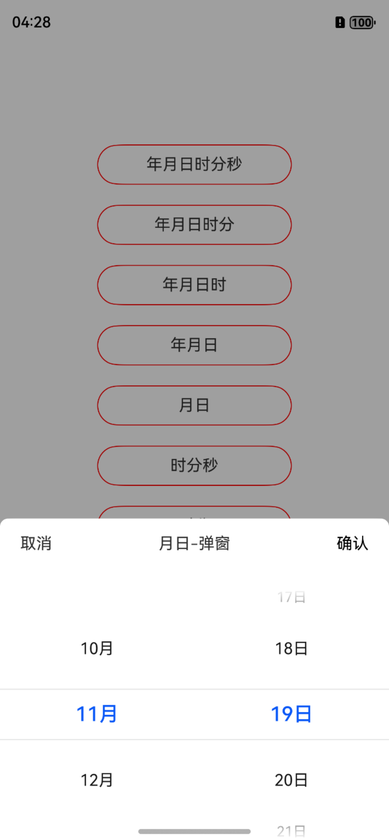
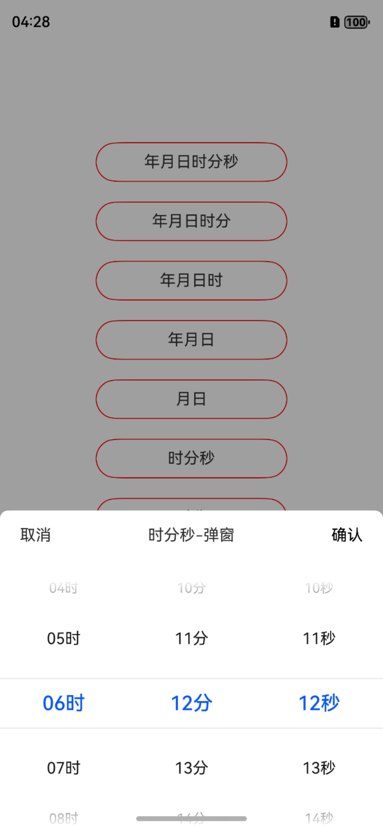
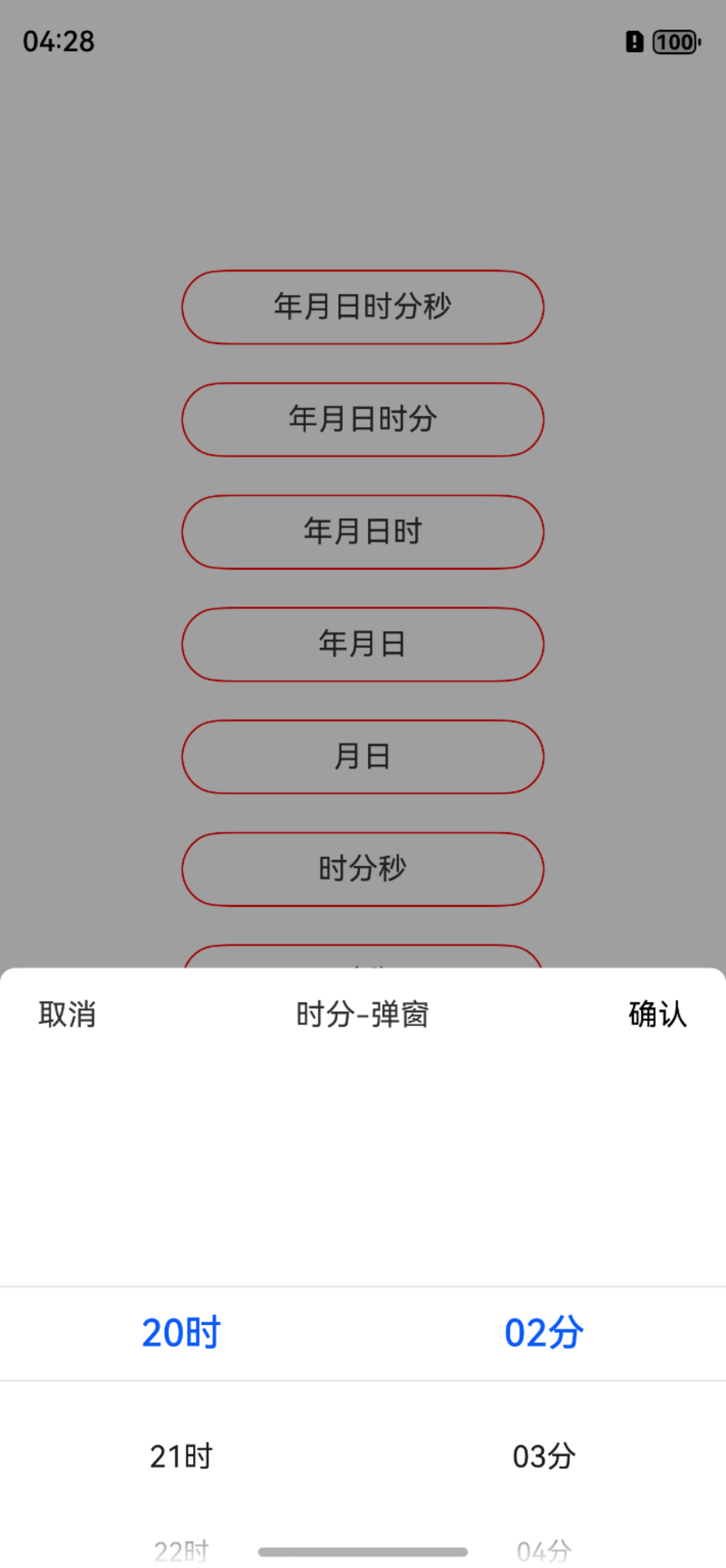
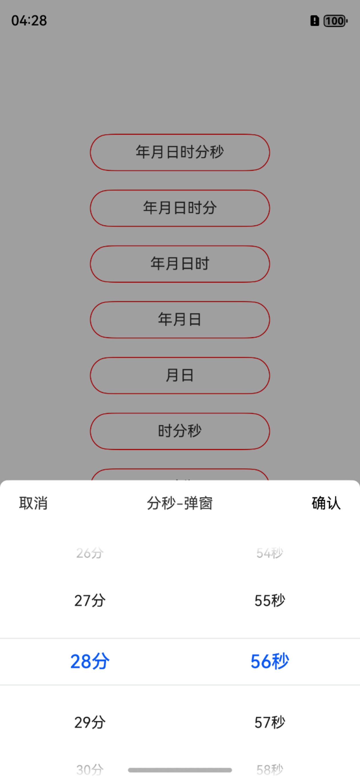
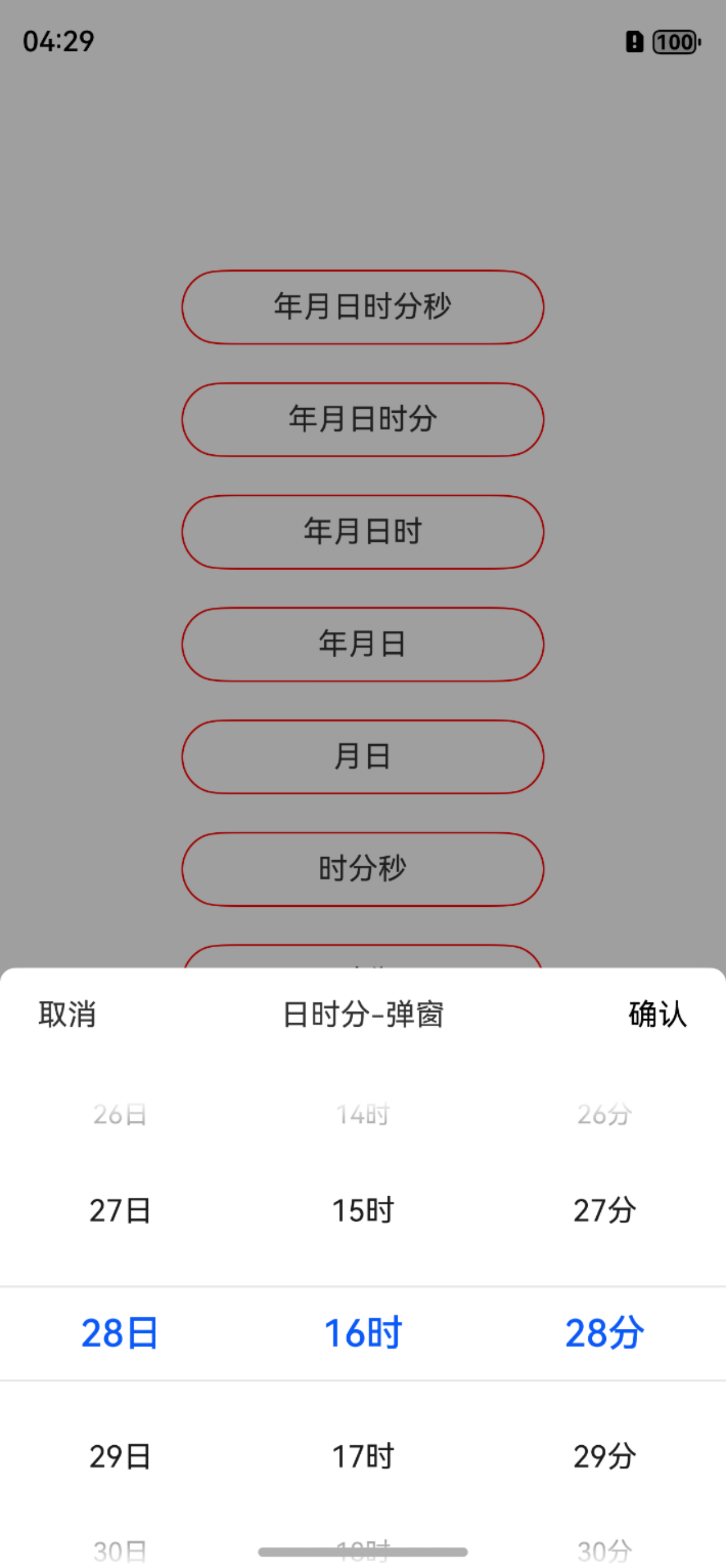
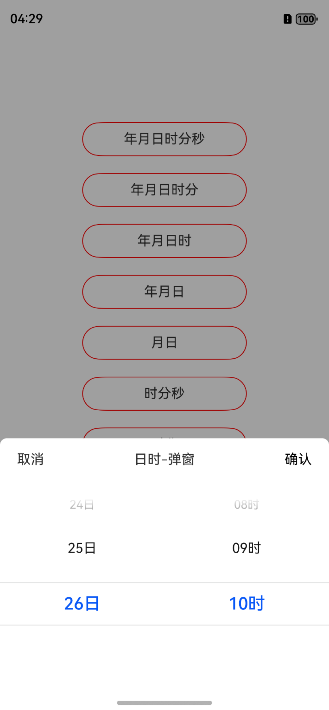
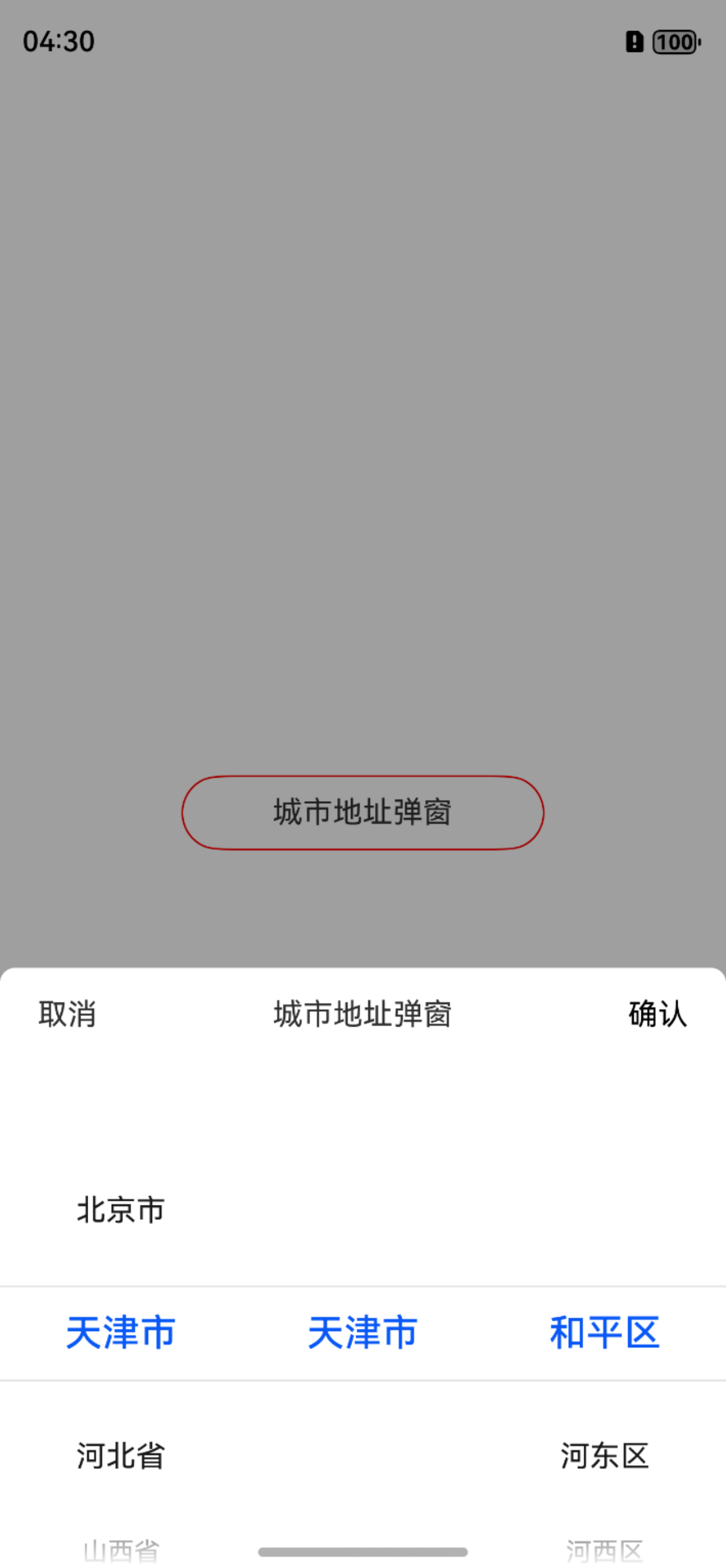
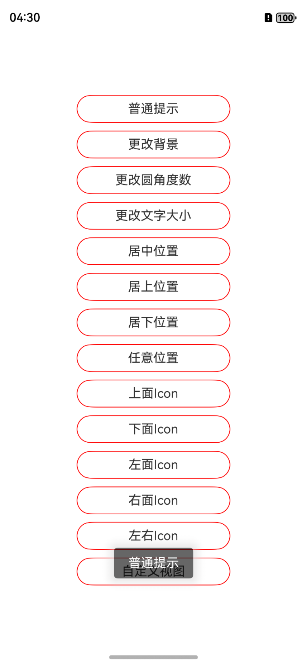
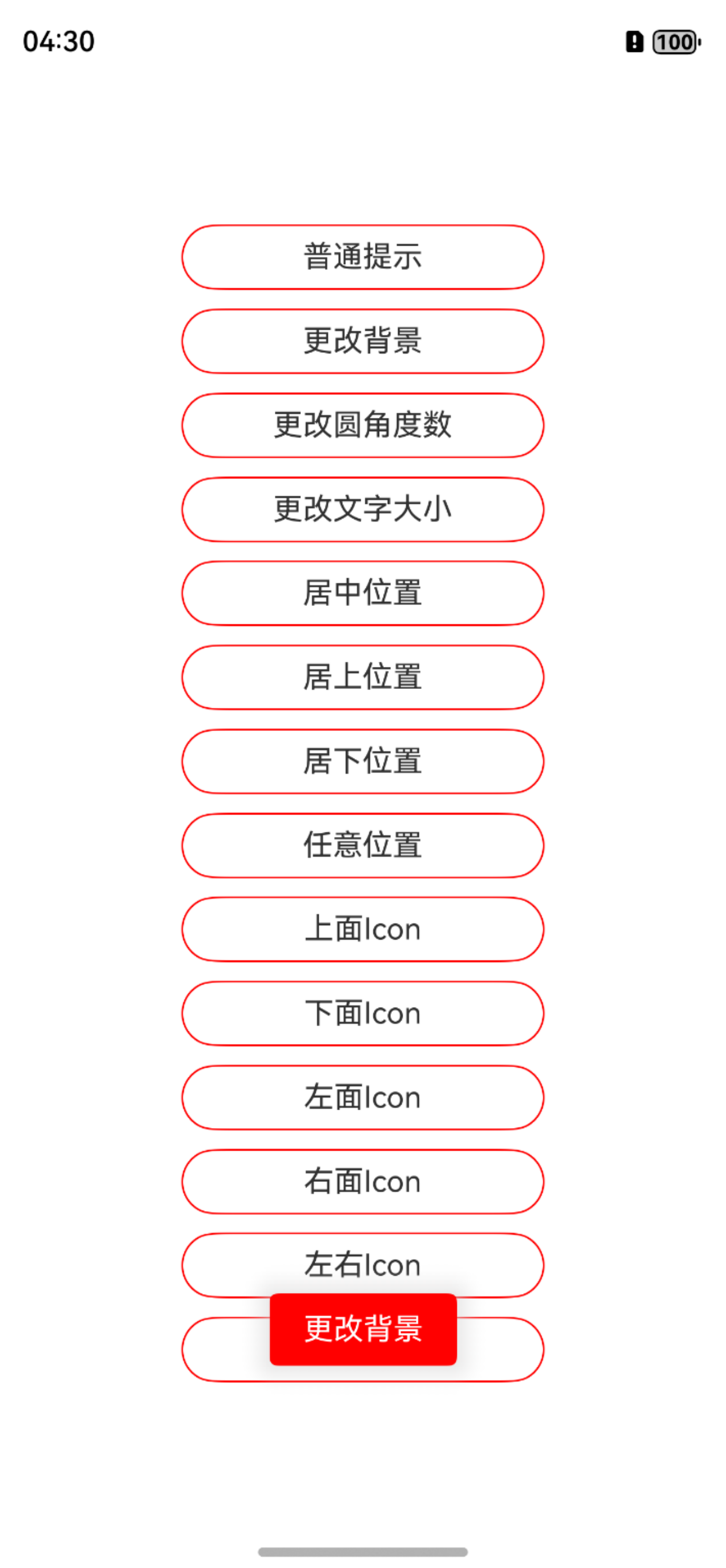
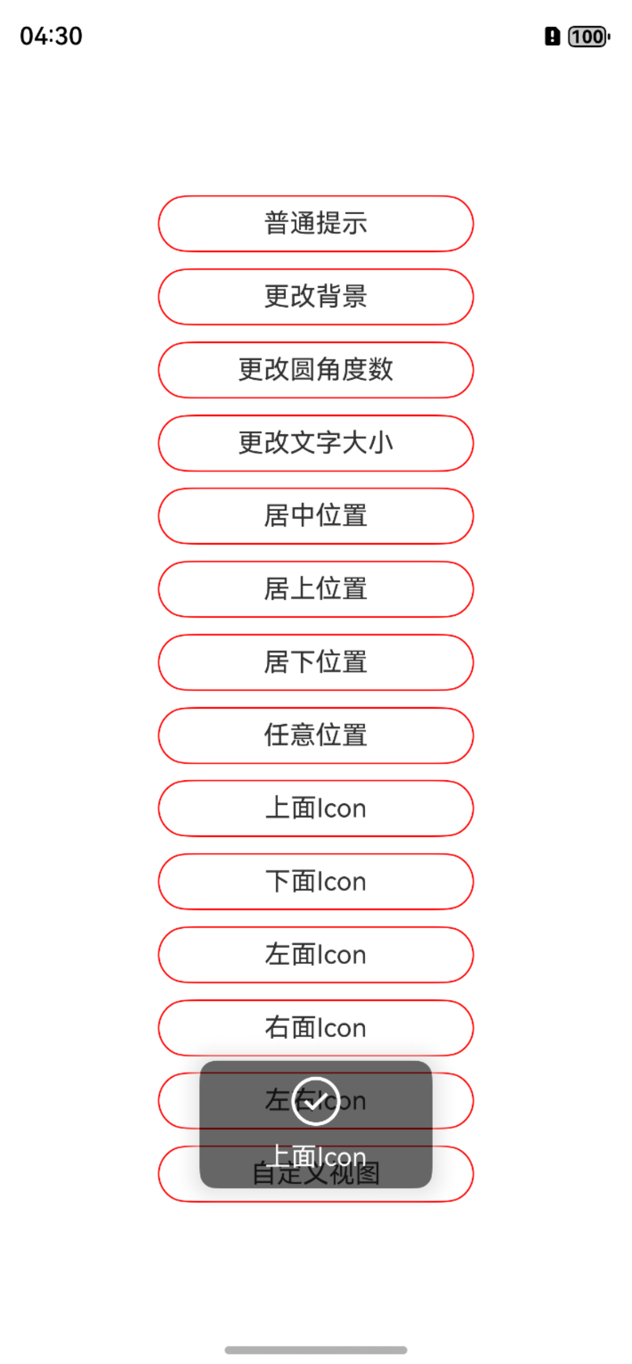
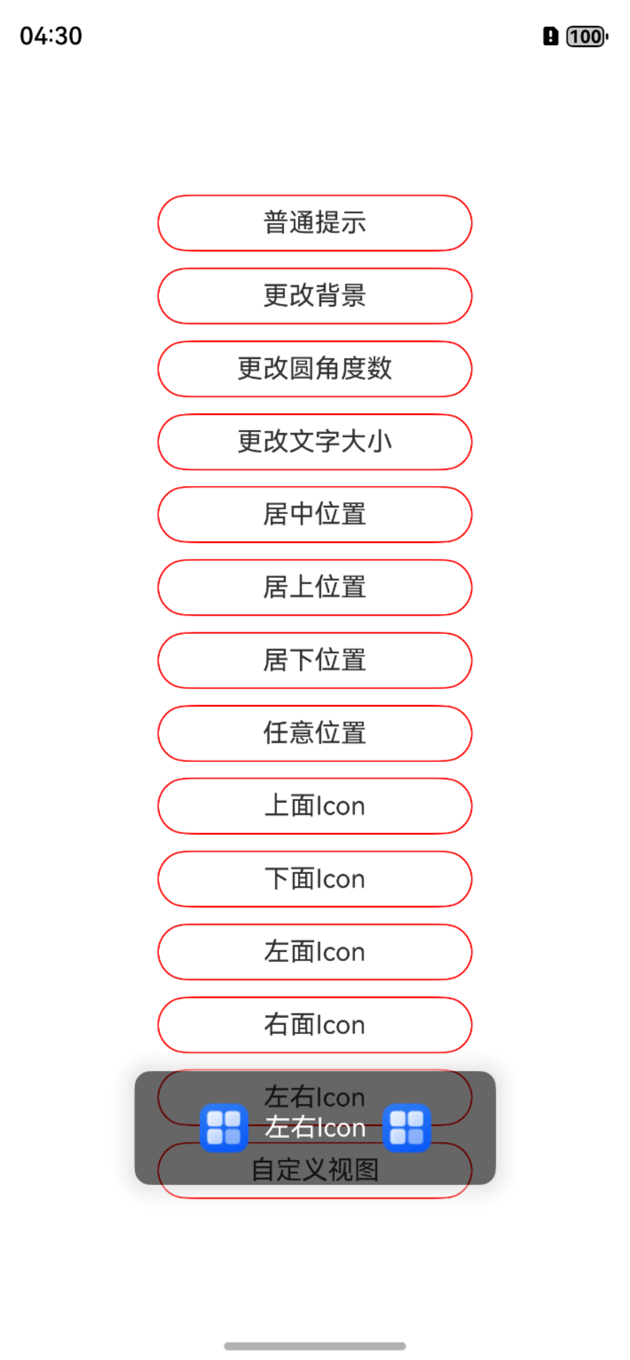
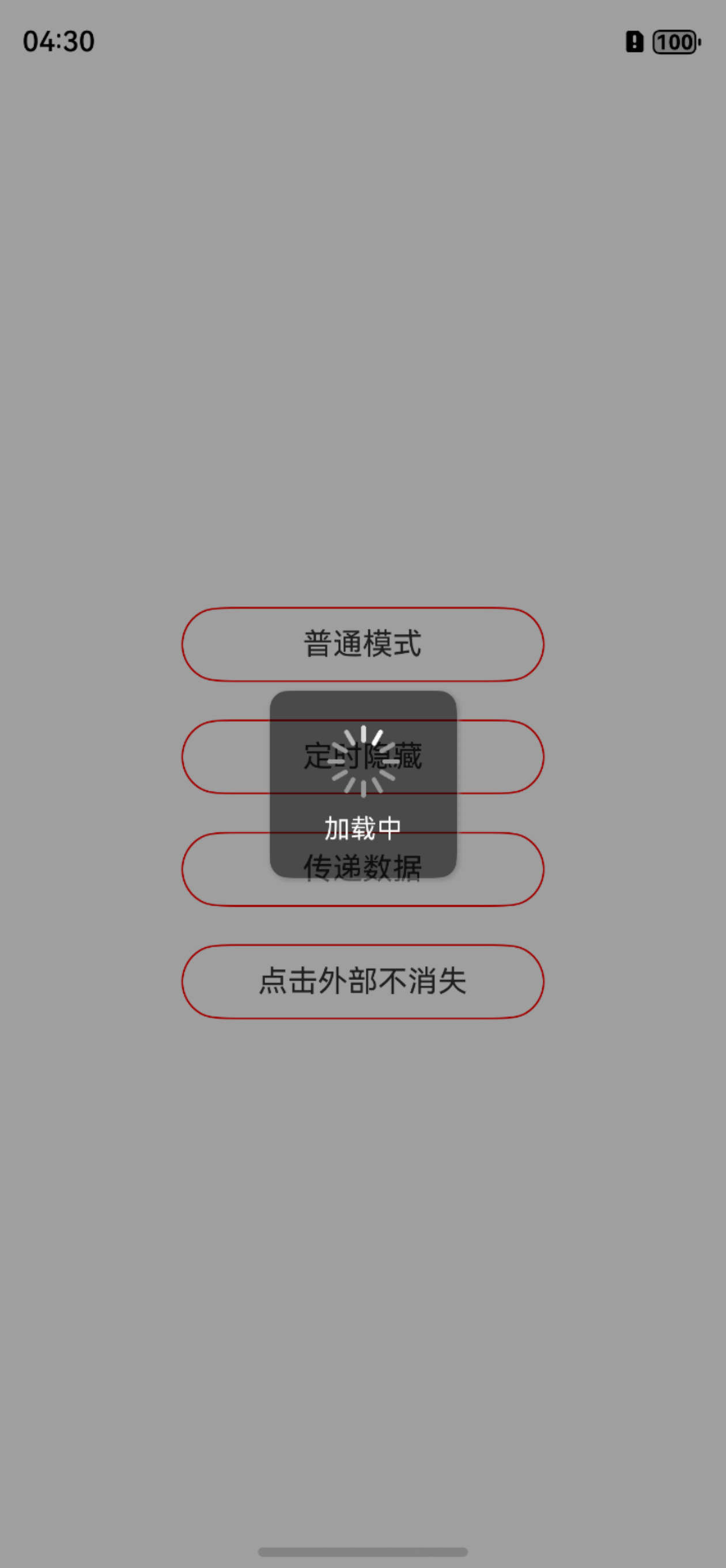
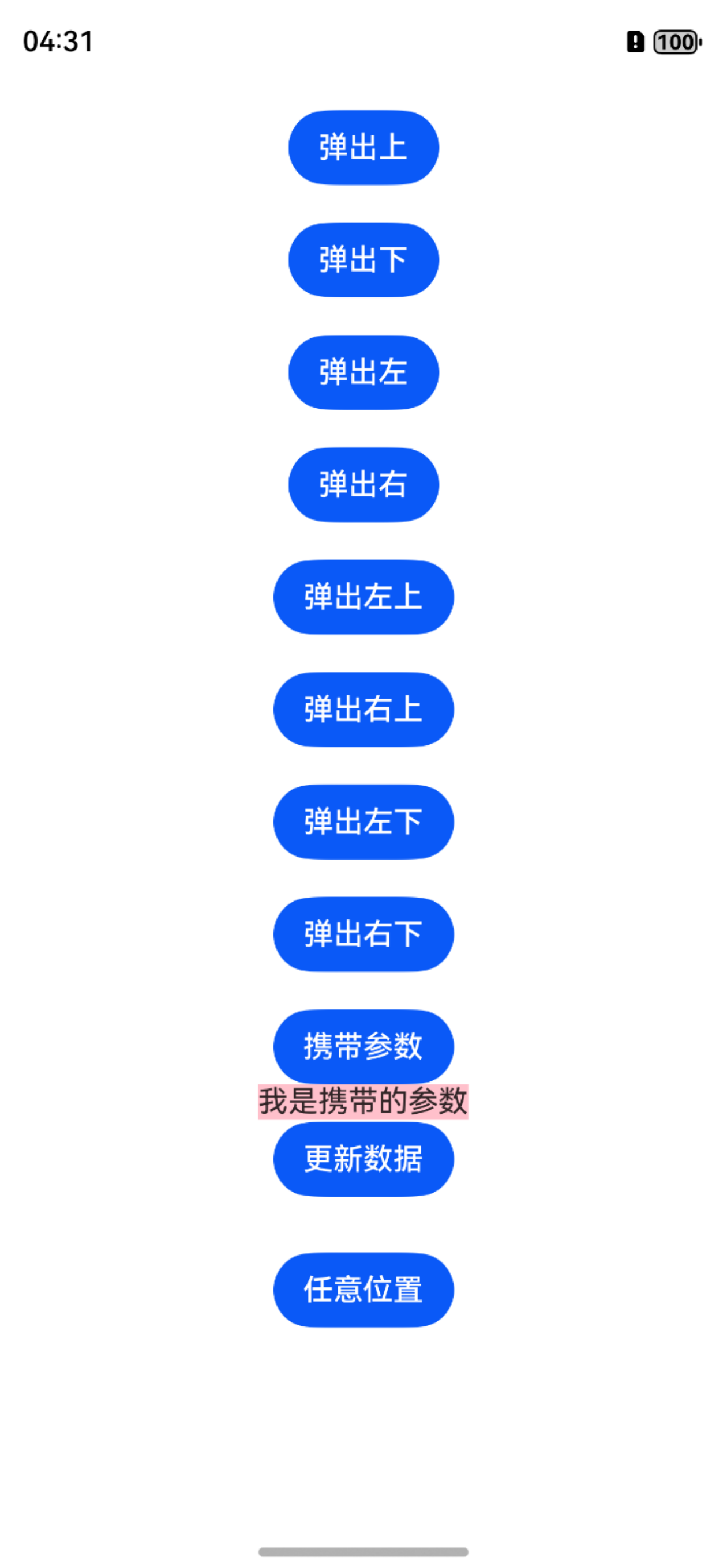
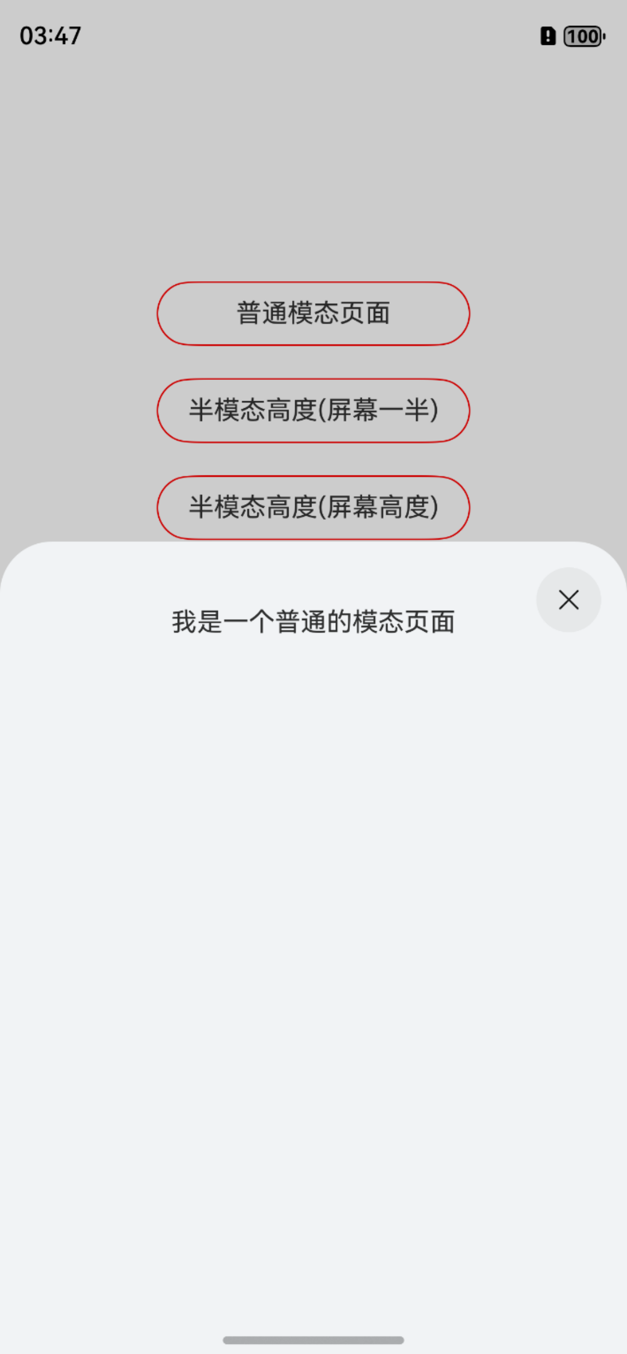
以上的所有弹窗,均支持数据的动态更新,样式的全局统一设置和局部单一设置,可满足多种不同场景需求。
方式一:在Terminal窗口中,执行如下命令安装三方包,DevEco Studio会自动在工程的oh-package.json5中自动添加三方包依赖。
建议:在使用的模块路径下进行执行命令。
ohpm install @abner/dialog
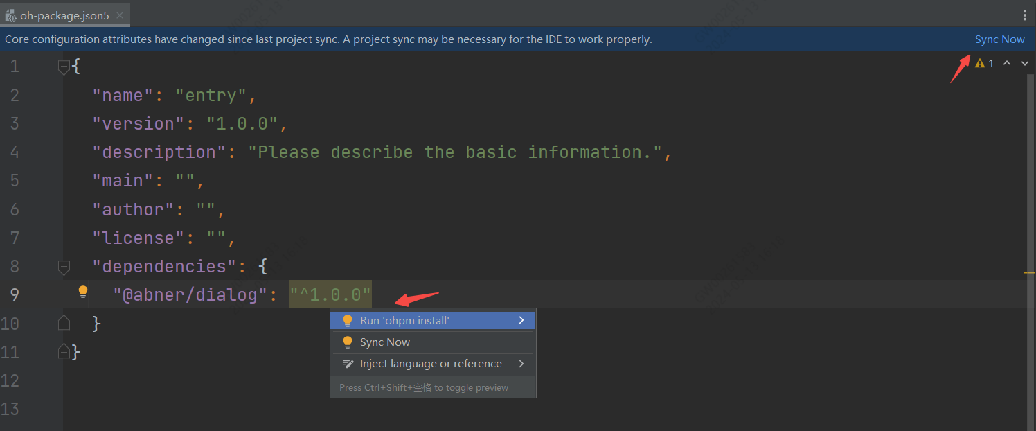
方式二:在工程的oh-package.json5中设置三方包依赖,配置示例如下:
"dependencies": { "@abner/dialog": "^1.2.7"}
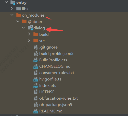
无论使用哪种方式进行依赖,最终都会在使用的模块中,生成一个oh_modules文件,并创建源代码文件,有则成功,无则失败,如下:
初始化可以更改统一的配置,比如宽高,比如大小、比如背景等等,支持八大模块弹窗样式设置,在这里,您可以按照UI设计进行全局统一设置,来满足您的需求,当然是在需要的情况下,如果默认的样式满足需求,全局初始化可以省略,您也可以在单独调用的时候进行修改样式。
initDialog(attribute)属性介绍
| 属性 | 类型 | 概述 |
|---|---|---|
| attribute | FusionAttribute | 可选参数,dialog属性全局配置,用于修改弹窗样式,可根据UI在这里进行配置 |
FusionAttribute是全局的dialog属性配置,如果默认提供的dialog样式和您的项目中样式不一样,可通过此参数进行设置,全局配置一次 页面中的所有使用地方均会生效,方便您后续使用。
| 属性 | 类型 | 概述 |
|---|---|---|
| dialogAttribute | DialogAttribute | 可选参数,全局的dialog属性,如宽高背景等设置 |
| infoOrConfirmAttribute | ContentAttribute | 可选参数,信息或者确认形式弹窗属性配置 |
| bottomListAttribute | BottomListAttribute | 可选参数,底部列表弹窗属性配置 |
| bottomGridAttribute | BottomGridAttribute | 可选参数,底部网格列表弹窗属性配置 |
| bottomListScrollAttribute | BottomListScrollAttribute | 可选参数,底部的滑动列表属性 |
| toastAttribute | ToastAttribute | 可选参数,Toast属性配置 |
| loadingAttribute | LoadingAttribute | 可选参数,loading提示 |
| isUseMainWindow | boolean | 是使用主window还是子window,默认是子 |
ContentAttribute是信息或者确认形式弹窗属性配置。
| 属性 | 类型 | 概述 |
|---|---|---|
| title | string / Resource | 可选参数,标题,全局初始化中无需配置 |
| message | string / Resource | 可选参数,描述信息,全局初始化中无需配置 |
| messageView | WrappedBuilder<Object[]> | 可选参数,自定义描述视图 |
| messageData | Object | 可选参数,自定义描述视图传递的数据,需messageView配合使用 |
| messageLink | string /Resource | 可选参数,描述信息下面的可点击链接,需配合isShowLink一起使用 |
| cancelText | string / Resource | 可选参数,取消文字 |
| confirmText | string / Resource | 可选参数,确认文字 |
| clickCancelHide | boolean | 可选参数,默认点击取消隐藏 |
| isHideTitle | boolean | 可选参数,是否隐藏标题,默认不隐藏 |
| clickCancel | 回调 | 可选参数,点击取消回调事件 |
| clickConfirm | 回调 | 可选参数,点击确认回调事件 |
| isHideCancelMenu | boolean | 是否隐藏取消按钮 |
| bottomMenuHeight | Length | 可选参数,底部按钮高度 |
| backgroundColor | ResourceColor | 可选参数,背景颜色 |
| radius | BorderRadiuses / Length | 可选参数,角度 |
| titleAttribute | TitleAttribute | 可选参数,标题样式属性 |
| messageAttribute | MessageAttribute | 可选参数,描述样式属性 |
| dividerHAttribute | DividerHAttribute | 可选参数,横向分割线样式属性 |
| dividerVAttribute | DividerVAttribute | 可选参数,垂直分割线样式属性 |
| confirmAttribute | ConfirmAttribute | 可选参数,确认样式属性 |
| cancelAttribute | CancelAttribute | 可选参数,取消样式属性 |
| dialogAttribute | DialogAttribute | 可选参数,弹窗总体属性 |
BottomListAttribute是底部列表弹窗属性配置。
| 属性 | 类型 | 概述 |
|---|---|---|
| backgroundColor | ResourceColor | 背景颜色 |
| items | string[] | 列表条目 |
| itemClick | (position: number) | 条目点击回调 |
| cancelClick | () | 取消点击回调 |
| isHideCancel | boolean | 是否隐藏取消按钮 |
| isTransparent | boolean | 是否透明展示 |
| itemRadius | Length / BorderRadiuses | 透明后条目整体的角度 |
| cancelRadius | Length / BorderRadiuses | 透明后取消按钮角度 |
| topLeftRadius | Length | dialog左上角角度 |
| topRightRadius | Length | dialog右上角角度 |
| itemAttr | BottomListItem | 条目属性 |
| itemDivider | ListItemDivider | 分割线属性 |
| cancelAttr | BottomListCancel | 底部取消属性 |
| dialogAttribute | DialogAttribute | 弹窗总体属性 |
| 属性 | 类型 | 概述 |
|---|---|---|
| items | BottomGridModel[] | 条目数据,用于网格 |
| itemLineArray | Array<BottomGridModel[]> | 条目数据,用户每行展示几个,每行几个就几个数据 |
| columnSize | number | 列数,默认是2列 |
| barTitleAttr | BarTitleGridAttribute | 网格上边的titlebar属性 |
| barHeight | number | 网格上边的titleBar的高度 |
| barCancelTextAttr | BarCancelTextGridAttribute | titleBar中的取消属性 |
| barCancelImageAttr | BarCancelImageGridAttribute | titleBar中的取消图片属性,和文字二选一 |
| isBarCancelImage | boolean | titleBar中的取消是否图片方式,默认是false |
| itemMarginTop | number | item每一行距离顶部 |
| backgroundColor | ResourceColor | 背景颜色 |
| topLeftRadius | Length | dialog左上角角度 |
| topRightRadius | Length | dialog右上角角度 |
| isHideBar | boolean | 是否隐藏titlebar |
| dialogAttribute | DialogAttribute | 全局dialog属性 |
| isItemAttrGlobal | boolean | 条目属性是否使用全局,默认是 |
| itemAttr | ItemGridAttribute | 条目属性 |
| itemClick | (position: number) | 条目点击回调 |
| cancelClick | () | 取消点击回调 |
| dividerColor | ResourceColor | 分割线颜色 |
| dividerHeight | number | 分割线高度 |
| isLastDividerShow | boolean | 最后一个是否显示,默认展示 |
| dividerMarginTop | Margin / Length | 分割线距离上边高度 |
| isShowBottomCancel | boolean | 是否展示底部取消按钮,默认不展示 |
| bottomCancelTextAttr | CancelTextGridAttribute | 底部的取消按钮属性 |
| 属性 | 类型 | 概述 |
|---|---|---|
| msg | string / Resource | 提示信息,初始化时无需 |
| duration | number | 弹出时间,默认2000 |
| backgroundColor | ResourceColor | 背景颜色 |
| fontColor | ResourceColor | 字体颜色 ,默认ffffff |
| fontWeight | number / FontWeight / string | 字体粗细设置,默认400 |
| fontSize | number / string / Resource | 字体大小,默认16 |
| fontFamily | string / Resource | 字体样式 |
| borderRadius | Length / BorderRadiuses | 角度 |
| padding | Padding / Length | 内边距 |
| flexAlign | FlexAlign | 位置方向 |
| leftSrc | PixelMap / ResourceStr/ DrawableDescriptor | 左边图片 |
| rightSrc | PixelMap / ResourceStr/ DrawableDescriptor | 右边图片 |
| topSrc | PixelMap / ResourceStr/ DrawableDescriptor | 上边图片 |
| bottomSrc | PixelMap / ResourceStr/ DrawableDescriptor | 下边图片 |
| imageMargin | Length | 图片距离文字距离 |
| imageWidth | Length | 图片宽度 |
| imageHeight | Length | 图片高度 |
| imageAlt | string /Resource | 加载时显示的占位图 |
每个弹窗中都有一个dialogAttribute属性,用来控制整体的弹窗样式。
| 属性 | 类型 | 概述 |
|---|---|---|
| windowBackgroundColor | ResourceColor | 背景颜色 |
| windowClickOutsideHide | boolean | 点击外部是否隐藏 |
| windowAlignment | DialogAlignment | 弹窗位置 |
| dialogDismiss | (action?:DismissDialogAction) => void | dialog隐藏状态回调 |
| dialogAppear | () => void | dialog显示回调 |
| windowBottomAnimation | boolean | 是否开启底部动画 |
| isPrivacyMode | boolean | 是否防止截屏,默认不是 |
| isSystemAnimation | boolean | 是否系统动画,默认既是 |
| dialogId | string | 标记弹窗的id,主要用于多个弹窗一起弹出,隐藏指定弹窗 |
showDialogInfo({
  title: "我是标题",
  message: "我是一段描述",
  clickConfirm: () => {
    //确认
    console.log("===点击了确认按钮")
    hide() //隐藏dialog
  }
}) //更新信息弹窗,可以修改任意的属性
updateDialogInfo({
message: "嘿嘿,我修改了啊"
}) showDialogConfirm({
title: "我是标题",
message: "我是一段描述",
clickConfirm: () => {
//确认
console.log("===点击了确认按钮")
hide() //隐藏dialog
},
clickCancel: () => {
console.log("===点击了取消按钮")
hide() //隐藏dialog
}
}) //更新确认形式弹窗,可以修改任意的属性
updateDialogConfirm({
message: "嘿嘿,我修改了啊"
}) showDialogConfirm({
title: "我是一个标题",
message: "我是一段描述",
isShowInformation: true, //展示信息
informationAttribute: {
checkboxSelect: true, //是否默认选中
iconAttribute: {
srcSelect: $r("app.media.select"), //选中
srcUnselected: $r("app.media.no_select"), //未选中
},
onChange: (isChange) => {
//点击改变了状态
console.log("===" + isChange)
}
},
clickCancel: () => {
//取消
console.log("===取消")
hide() //隐藏dialog
},
clickConfirm: () => {
//确认
console.log("===确认")
hide() //隐藏dialog
}
}) showDialogInfo({
title: "我是标题",
message: "我是一段描述",
messageLink: "我是可以点击的",
isShowLink: true,
messageLinkAttribute: {
fontColor: Color.Blue,
onclick: () => {
//点击
toast("点击了链接")
}
},
clickConfirm: () => {
//确认
hide() //隐藏dialog
}
}) showDialogConfirm({
title: "我是标题",
messageView: wrapBuilder(MessageView), //传递自定义视图
messageData: new TextBean("我是自定义的message视图", true), //传递自定义数据,可以是任意的类型
clickConfirm: () => {
//确认
hide() //隐藏dialog
}
}) //更新确认形式弹窗,可以修改任意的属性
updateDialogConfirm({
messageData: new TextBean("嘿嘿,我更新了哦", true)
})showDialogBottomList({
items: ["我是条目一", "我是条目二", "我是条目三", "我是条目四"],
itemClick: (position: number) => {
console.log("===点击的条目索引:" + position)
}
})showDialogBottomList({
items: ["我是条目一", "我是条目二"],
itemClick: (position: number) => {
console.log("==========:" + position)
},
isTransparent: true,
dialogAttribute: {
dialogMarginLeft: 20,
dialogMarginRight: 20,
dialogMarginBottom: 20,
}
})showDialogBottomList({
itemModels: [
new BottomListModel("条目一", { fontColor: Color.Red }),
new BottomListModel("条目二")],
itemClick: (position: number) => {
console.log("===点击了条目索引:" + position)
}
})showDialogBottomGrid({
columnSize: 4,
items: [new BottomGridModel("微信", $r("app.media.app_icon")),
new BottomGridModel("朋友圈", $r("app.media.app_icon")),
new BottomGridModel("QQ", $r("app.media.app_icon")),
new BottomGridModel("QQ空间", $r("app.media.app_icon")),
new BottomGridModel("微博", $r("app.media.app_icon")),
new BottomGridModel("微博", $r("app.media.app_icon")),
new BottomGridModel("微博", $r("app.media.app_icon")),
new BottomGridModel("微博", $r("app.media.app_icon"))
],
itemClick: (position) => {
console.log("===条目索引:" + position)
}
})showDialogBottomGrid({
columnSize: 4,
isShowBottomCancel: true,
isHideBar: true,
itemLineArray: [
[new BottomGridModel("测试", $r("app.media.app_icon")),
new BottomGridModel("测试", $r("app.media.app_icon"))],
[new BottomGridModel("测试", $r("app.media.app_icon")),
new BottomGridModel("测试", $r("app.media.app_icon")),
new BottomGridModel("测试", $r("app.media.app_icon"))]
],
itemClick: (position) => {
console.log("===条目索引:" + position)
}
})showDialogBottomListScroll({
items: ["男", "女"],
selected: 1, //默认选择
titleBarAttribute: {
titleText: "选择性别"
},
confirmClick: (value, index) => {
console.log(value + "===" + index)
}
})showDialogBottomListScroll({
selected: [1, 2], //默认选择
items: [["第一列1", "第一列2"], ["第二列1", "第二列2", "第二列3"]],
titleBarAttribute: {
titleText: "底部双列表不联动"
},
confirmClick: (value, index) => {
console.log(value + "===" + index)
}
})showDialogBottomListScroll({
items: this.doubleList,
titleBarAttribute: {
titleText: "底部双列表联动"
},
confirmClick: (value, index) => {
console.log(value + "===" + index)
}
})showDialogBottomListScroll({
items: this.thirdList,
titleBarAttribute: {
titleText: "底部三列表联动",
},
confirmClick: (value, index) => {
console.log(value + "===" + index)
}
})showDialogTime({
titleBarAttribute: {
titleText: "年月日时分秒-弹窗",
},
timeAttribute: {
timeType: TimeDialogType.YMDHMS,
startTime: "2020-10-10-10-10-10",
endTime: "2026-10-10-10-10-9",
selectTime: "2021-11-11-11-11-11",
},
timeConfirmClick: (date) => {
//时间回调
console.log("===时间结果:" + date)
},
confirmClick: (value, index) => {
//内容和索引回调
console.log("===内容结果:" + value + "===索引结果:" + index)
}
})showDialogTime({
titleBarAttribute: {
titleText: "年月日时分-弹窗",
},
timeAttribute: {
timeType: TimeDialogType.YMDHM,
selectTime: "1992-7-23-8-8", //选择的时间
},
timeConfirmClick: (date) => {
//时间回调
console.log("===时间结果:" + date)
},
confirmClick: (value, index) => {
//内容和索引回调
console.log("===内容结果:" + value + "===索引结果:" + index)
}
})showDialogTime({
titleBarAttribute: {
titleText: "年月日时-弹窗",
},
timeAttribute: {
timeType: TimeDialogType.YMDH,
selectTime: "2000-7-23-8-8", //选择的时间
startTime: "1992-1-1-0",
endTime: "2020-12-31-23"
},
timeConfirmClick: (date) => {
//时间回调
console.log("===时间结果:" + date)
},
confirmClick: (value, index) => {
//内容和索引回调
console.log("===内容结果:" + value + "===索引结果:" + index)
}
})showDialogTime({
titleBarAttribute: {
titleText: "年月日-弹窗",
},
timeAttribute: {
timeType: TimeDialogType.YMD,
startTime: "2024-10-24",
selectTime: "2024-12-24",
endTime: "2029-12-10",
},
timeConfirmClick: (date) => {
//时间回调
console.log("===时间结果:" + date)
},
confirmClick: (value, index) => {
//内容和索引回调
console.log("===内容结果:" + value + "====" + index)
}
})showDialogTime({
titleBarAttribute: {
titleText: "月日-弹窗",
},
timeAttribute: {
timeType: TimeDialogType.MD,
startTime: "10-20", //选择的时间
endTime: "12-18",
selectTime: "11-19"
},
timeConfirmClick: (date) => {
//时间回调
console.log("===时间结果:" + date)
},
confirmClick: (value, index) => {
//内容和索引回调
console.log("===内容结果:" + value + "====" + index)
}
})showDialogTime({
titleBarAttribute: {
titleText: "时分秒-弹窗",
},
timeAttribute: {
timeType: TimeDialogType.HMS,
selectTime: "6-12-12", //选择的时间
},
timeConfirmClick: (date) => {
//时间回调
console.log("===时间结果:" + date)
},
confirmClick: (value, index) => {
//内容和索引回调
console.log("===内容结果:" + value + "====" + index)
}
})showDialogTime({
titleBarAttribute: {
titleText: "时分-弹窗",
},
timeAttribute: {
timeType: TimeDialogType.HM,
startHours: 20,
startMinutes: 2,
endHours: 23,
endMinutes: 59,
},
timeConfirmClick: (date) => {
//时间回调
console.log("===时间结果:" + date)
},
confirmClick: (value, index) => {
//内容和索引回调
console.log("===内容结果:" + value + "====" + index)
}
})showDialogTime({
titleBarAttribute: {
titleText: "分秒-弹窗",
},
timeAttribute: {
timeType: TimeDialogType.MS,
selectDate: new Date()
},
timeConfirmClick: (date) => {
//时间回调
console.log("===时间结果:" + date)
},
confirmClick: (value, index) => {
//内容和索引回调
console.log("===内容结果:" + value + "====" + index)
}
})showDialogTime({
titleBarAttribute: {
titleText: "日时分-弹窗",
},
timeAttribute: {
timeType: TimeDialogType.DHM,
selectDate: new Date()
},
timeConfirmClick: (date) => {
//时间回调
console.log("===时间结果:" + date)
},
confirmClick: (value, index) => {
//内容和索引回调
console.log("===内容结果:" + value + "====" + index)
}
})showDialogTime({
titleBarAttribute: {
titleText: "日时-弹窗",
},
timeAttribute: {
timeType: TimeDialogType.DH,
startTime: "24-10",
endTime: "26-10",
},
timeConfirmClick: (date) => {
//时间回调
console.log("===时间结果:" + date)
},
confirmClick: (value, index) => {
//内容和索引回调
console.log("===内容结果:" + value + "====" + index)
}
})showDialogAddress({
titleBarAttribute: {
titleText: "城市地址弹窗",
},
confirmClick: (value, index) => {
console.log(value + "===" + index)
}
})toast("普通提示") toast("更改背景", { backgroundColor: Color.Red, fontColor: Color.White })toast("更改圆角度数", { borderRadius: 5 }) toast("更改文字大小", { fontSize: 20 }) toast("居中位置", { toastAlignment: ToastAlignment.Center }) toast("居上位置", { toastAlignment: ToastAlignment.Top }) toast("任意位置", { offsetX: 20, offsetY: 20 })toast("上面Icon", {
topIcon: $r("app.media.success"),
borderRadius: 10,
padding: {
left: 40,
right: 40,
bottom: 10
}
})toast("下面Icon", {
bottomIcon: $r("app.media.app_icon"),
borderRadius: 10,
padding: {
left: 40,
right: 40,
top: 10
}
}) toast("自定义视图", {
backgroundColor: Color.Transparent,
padding: 0,
view: wrapBuilder(ToastView)
})showPopupWindow({
id: "popupTop",
view: wrapBuilder(BuilderWindowView)
}) showPopupWindow({
id: "popupBottom",
view: wrapBuilder(BuilderWindowView),
direction: PopupDirection.BOTTOM
}) let params = new WindowParams()
params.title = "我是携带的参数"
showPopupWindow({
id: "popupParams",
params: params,
viewParams: wrapBuilder(BuilderWindowParams),
direction: PopupDirection.BOTTOM
}) let params = new WindowParams()
params.title = "嘿嘿,我更新了"
updatePopupData(params) showPopupWindow({
view: wrapBuilder(BuilderWindowView),
x: 60,
y: 300
})loading() loading({ text: "正在请求中很多数据……" })首先定义自己的视图UI
/*
* Author:AbnerMing
* Describe:自定义弹窗,布局自己定义
*/
@Builder
function SelfDialog() {

  Column() {

    Text("我是一个自定义弹窗")
      .margin({ top: 30 })

    TextInput()
      .margin({ top: 10 })

    Row() {
      Button("取消").onClick(() => {
        //隐藏dialog
        hide()
      })
      Button("确定")
        .margin({ left: 30 })
    }.margin({ top: 20 })
      .margin({ top: 30 })
  }.backgroundColor(Color.White)
    .width("60%")
}
调用showDialog进行弹出
showDialog(wrapBuilder(SelfDialog)) let params = new DialogParams()
params.title = "我是传递的参数"
showDialogParams(wrapBuilder(BuilderDialogParams), params) let params1 = new DialogParams()
params1.title = "嘿嘿,我数据更新了"
updateDialogParams(params1)只需要使用BottomAnimationView作为根布局包裹即可。
/*
* Author:AbnerMing
* Describe:自定义弹窗,布局自己定义
*/
@Builder
function BuilderDialog() {
  //使用BottomAnimationView可以在底部弹出
  BottomAnimationView() {
    Column() {
      Text("我是一个自定义弹窗")
        .margin({ top: 30 })

      TextInput()
        .margin({ top: 10 })

      Row() {
        Button("取消").onClick(() => {
          //隐藏dialog
          hide()
        })
        Button("确定")
          .margin({ left: 30 })
      }.margin({ top: 20 })
      .margin({ top: 30 })
    }.backgroundColor(Color.White)
    .width("60%")
  }
}hide() hidePosition(1) hideDialogId("dialogInfo1") hideAll()声明一个Builder
@Builder
function sheetView() {
  Column() {
    Text("我是一个普通的模态页面")
      .width("100%")
      .height(100)
      .textAlign(TextAlign.Center)
  }
}
弹出模态
showDialogSheet({ layout: wrapBuilder(sheetView) }) showDialogSheet({
layout: wrapBuilder(sheetView),
options: {
height: SheetSize.MEDIUM
}
}) showDialogSheet({
layout: wrapBuilder(sheetView),
options: {
height: SheetSize.LARGE
}
})showDialogSheet({
layout: wrapBuilder(sheetView),
options: {
height: SheetSize.FIT_CONTENT
}
})showDialogSheet({
layout: wrapBuilder(sheetView),
options: {
height: 300
}
})showDialogSheet({
layout: wrapBuilder(sheetView),
options: {
showClose: false
}
})@Builder
function changeStyleSheetView(d: SheetData) {
Column() {
Text(d.title)
.width("100%")
.height(100)
.textAlign(TextAlign.Center)
Button("更改样式").onClick(() => {
//其他属性不需要
updateStyleDialogSheet({
options: {
backgroundColor: Color.Pink
}
})
})
Button("关闭")
.margin({ top: 10 })
.onClick(() => {
closeDialogSheet()
})
}
}
export class SheetData {
title?: string
constructor(title?: string) {
this.title = title
}
} let sheetData = new SheetData("模态页面更新样式")
let sheetWrap = wrapBuilder(changeStyleSheetView)
showDialogSheet({
layout: sheetWrap,
data: sheetData
}) let sheetData1 = new SheetData("模态页面更新数据,3秒后我就会更新")
let sheetWrap1 = wrapBuilder(changeStyleSheetView)
showDialogSheet({
layout: sheetWrap1,
data: sheetData1
})
setTimeout(() => {
updateDataDialogSheet(new SheetData("嘿嘿!我更新了~"))
}, 3000) let sheetData2 = new SheetData("测试关闭模态页面")
let sheetWrap2 = wrapBuilder(changeStyleSheetView)
showDialogSheet({
layout: sheetWrap2,
data: sheetData2
})如果您在使用上有问题,解决不了,或者查看精华的鸿蒙技术文章,可扫码进行操作。
Copyright (C) AbnerMing, HarmonyOSDialog Open Source Project

Licensed under the Apache License, Version 2.0 (the "License");
you may not use this file except in compliance with the License.
You may obtain a copy of the License at

     http://www.apache.org/licenses/LICENSE-2.0

Unless required by applicable law or agreed to in writing, software
distributed under the License is distributed on an "AS IS" BASIS,
WITHOUT WARRANTIES OR CONDITIONS OF ANY KIND, either express or implied.
See the License for the specific language governing permissions and
limitations under the License.