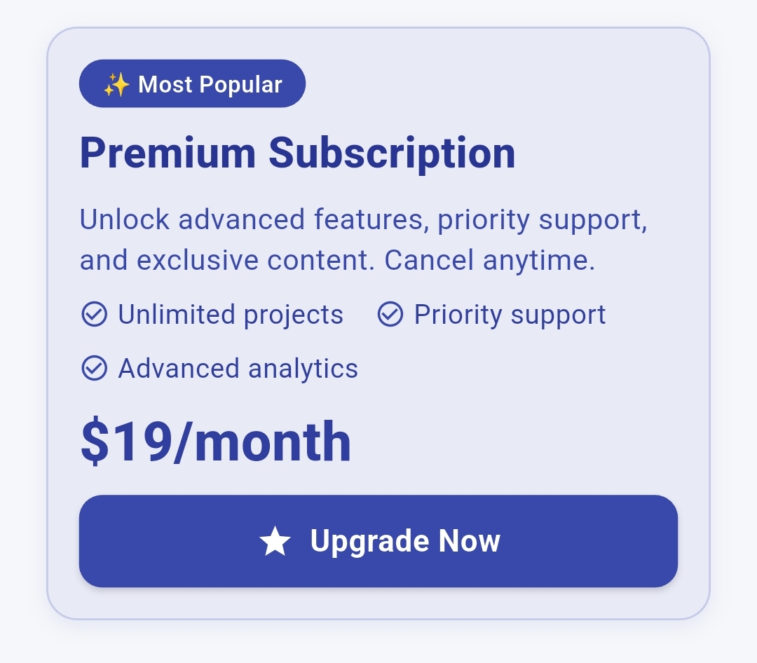
The most powerful and customizable card widget for Flutter applications. Create stunning, professional cards with advanced features like image positioning, interactive overlays, content grids, rating systems, and sophisticated button controls.
🎨 100+ Customizable Properties - Complete control over every aspect
🖼️ Advanced Image System - Multiple positioning options with overlay effects
📊 Content Grid Layouts - Perfect for metrics, analytics, and data display
⭐ Interactive Rating System - Customizable stars with tap-to-rate functionality
🔘 Professional Button System - 5 button styles with animations and loading states
💫 Micro-animations - Smooth hover effects and press animations
📱 Responsive Design - Adapts beautifully to all screen sizes
🎯 Production Ready - Used by thousands of developers worldwide
Add this to your package's pubspec.yaml file:
dependencies :
flutter_advanced_cards : ^1.0.0 Then run:
import 'package:flutter_advanced_cards/flutter_advanced_cards.dart' ;
AdvancedCard (
title: 'Beautiful Card' ,
description: 'This is a stunning card with advanced features' ,
cardImage: 'https://example.com/image.jpg' ,
imagePosition: ImagePosition .top,
buttonText: 'Get Started' ,
onButtonPressed: () {
print ('Button pressed!' );
},
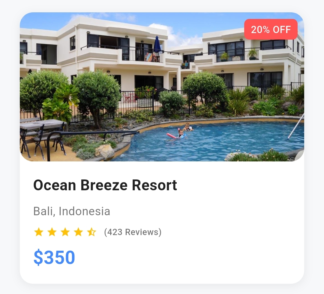
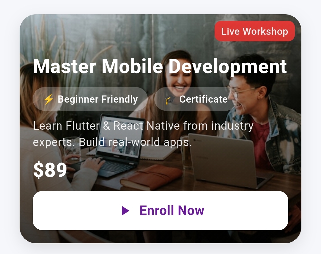
)Course Card with Background Image AdvancedCard (
fullWidth: true ,
height: 280 ,
borderRadius: 20 ,
cardImage: 'https://images.unsplash.com/photo-1522202176988-66273c2fd55f' ,
imagePosition: ImagePosition .background,
statusChips: [
StatusChip (
text: 'Live Workshop' ,
position: ChipPosition .topRight,
backgroundColor: Colors .red[600 ],
),
],
title: 'Master Mobile Development' ,
titleColor: Colors .white,
titleFontSize: 24 ,
titleFontWeight: FontWeight .w800,
description: 'Learn Flutter & React Native from industry experts' ,
descriptionColor: Colors .white.withOpacity (0.9 ),
customChips: [
ContentChip (
text: '⚡ Beginner Friendly' ,
backgroundColor: Colors .white.withOpacity (0.25 ),
textColor: Colors .white,
),
ContentChip (
text: '🎓 Certificate' ,
backgroundColor: Colors .white.withOpacity (0.25 ),
textColor: Colors .white,
),
],
chipPosition: ContentChipPosition .afterTitle,
price: '\$ 89' ,
priceFontSize: 28 ,
priceColor: Colors .white,
buttonText: 'Enroll Now' ,
buttonIcon: Icons .play_arrow,
buttonBackgroundColor: Colors .white,
buttonTextColor: Colors .purple[800 ],
onButtonPressed: () {
// Handle enrollment
},
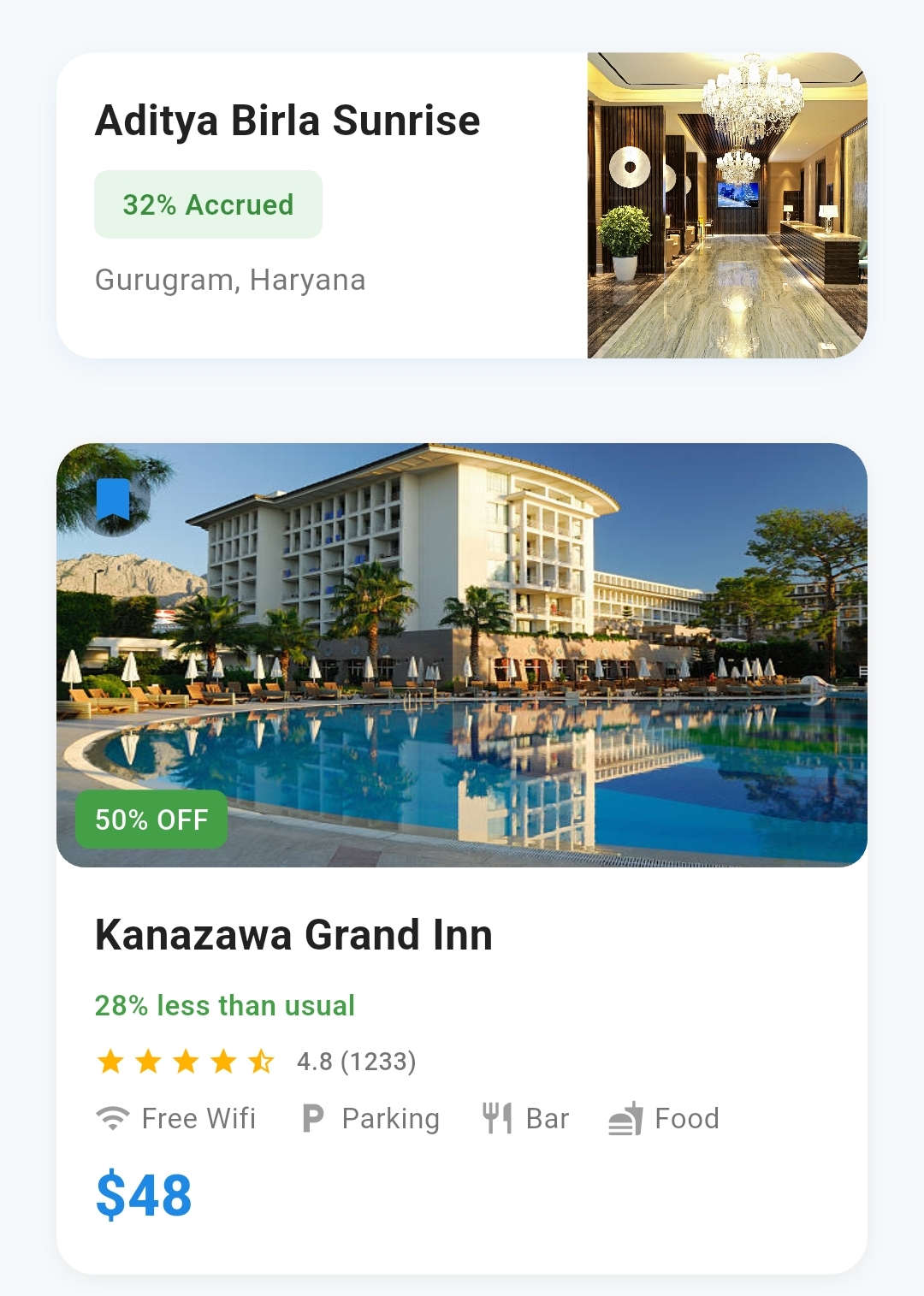
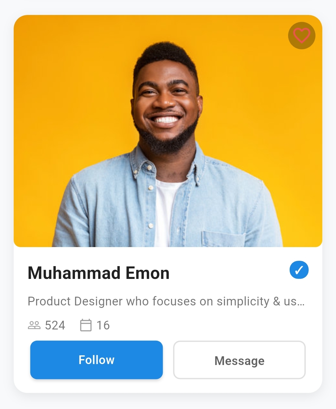
)Profile Card with Actions AdvancedCard (
fullWidth: true ,
cardImage: 'https://images.unsplash.com/photo-1487058792275-0ad4aaf24ca7' ,
imagePosition: ImagePosition .top,
imageRatio: ImageRatio .oneThird,
showBookmarkIcon: true ,
title: 'Sarah Chen' ,
customChips: [
ContentChip (
text: 'Pro' ,
backgroundColor: Colors .purple[600 ],
textColor: Colors .white,
),
],
chipPosition: ContentChipPosition .rightOfTitle,
description: 'Senior UX Designer at Google • 8 years experience' ,
iconTextPairs: [
IconTextPair (
icon: Icons .work_outline,
text: 'Google' ,
),
IconTextPair (
icon: Icons .location_on_outlined,
text: 'San Francisco' ,
),
],
buttons: [
CardButton (
text: 'Connect' ,
style: CardButtonStyle .elevated,
backgroundColor: Colors .purple[600 ],
),
CardButton (
text: 'Portfolio' ,
style: CardButtonStyle .outlined,
),
],
)AdvancedCard (
backgroundColor: Colors .green[50 ],
borderColor: Colors .green[100 ],
title: 'Weekly Revenue' ,
customChips: [
ContentChip (
text: '+12.5%' ,
backgroundColor: Colors .green[100 ],
textColor: Colors .green[700 ],
prefixIcon: Icons .trending_up,
),
],
metrics: [
MetricItem (
label: 'This Week' ,
value: '\$ 24.8K' ,
valueColor: Colors .green[700 ],
valueFontWeight: FontWeight .w800,
),
MetricItem (
label: 'Last Week' ,
value: '\$ 22.1K' ,
valueColor: Colors .grey[600 ],
),
],
metricsColumns: 1 ,
)
Property
Type
Default
Description
widthdouble?nullFixed width of the card
heightdouble?nullFixed height of the card
fullWidthboolfalseMakes card take full available width
fullHeightboolfalseMakes card take full available height
backgroundColorColor?Colors.whiteBackground color of the card
borderRadiusdouble?12.0Border radius for all corners
customBorderRadiusBorderRadiusGeometry?nullCustom border radius for specific corners
paddingEdgeInsetsGeometry?EdgeInsets.all(16.0)Internal padding of the card
marginEdgeInsetsGeometry?EdgeInsets.all(8.0)External margin around the card
Property
Type
Default
Description
borderWidthdouble?nullWidth of the border (0 = no border)
borderColorColor?Colors.grey.shade300Color of the border
hasShadowbooltrueEnable/disable shadow
shadowColorColor?Colors.grey.withOpacity(0.2)Color of the shadow
shadowBlurdouble?4.0Blur radius of the shadow
shadowSpreaddouble?1.0Spread radius of the shadow
shadowOffSetOffset?Offset(0, 2)Offset of the shadow
customShadowsList<BoxShadow>?nullCustom list of shadows
Property
Type
Default
Description
onTapVoidCallback?nullCallback when card is tapped
onLongPressVoidCallback?nullCallback when card is long pressed
enableHoverbooltrueEnable hover effects
Property
Type
Default
Description
cardImagedynamicnullImage source (URL, asset path, or Widget)
imagePositionImagePositionImagePosition.topPosition of image (top, left, right, background)
imageRatioImageRatioImageRatio.halfSize ratio (oneThird, half, twoThirds, full)
customImageWidthdouble?nullCustom width (overrides ratio)
customImageHeightdouble?nullCustom height (overrides ratio)
imageBorderRadiusdouble?8.0Border radius for the image
imageFitBoxFitBoxFit.coverHow image should fit its container
Property
Type
Default
Description
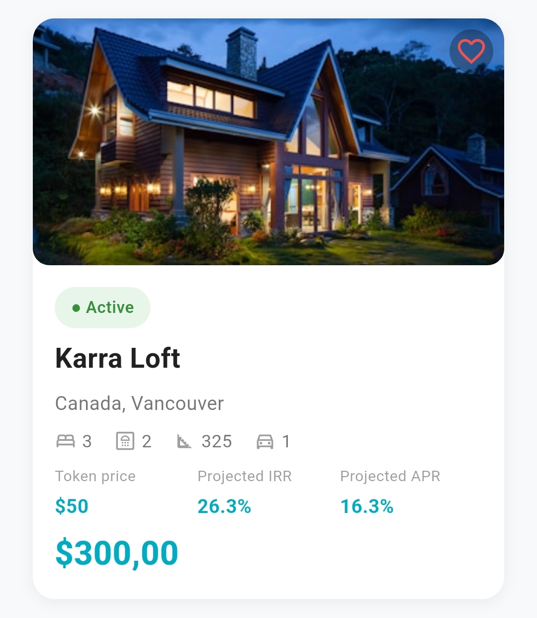
showLikeIconboolfalseShow like/heart icon on image
likeIconPositionOverlayPositionOverlayPosition.topRightPosition of like icon
likeIconIconDataIcons.favoriteIcon for like button
likeIconColorColor?nullColor of like icon
likeIconSizedouble24.0Size of like icon
isLikedboolfalseCurrent like state
onLikeTapVoidCallback?nullCallback when like icon is tapped
showBookmarkIconboolfalseShow bookmark/save icon
bookmarkIconPositionOverlayPositionOverlayPosition.topLeftPosition of bookmark icon
bookmarkIconIconDataIcons.bookmarkIcon for bookmark button
bookmarkIconColorColor?nullColor of bookmark icon
bookmarkIconSizedouble24.0Size of bookmark icon
isBookmarkedboolfalseCurrent bookmark state
onBookmarkTapVoidCallback?nullCallback when bookmark is tapped
statusChipsList<StatusChip>?nullStatus chips displayed on image
Title Properties:
Property
Type
Default
Description
titleString?nullMain title text
titleFontSizedouble?18.0Font size of title
titleFontWeightFontWeight?FontWeight.boldFont weight of title
titleColorColor?Colors.black87Color of title text
titleFontFamilyString?nullFont family for title
titleAlignmentContentAlignmentContentAlignment.leftAlignment of title
titleMaxLinesint?nullMaximum lines for title
titleOverflowTextOverflow?TextOverflow.ellipsisOverflow behavior for title
Description Properties:
Property
Type
Default
Description
descriptionString?nullDescription/subtitle text
descriptionFontSizedouble?14.0Font size of description
descriptionFontWeightFontWeight?FontWeight.normalFont weight of description
descriptionColorColor?Colors.grey[600]Color of description text
descriptionFontFamilyString?nullFont family for description
descriptionAlignmentContentAlignmentContentAlignment.leftAlignment of description
descriptionMaxLinesint?nullMaximum lines for description
descriptionOverflowTextOverflow?TextOverflow.ellipsisOverflow behavior
Property
Type
Default
Description
ratingdouble?nullCurrent rating value (0.0 to maxRating)
maxRatingint5Maximum rating value
ratingStarSizedouble16.0Size of rating stars
ratingFilledColorColor?Colors.orangeColor of filled stars
ratingEmptyColorColor?Colors.grey[300]Color of empty stars
showRatingNumberbooltrueShow rating number next to stars
customRatingTextString?nullCustom text instead of rating number
onRatingChangedValueChanged<double>?nullCallback when rating is changed
Property
Type
Default
Description
chipsList<String>?nullSimple text chips
chipPositionContentChipPositionContentChipPosition.afterTitlePosition relative to title
chipBackgroundColorColor?Colors.grey[200]Background color of chips
chipTextColorColor?Colors.grey[700]Text color of chips
chipFontSizedouble?12.0Font size of chip text
chipFontWeightFontWeight?FontWeight.w500Font weight of chip text
chipBorderRadiusdouble?16.0Border radius of chips
onChipTapVoidCallback?nullCallback when chip is tapped
customChipsList<ContentChip>?nullAdvanced chips with icons and styling
Property
Type
Default
Description
metricsList<MetricItem>?nullList of metrics to display
metricsColumnsint3Number of columns in grid
metricsSpacingdouble16.0Spacing between metric items
showMetricsDividersboolfalseShow dividers between metrics
metricsBackgroundColorColor?nullBackground color of metrics section
Property
Type
Default
Description
iconTextPairsList<IconTextPair>?nullList of icon-text combinations
Property
Type
Default
Description
priceString?nullPrice text to display
priceFontSizedouble?18.0Font size of price
priceFontWeightFontWeight?FontWeight.boldFont weight of price
priceColorColor?Colors.blueColor of price text
priceAlignmentContentAlignmentContentAlignment.leftAlignment of price
Primary Button Properties:
Property
Type
Default
Description
buttonTextString?nullText displayed on button
buttonIconIconData?nullIcon displayed on button
buttonIconOnRightboolfalsePosition icon on right side of text
buttonStyleCardButtonStyleCardButtonStyle.elevatedStyle of button
buttonPositionButtonPositionButtonPosition.fullWidthPosition/alignment of button
buttonBackgroundColorColor?nullBackground color of button
buttonTextColorColor?nullText color of button
buttonBorderColorColor?nullBorder color (for outlined style)
buttonBorderWidthdouble1.5Width of button border
buttonFontSizedouble?16.0Font size of button text
buttonFontWeightFontWeight?FontWeight.w600Font weight of button text
buttonPaddingEdgeInsetsGeometry?nullCustom padding for button
buttonBorderRadiusdouble?8.0Border radius of button
buttonWidthdouble?nullCustom width of button
buttonHeightdouble?nullCustom height of button
buttonIconSizedouble20.0Size of button icon
buttonIconTextSpacingdouble8.0Spacing between icon and text
buttonElevationdouble2.0Elevation of elevated buttons
buttonHoverColorColor?nullColor when button is hovered
buttonIsLoadingboolfalseShow loading indicator
buttonIsDisabledboolfalseDisable button interaction
onButtonPressedVoidCallback?nullCallback when button is pressed
Multiple Buttons:
Property
Type
Default
Description
secondaryButtonCardButton?nullSecondary button widget
buttonsList<CardButton>?nullList of custom buttons
buttonSpacingdouble12.0Spacing between multiple buttons
buttonDirectionAxisAxis.horizontalDirection of button layout
buttonAlignmentMainAxisAlignmentMainAxisAlignment.centerAlignment of button group
Property
Type
Default
Description
contentSpacingdouble8.0Spacing between content sections
childWidget?nullCustom child widget (overrides structured content)
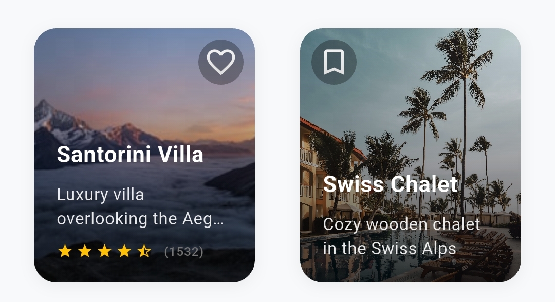
ImagePosition.top - Image at the top of contentImagePosition.left - Image on the left sideImagePosition.right - Image on the right sideImagePosition.background - Image as background with overlay
ImageRatio.oneThird - 1/3 of available spaceImageRatio.half - 1/2 of available spaceImageRatio.twoThirds - 2/3 of available spaceImageRatio.full - Full available space
OverlayPosition.topLeft - Top-left cornerOverlayPosition.topRight - Top-right cornerOverlayPosition.bottomLeft - Bottom-left cornerOverlayPosition.bottomRight - Bottom-right corner
ContentAlignment.left - Left alignedContentAlignment.center - Center alignedContentAlignment.right - Right aligned
ContentChipPosition.beforeTitle - Above the titleContentChipPosition.afterTitle - Below the titleContentChipPosition.rightOfTitle - Right side of title (same line)
CardButtonStyle.elevated - Filled button with shadowCardButtonStyle.outlined - Border buttonCardButtonStyle.text - Text-only buttonCardButtonStyle.icon - Icon-only buttonCardButtonStyle.iconText - Icon + text button
ButtonPosition.left - Left alignedButtonPosition.center - Center alignedButtonPosition.right - Right alignedButtonPosition.fullWidth - Full width button
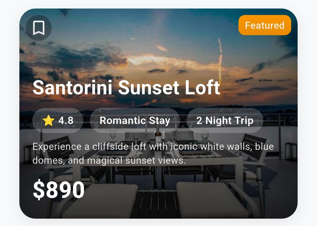
StatusChip (
text: 'Featured' ,
position: ChipPosition .topRight,
backgroundColor: Colors .orange,
textColor: Colors .white,
fontSize: 12 ,
fontWeight: FontWeight .w600,
borderRadius: 8 ,
)ContentChip (
text: 'Premium' ,
backgroundColor: Colors .blue[100 ],
textColor: Colors .blue[700 ],
prefixIcon: Icons .star,
iconColor: Colors .blue,
fontSize: 12 ,
borderRadius: 16 ,
onTap: () {
// Handle chip tap
},
)MetricItem (
label: 'Revenue' ,
value: '\$ 24.8K' ,
labelColor: Colors .grey[600 ],
labelFontSize: 12 ,
valueColor: Colors .green[700 ],
valueFontWeight: FontWeight .bold,
valueFontSize: 16 ,
)IconTextPair (
icon: Icons .location_on,
text: 'San Francisco' ,
iconColor: Colors .grey[500 ],
textStyle: TextStyle (
fontSize: 14 ,
color: Colors .grey[600 ],
),
)CardButton (
text: 'Get Started' ,
icon: Icons .play_arrow,
style: CardButtonStyle .elevated,
backgroundColor: Colors .blue,
textColor: Colors .white,
borderRadius: 10 ,
height: 44 ,
onPressed: () {
// Handle button press
},
)// Dark theme card
AdvancedCard (
backgroundColor: Colors .grey[900 ],
borderColor: Colors .grey[700 ],
titleColor: Colors .white,
descriptionColor: Colors .grey[300 ],
shadowColor: Colors .black.withOpacity (0.5 ),
// ... other properties
)
// Glassmorphism effect
AdvancedCard (
backgroundColor: Colors .white.withOpacity (0.1 ),
borderWidth: 1 ,
borderColor: Colors .white.withOpacity (0.2 ),
customShadows: [
BoxShadow (
color: Colors .black.withOpacity (0.1 ),
blurRadius: 20 ,
spreadRadius: 0 ,
),
],
// ... other properties
)LayoutBuilder (
builder: (context, constraints) {
return AdvancedCard (
fullWidth: true ,
titleFontSize: constraints.maxWidth > 600 ? 24 : 18 ,
descriptionFontSize: constraints.maxWidth > 600 ? 16 : 14 ,
imageRatio: constraints.maxWidth > 600
? ImageRatio .half
: ImageRatio .oneThird,
// ... other responsive properties
);
},
)
Use fullWidth: true instead of setting specific widths when possibleOptimize images before using them in cardsLimit the number of chips and metrics for better performanceUse isDisabled: true instead of removing buttons to maintain layout
Consistent spacing - Use the same contentSpacing throughout your appColor harmony - Stick to your app's color paletteTypography hierarchy - Use different font sizes to create visual hierarchyAccessibility - Ensure sufficient color contrast and touch targets
// E-commerce product card
AdvancedCard (
cardImage: product.imageUrl,
imagePosition: ImagePosition .top,
showLikeIcon: true ,
title: product.name,
description: product.description,
price: '\$ ${product .price }' ,
rating: product.rating,
buttonText: 'Add to Cart' ,
onButtonPressed: () => addToCart (product),
)
// Social media post card
AdvancedCard (
cardImage: post.authorAvatar,
imagePosition: ImagePosition .left,
imageRatio: ImageRatio .oneThird,
title: post.authorName,
description: post.content,
iconTextPairs: [
IconTextPair (icon: Icons .favorite, text: '${post .likes }' ),
IconTextPair (icon: Icons .comment, text: '${post .comments }' ),
],
buttons: [
CardButton (text: 'Like' , style: CardButtonStyle .text),
CardButton (text: 'Comment' , style: CardButtonStyle .text),
],
)
// Dashboard metric card
AdvancedCard (
backgroundColor: Colors .blue[50 ],
title: 'Monthly Revenue' ,
customChips: [
ContentChip (
text: '+15.3%' ,
backgroundColor: Colors .green[100 ],
textColor: Colors .green[700 ],
prefixIcon: Icons .trending_up,
),
],
metrics: [
MetricItem (label: 'This Month' , value: '\$ 125.4K' ),
MetricItem (label: 'Last Month' , value: '\$ 108.9K' ),
],
metricsColumns: 2 ,
)We welcome contributions! Please see our Contributing Guide for details.
This project is licensed under the MIT License - see the LICENSE file for details.
If you find this package helpful, please:
Made with ❤️ for the Flutter community