feat(gui): scalable SVG icons for toolbar and preferences on hi-DPI#487
feat(gui): scalable SVG icons for toolbar and preferences on hi-DPI#487Zeyckler wants to merge 32 commits into
Conversation


The toolbar and Preferences page-list icons were fixed-size raster art
(32x32 / 16x16) embedded in the executable. Because the GUI is
per-monitor-DPI aware, those bitmaps were drawn at their physical pixel
size and looked tiny and blurry on 4K and other hi-DPI screens. This
migrates them to resolution-independent SVG so wx rasterizes each icon
crisply at whatever logical size / DPI the widget requests.

Pipeline:
- embed_icons.py now embeds each icon's optional same-name .svg twin
  next to its PNG. AMuleIconEntry gains svg_data/svg_len. The PNG stays
  mandatory (raster fallback and natural size); an .svg with no .png
  twin is a build error.
- CamuleArtProvider::CreateBitmapBundle() serves an SVG-backed
  wxBitmapBundle via wxBitmapBundle::FromSVG() when wx has SVG support
  (wxHAS_SVG), and otherwise falls back to the PNG plus a smooth 2x
  upscale. A malformed/unsupported SVG also degrades to the PNG path.
- The main toolbar (Add_Skin_Icon) and the Preferences page list request
  bundles from the art provider; an active user skin still takes
  precedence and keeps its own PNG art.
- CMake globs *.svg alongside *.png for the generated table; the
  checked-in icon_data.c fallback (used only when Python3 is absent at
  configure time) is regenerated to match.

Artwork:
- 28 toolbar/preferences icons redrawn as flat, NanoSVG-compatible SVGs
  (shapes/paths/gradients only), plus an SVG for the IP2Country pin. The
  Linux Tux (Directories) reuses the Crystal Project penguin and the
  Events mule follows the eMule mascot.

Notes for reviewers:
- Requires wx >= 3.2 (already the project minimum). NanoSVG is on by
  default in wx's CMake and autotools builds; without it the icons fall
  back to the embedded PNGs, so nothing breaks.
- The generic wxListCtrl on wxGTK/wxOSX only selects the hi-res
  rendition from wx 3.3; wxMSW uses it from 3.2.
- Licensing: the Tux is Crystal Project (LGPL, Everaldo); the mule
  follows the eMule project logo -- please confirm attribution suits the
  project before merge.

Co-Authored-By: Claude Opus 4.8 <noreply@anthropic.com>
# Conflicts:
#	src/PrefsUnifiedDlg.cpp
clang-tidy Tier-2 (modernize-use-nullptr) flagged the two NULL
comparisons on the newly added lines. Switch them to nullptr.

Co-Authored-By: Claude Opus 4.8 <noreply@anthropic.com>

|
Really nice work — the pipeline is clean, and the PNG-fallback + skin-precedence design plus the edge-case handling (UTF-8 write for mingw, 1. Reuse our existing locale-safe lowercasing. For the toolbar art-id fold in #include "CCtypeAsciiScope.h"
...
CCtypeAsciiScope scope;
const wxString artName = iconName.Lower();2. Licensing. Thanks for flagging it — the main thing to settle, and it's really just the two non-original icons: Directories (Crystal Project Tux, LGPL 2.1, © Everaldo) and Events (derived from the eMule mascot). Everything else is your own redraw and is fine. For the LGPL Tux, a Simplest path: since the rest of the set is already your own art, replacing just those two — with original drawings (a generic folder / a generic events glyph) or CC0 / public-domain equivalents — avoids the attribution-in-app requirement entirely. We can go either way; the team should weigh in. 3. Screenshots. Could you attach before/after shots of the new toolbar + Preferences list on a hi-DPI display? The payoff is entirely visual and none of us has eyes on it yet, so it'd let the team review the artwork and agree on direction. |
|
One more minor point I should have included above — in image = image.Scale(size, ...); // natural -> requested size
wxImage image2x = image.Scale(2x, ...); // 2x of the *rescaled* imageThat's a scale-of-a-scale (two lossy resamples). Deriving the 2× from the original instead — |

- Add_Skin_Icon: fold the toolbar art id with the existing
  CCtypeAsciiScope RAII helper (pins LC_CTYPE to "C") plus
  wxString::Lower(), instead of a hand-rolled ASCII loop. Matches the
  locale-safe country-code lowercasing in MaxMindDBDatabase.cpp that
  feeds the same CamuleArtProvider.
- CamuleArtProvider::CreateBitmapBundle: in the PNG fallback, derive
  both the 1x and 2x renditions from the original decoded image so each
  is a single high-quality resample, instead of building the 2x from
  the already-rescaled 1x (scale-of-a-scale).

Co-Authored-By: Claude Opus 4.8 <noreply@anthropic.com>
…icon

The Preferences "Directories" icon embeds the Tux penguin from the
Crystal Project icon set (Everaldo Coelho, LGPL v2.1). LGPL 2.1 §6(c)
requires the credit to appear among the copyright notices shown to the
user, so add it to the About dialog (untranslated, alongside the
existing notices) and document the component in docs/THIRDPARTY.md next
to the picojson / muleunit entries.

Co-Authored-By: Claude Opus 4.8 <noreply@anthropic.com>
|
Thanks for the quick turnaround on the review points! On the licensing though — the LGPL About-dialog credit you added is technically correct, but on reflection carrying a permanent in-app copyright notice (+ THIRDPARTY.md entry + license text) for a single icon feels disproportionate. Since you've already hand-drawn the other 28 icons, the cleaner path is to do the same for the two derived ones:
Either way keeps the app free of a per-icon copyright notice. |
# Conflicts:
#	src/CMakeLists.txt
…tion

The Preferences "Directories" icon was redrawn from the Crystal Project
Tux (LGPL v2.1), which obliged a permanent in-app copyright notice plus a
THIRDPARTY.md entry and license reference for a single icon. Per reviewer
feedback (amule-org#487) that is disproportionate, so replace it with original,
hand-drawn art that carries no third-party derivation:

- src/icons/prefs_directories.svg: original amber folder glyph, NanoSVG-safe
- src/AboutDialog.cpp: drop the Crystal Project credit line
- docs/THIRDPARTY.md: drop the "Crystal Project icons" section
- src/icons/icon_data.c: regenerate (Directories SVG twin updated)

The Events icon keeps the eMule mascot: it is GPL-consistent with aMule
(which is itself based on eMule) and carries no separate attribution.

Co-Authored-By: Claude Opus 4.8 <noreply@anthropic.com>
Following the same reviewer feedback (amule-org#487), replace the Events icon —
previously traced from the eMule mascot — with an original notification
bell drawn from scratch, so the icon tree carries no derived art at all
and needs no attribution.

- src/icons/prefs_events.svg: original bell glyph, NanoSVG-safe
- src/icons/icon_data.c: regenerate (Events SVG twin updated, ~91KB -> ~0.7KB)

Co-Authored-By: Claude Opus 4.8 <noreply@anthropic.com>
The Events SVG became a bell in 6989700, but its PNG twin
(prefs_events.png) still held the old eMule mascot — so the raster
fallback path and any non-SVG build still rendered the mascot. Replace
the PNG with the bell so the Events icon is the bell across every render
path.

- src/icons/prefs_events.png: bell raster (was the eMule mascot)
- src/icons/icon_data.c: regenerate

Co-Authored-By: Claude Opus 4.8 <noreply@anthropic.com>
Same fix as the Events bell: the Directories SVG is the folder, but its
PNG twin still held the old penguin, so the raster fallback path and
non-SVG builds still rendered the penguin. Replace the PNG with the
folder so Directories is consistent across every render path.

- src/icons/prefs_directories.png: folder raster (was the old penguin)
- src/icons/icon_data.c: regenerate

Co-Authored-By: Claude Opus 4.8 <noreply@anthropic.com>
|
All the review points are addressed — the I'm building on all platforms to verify, and I'll post screenshots here so the team can weigh in on the artwork. Thanks for the quick iterations! |

I'm adding more icons, as I forgot to rework several icons of the main window. |
Migrate the remaining hand-pixelled main-window images to the SVG art
pipeline: the status bar (log "i", users, up/down speed arrows and the
eD2k/Kad connection globe), the transfer window's clear-completed check
(+ its disabled state) and the show/hide-sources chevron toggles.

- src/icons/: 18 new icons. Each PNG twin is the original bitmap,
  extracted from muuli_wdr.cpp's embedded RGB/XPM data, so the raster
  fallback stays pixel-identical to today's art; each SVG is a
  hand-drawn remaster. The globe keeps the original composition
  scheme -- a base globe plus one overlay arrow per network state --
  with identical arrow geometry across base and overlays so the
  overlays cover the base exactly at any raster scale.
- muuli_wdr.cpp: the status bar and transfer window widgets take
  their art from wxArtProvider bundles ("amule:" ids); the now-unused
  dlStatusImages()/connImages() image tables are removed.
- amuleDlg.cpp: ShowConnectionState composes the globe from bundles
  rasterized at the window's DPI scale (GetBitmapFor), replacing the
  wxImageList overlay draw onto the widget's current bitmap;
  ShowTransferRate picks the speed-state art id directly.
- TransferWnd/SharedFilesWnd: the sources-list toggles use the
  bundle-aware SetBitmapPressed/SetBitmapCurrent setters (the legacy
  SetBitmapSelected/SetBitmapHover aliases are wxBitmap-only).

Co-Authored-By: Claude Opus 4.8 <noreply@anthropic.com>
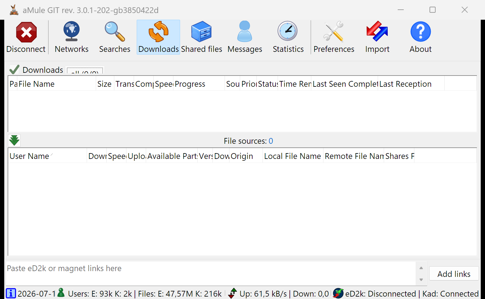
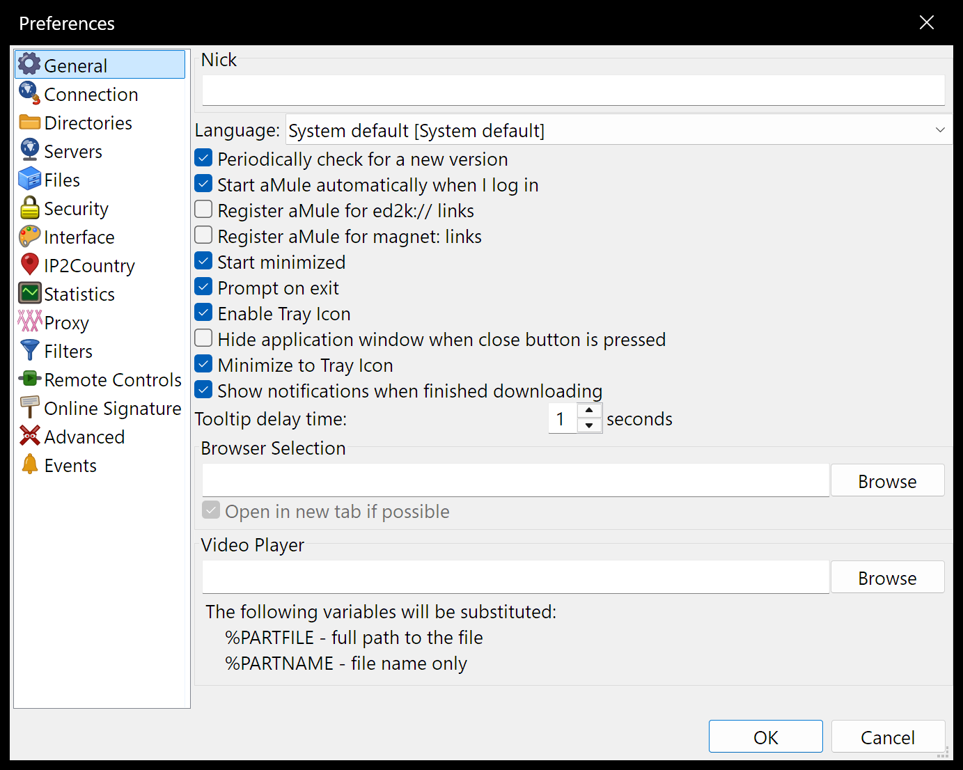
OK, I tested on all platforms MacOS, Windows, Linux and they all render correctly. Navigation bar: 

Preferences panel: 

Windows screenshots are taken with Display scaling at 175%. @ngosang @danim7 @mrjimenez your feedback appreciated before we can merge this. |
Co-Authored-By: Claude Opus 4.8 <noreply@anthropic.com>
|
Btw @Zeyckler, if you're comfortable working with SVG, we could use a hand updating the aMule logo as well. I put together an SVG logo with SVGGenie AI 
It's not perfect, but it could serve as a starting point. |
…e-avatar users, chevron arrows)

Address review feedback on the newly-added status icons:

- status_conn_*: the connection arrows are now curved arrows converging on
  the globe centre, matching the original artwork -- the Kad arrow (top-right)
  points south-west and the eD2k arrow (bottom-left, its 180-degree rotation)
  points north-east. The eD2k/Kad -> corner mapping matches the original
  (eD2k bottom-left, Kad top-right) so each network's colour lands in the
  right corner.
- status_users: a single avatar (head + torso), not two figures.
- arrows_down / arrows_up: three distinct stacked chevron-arrows instead of a
  solid tree; arrows_up is arrows_down mirrored vertically (same geometry).

SVG-only change; the PNG twins remain the extracted originals. icon_data.c
regenerated.

Co-Authored-By: Claude Opus 4.8 <noreply@anthropic.com>
…zes, one-piece globe arrows)

Further review feedback on the main-window icons:

- status_users: single figure in a 3/4 pose -- head turned to look
  down-right, a distinct bent left arm, rounded turned back -- replacing
  the flat front-facing avatar.
- arrows_down / arrows_up: three stacked triangles sized small -> medium
  -> big (biggest at the tip); the previous size order was reversed.
  arrows_up remains the vertical mirror of arrows_down.
- status_conn_*: the two network arrows are now single-piece curved
  arrows (head and body one silhouette), shorter and thicker; the globe
  gains an Africa + Europe landmass instead of abstract green blobs.

SVG-only; PNG twins stay the extracted originals. icon_data.c regenerated.

Co-Authored-By: Claude Opus 4.8 <noreply@anthropic.com>
… arrows, redrawn users)

- arrows_down / arrows_up: the three triangles now stack with the SMALL one
  on top (front) and the big one at the back, matching the original (whose
  internal edges show the smaller triangle in front). Sizes stay
  small->medium->big; up remains the vertical mirror of down.
- status_conn_*: each network arrow now starts at the globe rim -- Kad at the
  north-east edge, eD2k at the south-west -- and points inward, still a single
  short, thick one-piece curved arrow.
- status_users: redrawn from scratch to match the original pose -- a single
  chunky figure, small head turned to look down-right, a rounded right
  shoulder/back and a distinct left arm.

SVG-only; PNG twins unchanged. icon_data.c regenerated.

Co-Authored-By: Claude Opus 4.8 <noreply@anthropic.com>
- status_users: redrawn as a clean, glossy person (round head + smooth
  rounded shoulders, subtle turn/arm seam) instead of the lumpy silhouette.
- status_conn_*: thicker one-piece arrows (chunkier head and body).
- status_conn_base: pull the globe's top highlight fully inside the rim.

SVG-only; PNG twins unchanged. icon_data.c regenerated.

Co-Authored-By: Claude Opus 4.8 <noreply@anthropic.com>
…ng users

- status_conn_*: adopt the user-supplied curved-arrow artwork, baked into
  16x16 coordinates (no transform attribute, NanoSVG-safe). Kept the NE (Kad)
  / SW (eD2k) positions and the inward-pointing direction; recoloured per
  state (red/yellow/orange/green with a darker outline) in place of black.
- status_users: redrawn front-facing with both arms -- head, torso and two
  arms, kept the glossy green look.

SVG-only; PNG twins unchanged. icon_data.c regenerated.

Co-Authored-By: Claude Opus 4.8 <noreply@anthropic.com>
…eing clipped

- status_users: cut the torso flush with the bottom of the arms (a head-and-
  shoulders bust) instead of a long body.
- transfer_clear_completed(+_disabled): inset the tick so it keeps a margin
  inside its viewBox.
- muuli_wdr.cpp: the clear-completed button had collapsed toward the bitmap's
  best size (clipping the tick); give it a fixed 34x34 min size so the icon
  is no longer cut off.

Co-Authored-By: Claude Opus 4.8 <noreply@anthropic.com>
ShowConnectionState drew the Kad/eD2k overlay arrows straight into the
bitmap returned by GetBitmapBundle("amule:status_conn_base").GetBitmapFor().
wxArtProvider caches that bundle and wxBitmapBundleImplSVG caches its
rasterized bitmap, handing it back copy-on-write; a wxMemoryDC draws into
the shared pixel buffer without unsharing it. So the overlays were being
stamped into the cached base globe and accumulated on every later state
change (and poisoned the base for any other consumer of the bundle).

Deep-copy the base into a private bitmap (preserving the DPI scale factor)
before compositing the overlays onto it.

Co-Authored-By: Claude Opus 4.8 <noreply@anthropic.com>
The red plug cable in prefs_connection.svg and its twin toolbar_connect.svg
dipped past the 0 0 32 32 viewBox (the 3.4-wide stroke reached y~=33.7), so
its rounded tip was clipped flat against the icon's bottom edge. Raise the
lower curve of both cord strokes to keep the whole stroke within bounds, and
regenerate icon_data.c for the two updated SVGs.

Also harden embed_icons.py: error out if two icons resolve to the same art
id or C identifier. sanitise() folds '-'/'.' to '_', so distinct names could
silently collide into a duplicate C symbol; not triggered by the current
icon set, but a future rename now fails loudly at generation time.

Co-Authored-By: Claude Opus 4.8 <noreply@anthropic.com>
wxBitmapBundle::GetBitmapFor() returns an *unscaled* bitmap (scale factor
1.0) whose pixel size already matches the window DPI. Setting the composed
globe on the status-bar wxStaticBitmap as-is rendered it DPI-scale times
larger than the sibling icons (info, users, speed), which are bundle-backed
and size themselves in logical units -- clearly oversized on hi-DPI displays.

Stamp the window's DPI scale factor on the composite so its logical size
matches the siblings (a no-op at 100% DPI). Verified in-app at hi-DPI: the
globe now measures the same height as the users/speed icons.

Co-Authored-By: Claude Opus 4.8 <noreply@anthropic.com>
|
Here's how the icons look in a local build on a hi-DPI display (Windows, 4K @ 225% scaling), where the vector art is the whole point — everything is rasterized by wx at the display's scale instead of upscaling the old 16/32px bitmaps. Main window — the toolbar glyphs (Disconnect, Networks, Searches, Downloads, Shared files, Messages, Statistics, Preferences, Import, About) plus the status-bar icons (info, users, up/down speed, and the composed eD2k/Kad connection globe):
Preferences — the page-list icons down the left side:
|
|
Our comments crossed — the up/down arrows got exactly that treatment a few minutes before yours landed (057fc8b, comparison in my previous comment). For users you were right, and it was mostly size: the old raster figure fills a 14×16 box at 66% pixel coverage, while the SVG bust was 10×13 at 37% — brighter per pixel but emitting about a third less light overall, which reads as "dimmer and smaller". e71b8ef scales the figure up to the same 14×16 footprint (with slightly broader shoulders, closer to the old proportions); emitted light now measures within 5% of the raster.
|
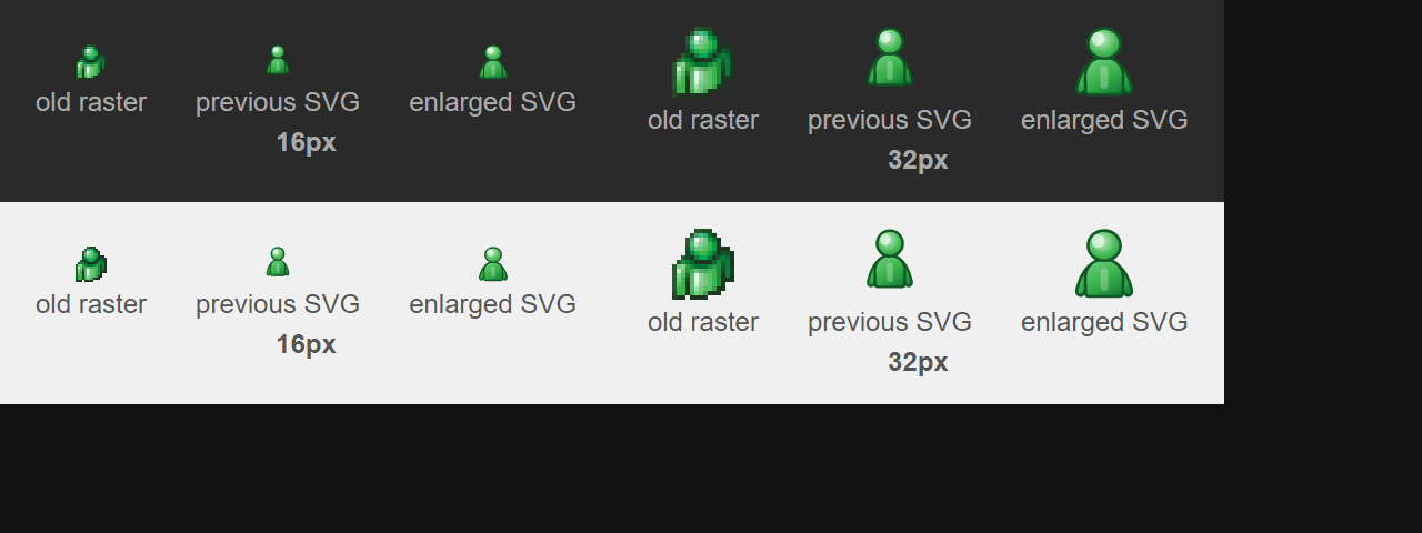
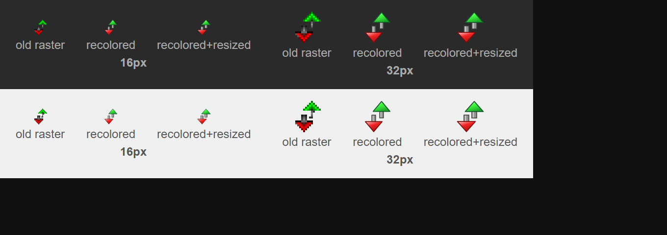
Review feedback on amule-org#487: alongside the brightness pass, the up/down
glyph also read a bit smaller than the raster art. The old arrowheads
are 9px wide with 3px stems; the SVG had 8.6-unit heads and ~2.1-unit
shafts, so the glyph carried less visual weight at status-bar size.

Widen the heads to 9.2 units and the shafts to 2.5 (+0.4 outline ~ the
old stems' 3px), keeping every stroke inside the 16x16 viewBox. At 16px
the glyph now covers 89px vs the raster's 74 with the same 14x16-ish
footprint. icon_data.c regenerated.

Co-Authored-By: Claude Opus 4.8 <noreply@anthropic.com>

Co-Authored-By: Claude Opus 4.8 <noreply@anthropic.com>
|
Follow-up on the size half of your remark — the up/down glyph was indeed a touch smaller than the raster: the old arrowheads are 9px wide with 3px stems, the SVG had 8.6-unit heads and ~2-unit shafts. f2ebcf6 widens the heads to 9.2 and the shafts to 2.5 (+outline ≈ the old 3px stems); at 16px the glyph now covers 89px vs the raster's 74. Combined with the recolor:
|
|
Good job, the users and up/down-speed glyphs both look great now. The only thing I'd tweak is the connection-status arrows on the composite network glyph: making them a bit bigger would help it read more clearly at status-bar size. 
|

|
The globe icon is hard too see and IMHO it's packing too much information. Each arrow has 3 colora if I recall. |
It's always been 3 state for each network (Kad and ED2k):
|
…lder

Review feedback on amule-org#487 asked for larger, clearer overlay arrows on the
composite network glyph. After several parameterised iterations of the
previous curved arrow, the arrows were redrawn by hand in an SVG editor
over the globe base: two bold swoosh arrows cycling around the globe,
tails toward the NE/SW corners, heads interlocking near the centre.

The editor output placed them via CSS transform-box/transform-origin,
which browsers honour but NanoSVG ignores, so every transform is baked
into absolute path coordinates. The SW arrow is the exact 180-degree
point reflection of the NE arrow, both arrows share the icon set's
top-left-lit gradient, and the pair sits 0.7 units outward from the
initial draft so the canvas margins stay balanced. The globe's
continents/gloss tweaks from the same edit are kept. All seven state
overlays are regenerated from the same geometry; icon_data.c updated.

Co-Authored-By: Claude Opus 4.8 <noreply@anthropic.com>
Co-Authored-By: Claude Opus 4.8 <noreply@anthropic.com>
|
I wasn't fully happy with how the parameterised tweaks to the previous arrow were converging, so I took your suggestion as an excuse to redraw the overlay arrows myself in an SVG editor — two bolder swoosh arrows cycling around the globe, tails toward the NE/SW corners, heads interlocking near the centre. They're substantially bigger than the previous rendition, which should help exactly where you flagged. eb97d34 lands the redesign. Some plumbing worth noting: the editor placed the arrows via CSS
As always, a look on your dark GTK setup would be appreciated — happy to keep iterating if it still doesn't read right. |
|
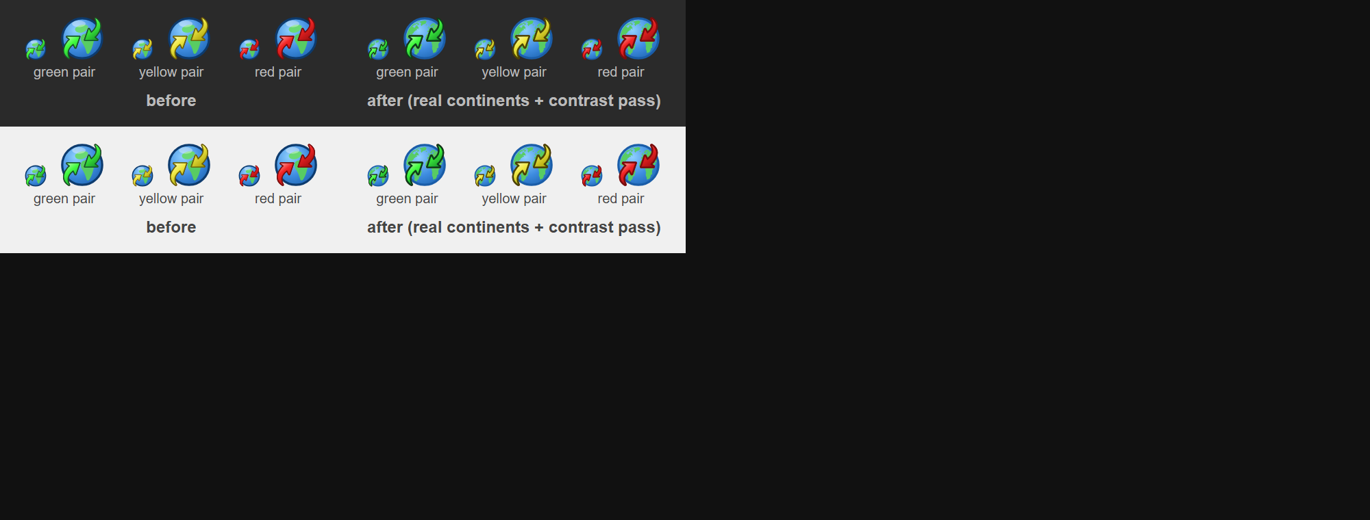
The red arrows stand out well now. The green and yellow ones are still a bit harder to read, though — probably lower contrast against the globe. Could we try either a bolder outline on the arrows, or making them slightly bigger? |
Replace the three hand-drawn continent blobs with actual coastlines
extracted from a proper Earth-globe SVG (Americas, Europe/Africa/Asia,
northern islands), baked through the source's full transform chain into
plain NanoSVG-safe paths and remapped onto our globe so coastlines that
touch the source's circle meet the rim's border line. All landmasses
share one uniform green, and the polar gloss is dropped -- the flatter,
detailed globe reads better at status-bar size. icon_data.c regenerated.

Co-Authored-By: Claude Opus 4.8 <noreply@anthropic.com>
got3nks: the red arrows read well, but green and yellow blend into the
globe. Give every overlay arrow a bolder outline (stroke 0.4 -> 0.6)
and darken the green/yellow/orange outline tones so the boundary does
the work the hue cannot; red keeps its outline colour. Lighten the
globe's rim (#0d3b6e -> #1a5da8) so the darkest edges in the icon are
the arrows, not the border -- the arrows now lead the composition.
icon_data.c regenerated.

Co-Authored-By: Claude Opus 4.8 <noreply@anthropic.com>
Co-Authored-By: Claude Opus 4.8 <noreply@anthropic.com>
|
a29e152 takes the outline route: every overlay arrow gets a bolder outline (0.4 → 0.6 units at 16px) and the green/yellow/orange outlines go darker, so the boundary does the work the hue can't — red keeps its color since that one already worked. On top of that the globe's rim is lightened a step, so the darkest edges in the icon now belong to the arrows rather than the border. Bonus from the same session (fdc2838): the hand-drawn continent blobs got replaced with real coastlines extracted from a proper Earth-globe SVG, recolored to the icon's green. Green / yellow / red pairs, before → after, dark and light bars:
Same request as always — a check on your dark setup would be great. |
|
@got3nks do you think it would be worthy to use the same globe (colors, shape, etc.) in the "Networks" and "Connection" (in settings)? So the 3 icons could share the globe part. |
|
Not sure, I'd probably keep them different |
|
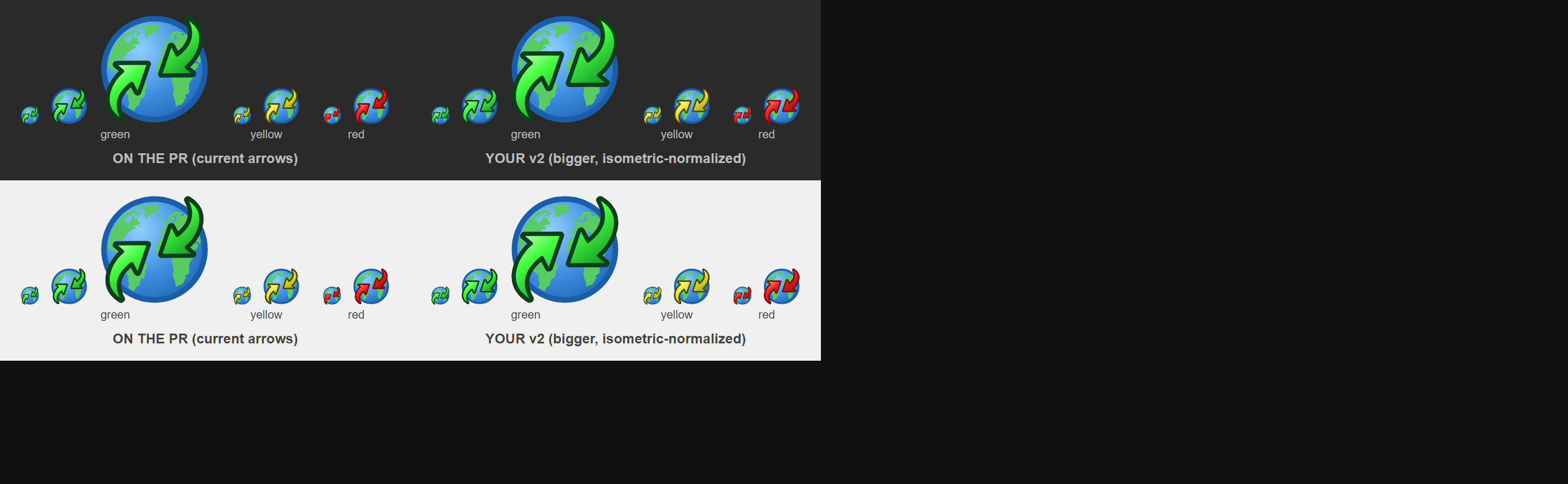
Thanks for the contrast pass! Honestly, on macOS the connection-status arrows are still a bit hard to read for me. I think the most reliable fix is to make them a bit bigger — and we can give the glyph some extra horizontal space in the status bar to make room. 
|
got3nks on macOS: the overlay arrows are still hard to read at
status-bar size; bigger is the reliable fix. The arrows were enlarged
by hand in the SVG editor, then normalized: the SW arrow is the exact
180-degree point reflection of the NE one, and the pair is balanced to
an isometric 14.8x14.8 footprint with equal 0.30 canvas margins on all
four sides -- the arrows now use practically the whole 16x16 box. All
seven state overlays regenerated from the same geometry; editor cruft
(style attributes) stripped; icon_data.c updated.

Co-Authored-By: Claude Opus 4.8 <noreply@anthropic.com>
Co-Authored-By: Claude Opus 4.8 <noreply@anthropic.com>
|
Great timing — I'd just finished doing exactly that. aba924f enlarges the arrows substantially (I resized them by hand in the SVG editor, then normalized the pair): they now use practically the whole 16×16 box — a 14.8×14.8 isometric footprint with equal 0.3-unit margins, the SW arrow being the exact 180° reflection of the NE one. Current (what you screenshotted) vs the enlarged version, green/yellow/red pairs on dark and light bars:
If macOS still wants more after this, I'm happy to take you up on the wider status-bar slot idea — with the SVG pipeline the glyph can render at any logical size, so widening the slot is purely a muuli layout tweak. |
|
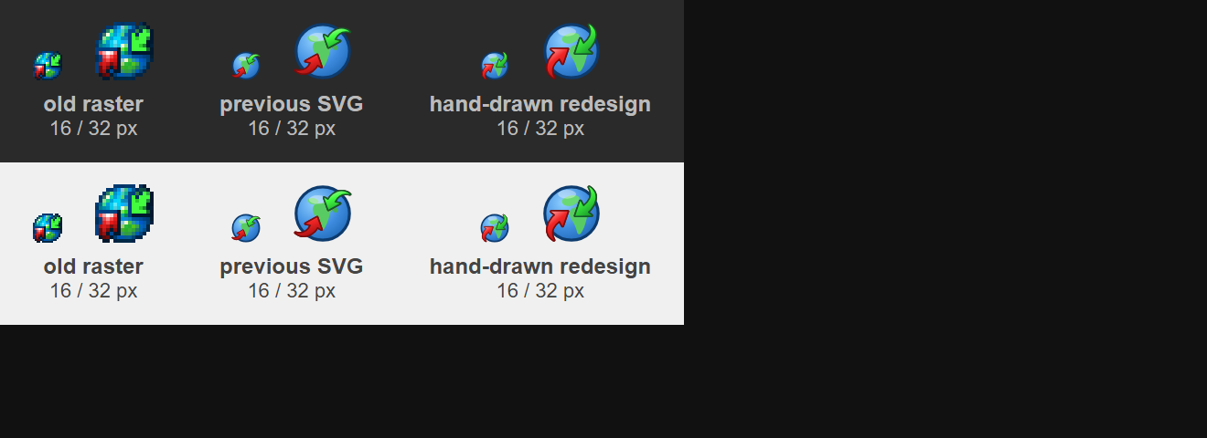
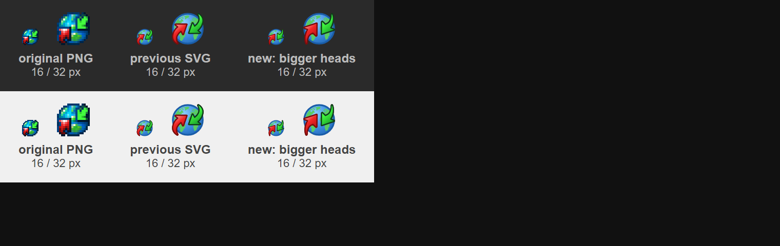
Here's a side-by-side of the new SVG glyph vs the original PNG (left: SVG, right: original PNG):
The original's arrows are noticeably bolder and larger — I think we should size the SVG arrows up to match. You can see the difference clearly. |


got3nks compared the SVG glyph against the original raster side by side:
the old art's arrows are bolder and larger, and asked for the SVG to
match. Rework the arrows with substantially bigger chevron heads and
shorter bodies (hand-drawn in the SVG editor), normalized as before:
the SW arrow is the exact 180-degree reflection of the NE one, and the
pair is balanced to an isometric 14.84x14.84 footprint with equal 0.28
canvas margins. All seven state overlays regenerated from the same
geometry; icon_data.c updated.

Co-Authored-By: Claude Opus 4.8 <noreply@anthropic.com>
Co-Authored-By: Claude Opus 4.8 <noreply@anthropic.com>
|
Agreed — next to the original the arrows were still too light. 7ed6060 reworks them with substantially bigger chevron heads and shorter bodies (redrawn by hand again), normalized as usual: both arrows identical (the SW one is the exact 180° reflection of the NE one) and the pair balanced to an isometric 14.84×14.84 footprint with equal margins. Original PNG vs the previous SVG vs the new one, on dark and light bars:
Hopefully this closes the gap on macOS — and the wider-slot option stays on the table if you'd like even more presence. |
|
@Zeyckler I took a pass at making the connection-globe arrows more readable at status-bar size — bolder solid arrows with big heads and a thin outline, a brighter green, offset into two lanes so they pass as an exchange (heads keep a gap), tails reaching the corners. Consider it a starting point rather than a final design — feel free to refine it, tweak the shape/colours, or take it in a different direction entirely. I pushed it as a branch on my fork so you can pull it in and build on it: It's based on your current branch head, so it should apply cleanly. It touches only the eight Preview: 


|
|
@got3nks I don't like that straight arrow 😅 ; it loses the "curve" around the globe. IMHO, my design is more accurate to the original artwork, but as I said, I'm not a graphic designer, so I'm doing my best with AI and manual editing of the SVG in Boxy SVG Editor. Have you tried my last design on your Mac? Maybe it is enough for this first iteration of SVG migration. |
|
Yes I tested it on MacOS and it's still hard to read |

Maybe it's a matter of making the arrows brighter more than the shape? I could also dull a little bit the globe to increase the contrast between them. |
|
That would help, but I’d also try to make their body bigger |
4 participants


Summary
The main-toolbar buttons and the Preferences page-list icons were fixed-size raster art (32×32 / 16×16) embedded in the executable. Because the GUI is per-monitor-DPI aware, those bitmaps get drawn at their physical pixel size and look tiny/blurry on 4K and other hi-DPI displays. This migrates them to resolution-independent SVG, so wx rasterizes each icon crisply at whatever logical size / DPI the widget asks for.
Pipeline
embed_icons.pynow embeds each icon's optional same-name.svgtwin next to its PNG.AMuleIconEntrygainssvg_data/svg_len. The PNG stays mandatory — it's the raster fallback and defines the icon's natural size — so an.svgwith no matching.pngis a build error.CamuleArtProvider::CreateBitmapBundle()serves an SVG-backedwxBitmapBundleviawxBitmapBundle::FromSVG()when wx has SVG support (wxHAS_SVG); otherwise (or if an SVG fails to parse) it falls back to the PNG plus a smooth 2× upscale.Add_Skin_Icon) and the Preferences page list pull bundles from the art provider. An active user skin still takes precedence and keeps its own PNG art.*.svgalongside*.pngfor the generated table; the checked-inicon_data.cfallback (used only when Python3 is absent at configure time) is regenerated to match.Artwork
Notes for reviewers
wxListCtrlon wxGTK/wxOSX only selects the hi-res rendition from wx 3.3; wxMSW uses it from 3.2. Toolbar (wxToolBar) benefits everywhere.Test plan
text/filter/mask/clipPath/use/image/pattern/xlink).icon_data.cfallback is byte-in-sync with the current.svg/.pngset (29 SVG twins embedded).