


This webcomponent follows the open-wc recommendation.
 Storybook Documentation
🎨 HTML Canvas Render using HTMLCanvas
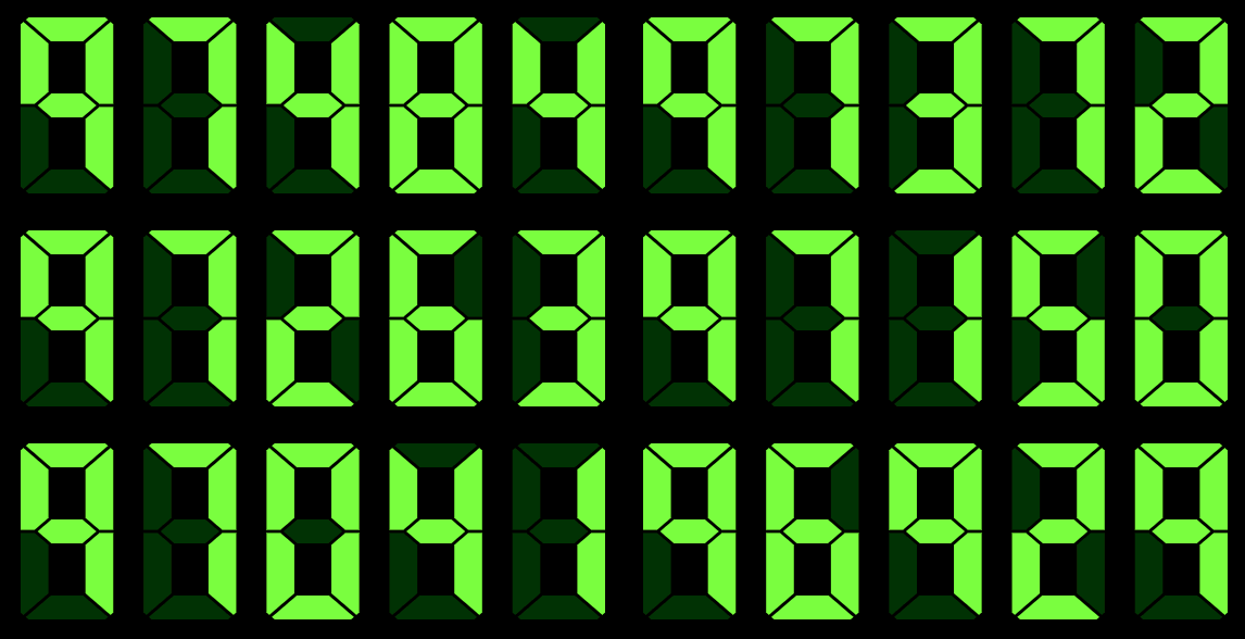
🍦 Vanilla Web Component Export as a dependency-free vanilla web component, usable with just HTML, CSS, and JS
#️⃣ Typescript Written in Typescript
🌈 Styles Offer fully customizable styling. Where possible use CSS to control customized settings
🧾 Support CSS props CSS properties like padding, margin, filters, etc., should affect the element as expected
🔎 Pan & Zoom Support ability to zoom in and change center point of the board
🌐 Accessibility Implement accessibility recommendations. WCAG, WAI-ARIA
🕹️ Interactivity Support user interactivity features including touch input, hover, selection, highlighting, and clicking.
npm i @dartbot/segment<script type="module">
import '@dartbot/segment/seven-segment.js';
</script>
<seven-segment></seven-segment>To scan the project for linting and formatting errors, run
npm run lintTo automatically fix linting and formatting errors, run
npm run formatTo execute a single test run:
npm run testTo run the tests in interactive watch mode run:
npm run test:watchTo run a local instance of Storybook for your component, run
npm run storybookTo build a production version of Storybook, run
npm run storybook:buildFor most of the tools, the configuration is in the package.json to reduce the amount of files in your project.
If you customize the configuration a lot, you can consider moving them to individual files.
npm startTo run a local development server that serves the basic demo located in demo/index.html
- Set Format
- char masks
- align
- Export Image
- standard
- large size
- Auto color calc
- Create your own
- Styles (shadow, glow)
- Effects
- marquee, blink, rotate, rotate fill
- Additional segments
- 16, 14, Posey
- Accessibility https://developer.mozilla.org/en-US/docs/Web/HTML/Reference/Elements/canvas#maximum_canvas_size
- Unit Tests