Home
Welcome to the ricing-wiki!
More specifically, this is a dummies guide to ricing (customizing) bspwm desktop. Although a lot of info would be useful for other window managers as well.
This guide assumes that you have bspwm installed and running. If that is not the case look that Archwiki or this link.
This is the default look of bspwm, using the settings provided with the package
meh.
This is how we want it to look
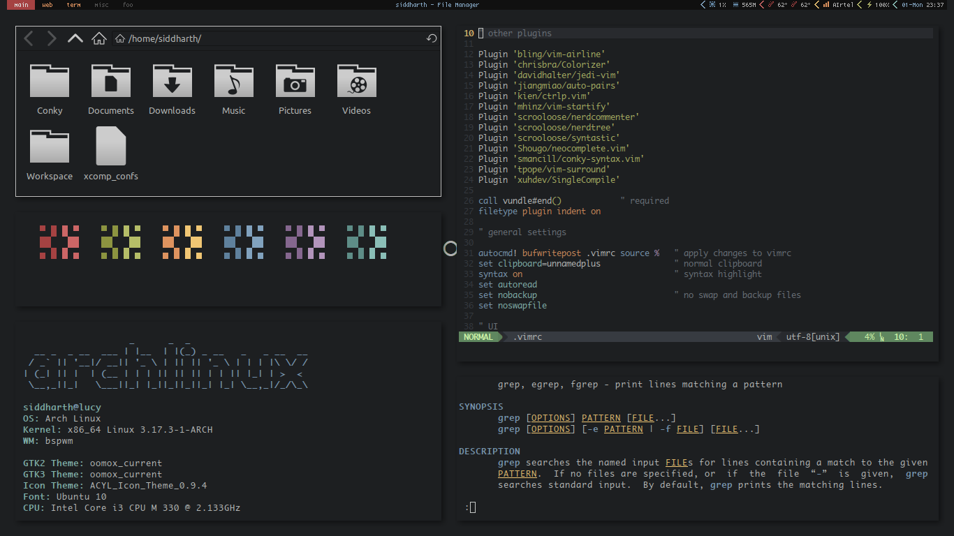
which isn't half bad, and definitely an improvement over the default.
So, to get nice looking desktop, we need to customize the following elements:
- Wallpaper (duh).
- Window Manager, which in case of bspwm, is properties like border width, and window gap.
- GTK+ theme, and icons.
- Terminal colorscheme. This also includes the various applications that run in the terminal - irssi, weechat, ncmpcpp, vim etc.
- Status bar.
That is all.
- Text editor
- [conky] (https://github.com/brndnmtthws/conky), for status info. You can use scripts, but more on that later.
- [compton] (https://github.com/chjj/compton), for some nice compositing effects
- [dzen2] (https://github.com/robm/dzen), for popups.
- lxappearence, for setting gtk theme and icons.
- Assorted terminal applications like irssi, ncmpcpp to reap /r/unixporn karma.
TODO
TODO
Terminal colors are numbered 0-7, for black, red, green, yellow, blue, magenta, cyan, and white respectively, and 8-15 for the corresponding bold colors.
A good colorscheme is a matter of personal preference. A good colorscheme improves both aesthetics and readability. The goal is to have the terminal colorscheme nicely coordinate with the desktop background, and use that set of colors for various terminal applications, as well as our status bar.
There are two choices for terminal colors.
1. Use existing schemes
This is by far the easiest thing to do. Select a nice colorscheme from xcolors, dotfiles, or the various forums. Then, just use a wallpaper that goes well with that colorscheme. This is really works well with vim colorschemes like base16.
2. Create your own
This is what most of us want to do. Create a colorscheme based on the wallpaper of our choice, to get a nice coordinated environment.
-
Use a script like this or this to generate colors from an image. Here is an excellent writeup on this topic.
-
Use Gimp, or an online tool like palettefx, to get the image color palette and pick colors from it. You can also use this to get complementary colors.
You can also use tools like terminal.sexy to test and tweak your colorscheme.
Regardless of the method you choose, you should have atleast 8 colors - 2 for foreground and background, and 6 for red to cyan. I mostly use the same colors for normal and bold, eliminating the need of further colors. However, I do recommend choosing 4 more colors. 2 shades of dark gray (for colors 0 and 8), and 2 shades of light gray (for colors 7 and 15). While not necessary, they come in quite handy for colorscheme elements like line numbers and visual, and still leave you with whole 46 shades of gray for the more esoteric requirements.
Getting a good, well behaved vim colorscheme that goes well with your setup can be difficult. There are a few ways to tackle this.
- You can build your setup around a vim colorscheme, using its colors.
- You can use a colorscheme that closely follows your terminal colors.
- You can use colorschemes that use only your terminal colors. They may still require tweaking some elements in order to create a well behaved colorscheme (By well behaved I mean a colorscheme in which different elements are easily distinguishable and which improves readability instead of hampering it with out of place colors). Take a look at shblah.vim for this purpose.
- Finally, you can just use your favorite colorscheme regardless.