A calm, content-first Hugo theme for multilingual blogs, long-form writing, talks, links, and cover-driven reading.
pocket-hugo-theme is designed to pair naturally with Pocket Hugo, but it also works as a standalone Hugo theme for personal sites that value readable typography, lightweight publishing, and flexible theme configuration.
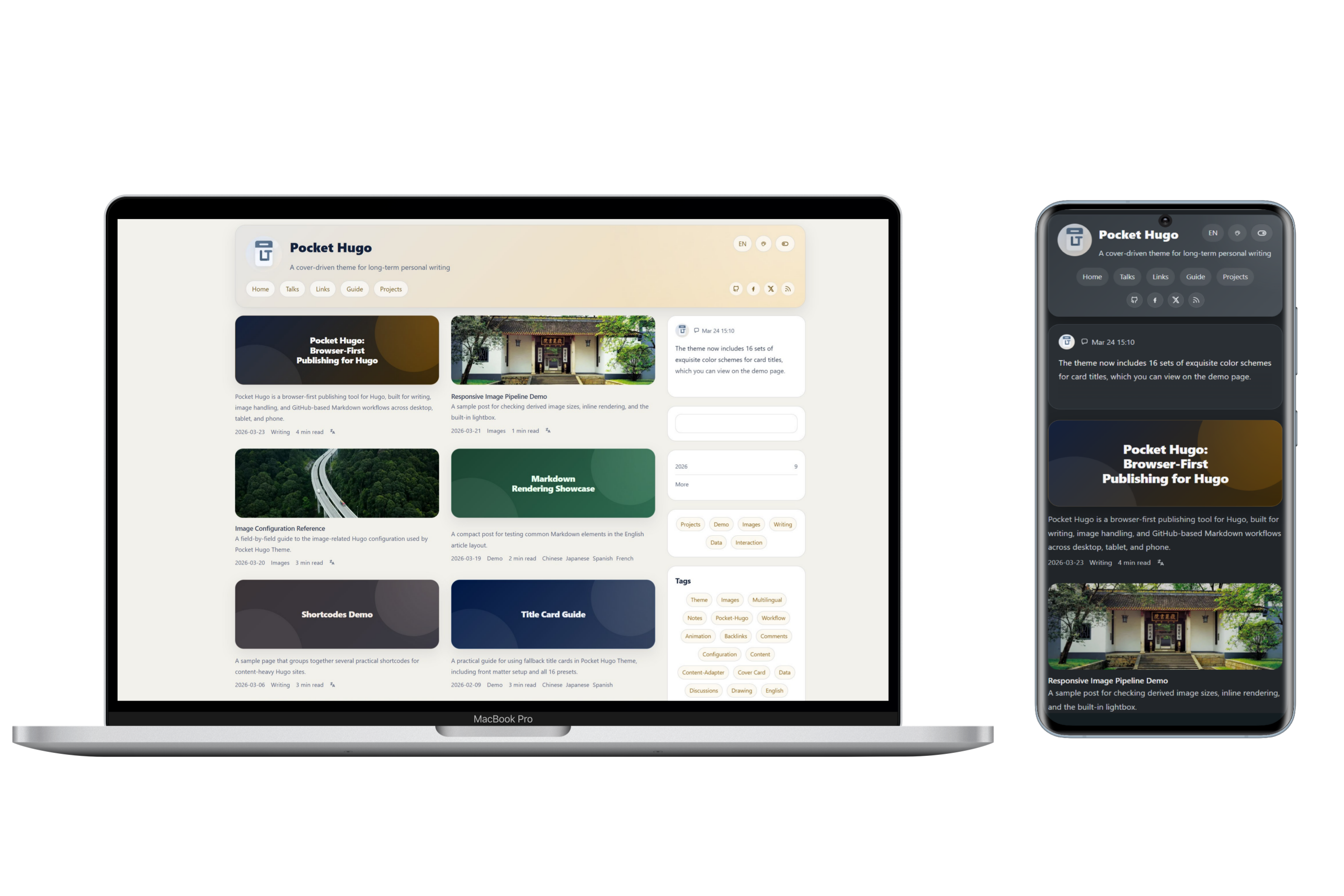
- Multilingual publishing with translation links, canonical handling, and
hreflangmetadata - Cover-first article cards with homepage, taxonomy, and article layouts tuned for personal blogs
- Local search with optional full-text indexing
- Talks page with homepage widget support and standalone RSS / JSON outputs
- Friend links shortcode with local or remote images
- Optional Giscus or Twikoo comments
- Configurable widget title visibility, article summaries, backlinks, TOC, reading time, and back-to-top button
- Multiple built-in color palettes plus optional visitor-side palette switching
- Configurable list width presets for single-column and double-column homepage/list layouts
- Configurable inline image height strategy and theme-aware image brightness settings
- Example site covering multilingual pages, shortcodes, content adapters, talks feeds, and image settings
- Hugo Extended
>= 0.149.0 - Development and testing environment: Hugo Extended
0.157.xand0.158.x
git submodule add https://github.com/h2dcc/pocket-hugo-theme.git themes/pocket-hugo-themetheme = "pocket-hugo-theme"Run the bundled example site locally:
hugo server --source exampleSite --themesDir ../..The repository includes:
exampleSite/hugo.toml: English-commented example configurationexampleSite/hugo.zh-cn.toml: Chinese-commented example configurationREADME.zh-CN.md: Chinese introduction and configuration notes
A typical site-level setup may look like this:
[params]
  favicon = "/img/logo-default.svg"
  appleTouchIcon = "/img/avatar.webp"
  summaryLength = 0
  articleWords = false
  backToTop = false
  viewTransitions = false

  [params.search]
    provider = "local"
    fullText = false

  [params.article]
    showSummary = true
    backlinks = true
    backlinksLimit = 5
    toc = true
    readingTime = true

  [params.layout]
    listMode = "double"

  [params.colorScheme]
    toggle = true
    default = "auto"
    preset = "morandi-mist"
showPicker = true[params.layout]
listMode = "double"- Use the wider homepage/list layout (
1320px) and enable the double-column list presentation on large screens.
- Use the wider homepage/list layout (
listMode = "single"- Use the more compact homepage/list layout (
1080px) for a calmer single-column reading rhythm.
- Use the more compact homepage/list layout (
[params.colorScheme]
toggle- Show or hide the light/dark mode switch in the header.
defaultauto,light, ordark.
preset- Choose the default palette.
showPicker- Show or hide the visitor-side palette picker in the header.
Available presets:
golden-summer-fieldssoft-pastel-shadesblack-gold-elegancefresh-greenslight-steeldeep-sea-bluemorandi-mistmonochrome-core
Example:
[params.colorScheme]
  toggle = true
  default = "auto"
  preset = "deep-sea-blue"
showPicker = trueA minimal, Bear-Blog-like stylesheet (assets/css/min.css) is bundled with the theme and can be toggled directly on the page - no rebuild or manual CSS swap required.
[params.minMode]
enabled- Whether to show the "Minimal" toggle button in the header. Defaults to
true.
- Whether to show the "Minimal" toggle button in the header. Defaults to
default- Whether the minimal view is enabled on first visit. Defaults to
false(regular theme).
- Whether the minimal view is enabled on first visit. Defaults to
The visitor's choice is stored in localStorage (key PocketMinMode) and restored automatically on the next visit. The minimal view borrows the original site's warm cocoa palette and typography: narrow single column, hidden sidebar, title + date post list, dotted-link article content, and the original chroma code palette.
Example:
[params.minMode]
  enabled = true
default = false[params.search]
provider- Currently
local.
- Currently
fullTextfalse: search title, description, slug, categories, and tags only.true: include full article text in the local search index.
[params.seo]
tagline- Optional site tagline used by SEO title patterns.
homeDescription- Homepage meta description used by search engines and social previews.
descriptionLength- Maximum length used when truncating SEO descriptions.
separator- Separator string used by title templates.
[params.seo.title]
homepostpagegrouparchive
Available placeholders:
[site_name][tagline][separator][post_title][page_title][group_title][archive_title]
Example:
[params.seo]
  tagline = "A cover-driven theme for long-term personal writing"
  homeDescription = "Pocket Hugo Theme is a multilingual, cover-driven Hugo theme for long-form writing and calm publishing."
  descriptionLength = 180
  separator = " · "

  [params.seo.title]
    home = "[site_name]"
    post = "[post_title][separator][site_name]"
    page = "[page_title][separator][site_name]"
    group = "[group_title][separator][site_name]"
archive = "[archive_title][separator][site_name]"[params.article]
showListSummary- Control whether article cards render summaries below the title/meta row.
- This affects homepage, archives, taxonomy pages, and other list/card views.
showPageDescription- Control whether the single article/page view renders
.Descriptionbelow the title. - This is separate from card excerpts.
- Control whether the single article/page view renders
showSummary- Legacy alias for
showListSummary. - Still supported for compatibility, but new configs should prefer
showListSummary.
- Legacy alias for
backlinks- Enable backlinks on article pages.
backlinksLimit- Limit the number of backlink items shown.
toc- Enable the article table of contents.
readingTime- Show reading time metadata.
[params]
summaryLength- Control how long generated list summaries should be.
summaryLength = 0means “do not truncate automatically and show the full summary”, not “hide summaries”.
[params.images.cover]
useFill- Whether homepage/list covers should use Hugo
Fillcropping. - Set to
falseto preserve the original image instead of generating a cropped cover.
- Whether homepage/list covers should use Hugo
cardFill- Hugo
Fillspec for homepage and normal list cards.
- Hugo
taxonomyFill- Hugo
Fillspec for taxonomy cards.
- Hugo
openGraphVariant- Variant used for
og:imageandtwitter:image. - Usually
cardfor a cropped social image, orsinglefor the uncropped article cover.
- Variant used for
useDefaultlistTitle- Whether generated gradient cards on homepage, taxonomy, archive, and other list pages show the outer title.
- This site-level switch only affects generated gradient cards, not normal image covers.
fallbackMode- Fallback cover mode when the current post or page does not define one.
- Use
imagefor a normal default image, orgradientfor a generated title card.
openGraphUseDefault- When the page has no own image, still use
defaultasog:image/twitter:image.
- When the page has no own image, still use
defaultMode- Legacy alias kept for backward compatibility.
default- Local path or remote URL for the fallback cover image when
fallbackMode = "image".
- Local path or remote URL for the fallback cover image when
Example:
[params.images.cover]
  useFill = true
  cardFill = "640x300 Center q85"
  taxonomyFill = "640x300 Center q85"
  openGraphVariant = "card"
  useDefault = true
  fallbackMode = "gradient"
  openGraphUseDefault = true
default = "/img/default-cover.webp"You can force a generated title card from front matter even when the page has an image.
Simple form:
coverCard: "a"atoh: the 8 light presetsAtoH: the 8 dark presets- any other value: automatic random preset
When coverCard is set, the generated title card takes priority over image.
To hide the repeated outer title for a single page:
listTitle: false- On list pages, this hides the outer card title.
- On single pages, if the page is using a generated title card, it also hides the separate page title block.
If you do nothing, the theme can still generate a fallback title card automatically when:
params.images.cover.useDefault = trueparams.images.cover.fallbackMode = "gradient"
[params.images.content]
enableMaxHeight- Enable or disable max-height control for inline article images.
limitHeight- When
true, use one shared height on all breakpoints.
- When
unifiedMaxHeight- Shared height used when
limitHeight = true.
- Shared height used when
mobileMaxHeighttabletMaxHeightdesktopMaxHeight- Per-breakpoint max-height values used when
limitHeight = false.
- Per-breakpoint max-height values used when
fullWidthFitobject-fitstrategy for full-width inline images, such ascoverorcontain.
Example:
[params.images.content]
  enableMaxHeight = true
  limitHeight = false
  unifiedMaxHeight = "320px"
  mobileMaxHeight = "160px"
  tabletMaxHeight = "250px"
  desktopMaxHeight = "350px"
fullWidthFit = "cover"[params.images.brightness]
light- CSS
brightness()value for images in light mode.
- CSS
dark- CSS
brightness()value for images in dark mode.
- CSS
Example:
[params.images.brightness]
  light = "1"
dark = "0.92"[params.images.pipeline]
responsive- Enable responsive derived images.
format- Output format such as
webp.
- Output format such as
quality- Image quality.
coverWidths- Generated widths for cover images.
contentWidths- Generated widths for inline content images.
The theme supports three optional comment providers:
giscustwikoocustom
Example:
[params.comments]
  enabled = false
  provider = "giscus"

  [params.comments.giscus]
    mapping = "pathname"
    theme = "preferred_color_scheme"

  [params.comments.twikoo]
# envId = "https://your-service.example.com"The theme includes three no-op partials you can override in your own site project without editing the theme itself:
layouts/partials/custom/fonts.html- for remote font links such as Google Fonts or self-hosted font loaders
layouts/partials/custom/css.html- for loading a custom stylesheet after the theme CSS
layouts/partials/custom/comments.html- for integrating a custom comment provider when
provider = "custom"
- for integrating a custom comment provider when
These are intended as stable extension points for site-specific customization.
Minimal examples:
<!-- layouts/partials/custom/fonts.html -->
<link rel="preconnect" href="https://fonts.googleapis.com">
<link rel="preconnect" href="https://fonts.gstatic.com" crossorigin>
<link href="https://fonts.googleapis.com/css2?family=IBM+Plex+Sans:wght@400;500;700&display=swap" rel="stylesheet">
<!-- layouts/partials/custom/css.html -->
<link rel="stylesheet" href="{{ "css/custom.css" | relURL }}">/* static/css/custom.css */
:root {
--content-width: 1180px;
}[params.comments]
enabled = true
provider = "custom"<!-- layouts/partials/custom/comments.html -->
<div id="custom-comments"></div>
<script src="https://example.com/comments.js" defer></script>The theme includes a dedicated talks page layout and homepage widget pattern for lightweight updates.
- Talks pages can output standalone RSS and JSON feeds.
- The homepage widget can reuse the first talk item.
- This works especially well with Pocket Hugo's timeline-style quick publishing flow.
The bundled exampleSite/ demonstrates:
- multilingual menus and translation links
- article pages, talks, links, and about pages
- title-card fallback behavior and all 16 title-card presets
- shortcodes
- content adapters
- image configuration reference pages
- comment provider examples
- palette switching and layout configuration
theme.toml: Hugo theme metadatahugo.toml: minimum Hugo version for the theme itselfimages/: theme preview assetsexampleSite/: runnable demo site
- The theme is optimized for personal publishing rather than large portal homepages.
- If you use Pocket Hugo, this theme is intended to be its recommended presentation layer.
- For Chinese users, see README.zh-CN.md.