

Absolute positioning, customizable typography, SVG icon packs, and flexible layout — designed to be easy to use and powerful.
👉 Works with any weather entity. 👉 Optional SVG icon pack support. 👉 Full YAML config — no dependencies.
- 🕒 Big stylized clock with customizable spacing & colors
- 📅 Date & day labels
- 🌦 Weather icon + condition + temperature
- 📍 Location label
- 🎨 Fully positionable UI elements
- 🎨 Optional colorful SVG icon pack
- ⛅ Black & White Cloud SVG Pack (dual‑tone icons)
- 🧠 Smart defaults + full stub config for UI add
- 📐 Configurable card height
ClockPro Card can be installed in two ways:
- Open HACS in Home Assistant.
- Search for: Clock Pro Card.
- Select the repository and click Download.
- Restart Home Assistant.
After installation, HACS will automatically register the card as a Lovelace resource.
📌 Method 2 — Manual Installation
- Download
clockpro-card.js - Place it into:
/config/www/community/clockpro-card/
- (Optional) Add your
icon-pack.jsinto the same folder - Add the resource manually:
url: /local/community/clockpro-card/clockpro-card.js
type: module
File paths:
/local/community/clockpro-card/clockpro-card.js
/local/community/clockpro-card/icon-pack.js
- No custom repository setup is required, Clock Pro is in the official HACS Default Repository Store.
- Manual installation is only recommended for advanced or offline setups.
Clock Pro Card includes a built-in Visual Editor for Home Assistant Lovelace. The editor allows you to configure the card without writing any YAML, while still generating a configuration that is 100% equivalent to YAML.
Visual Editor is not a simplified mode. It is a full visual representation of the YAML configuration.
The Visual Editor follows these core principles:
- Full YAML-Free: every option can be configured visually
- YAML-Equivalent: no UI-only or hidden settings
- One-to-one mapping between editor controls and YAML keys
- No disabled / magic defaults
- Consistent positioning logic across all elements
If a setting exists in YAML, it exists in the Visual Editor — and vice versa.
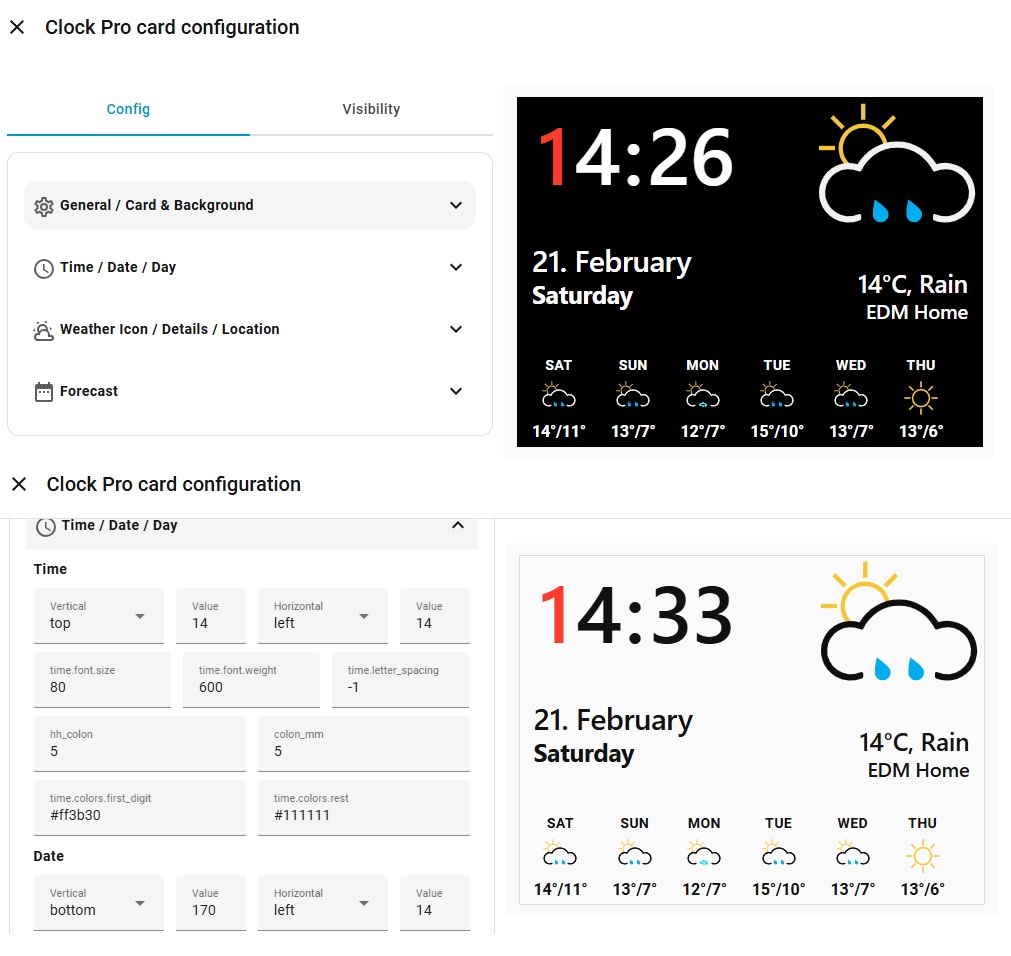
The editor is organized into four main sections:
-
General / Card & Background Global card settings, entity selection, background and icon options
-
Time / Date / Day Position, font and color settings for time, date and day labels
-
Weather Icon / Details / Location Weather icon placement, weather text and location label configuration
-
Forecast Optional multi-day weather forecast settings
Each section contains only related settings, keeping the editor predictable and easy to navigate.
All visual elements use the same positioning model:
- Vertical:
top/bottom - Horizontal:
left/right - Value: number (px) or percentage
This ensures:
- Consistent behavior across all elements
- No special cases or exceptions
- Identical results in Visual Editor and YAML
Related settings are grouped visually to reflect how they work together.
Examples:
- Font settings:
size + weight + letter_spacing - Transform settings:
x + y + scale
These settings are displayed on a single row in the editor to improve clarity and reduce visual noise.
The Visual Editor uses Home Assistant’s native entity selector for:
weather_entitylocation_entitysun_entity
Entities are selected directly from Home Assistant — no manual typing required.
Configurations created with the Visual Editor:
- Use the same keys and structure as YAML
- Can be freely edited in YAML after creation
- Can be switched between Visual Editor ⇄ YAML at any time
Using the Visual Editor does not lock you out of YAML — it simply makes configuration faster and safer.
The Visual Editor is ideal for:
- Initial setup
- Layout and positioning adjustments
- Font, spacing and color tuning
- Rapid visual experimentation
Advanced users can still rely entirely on YAML if preferred.
Copy & paste this full config, then edit values to taste:
type: custom:clockpro-card
weather_entity: weather.home
location_entity: zone.home
sun_entity: sun.sun

pro_icon: true
pro_icon_pack: /local/community/clockpro-card/icon-pack.js,
pro_icons_folder: your-folder-name,


card:
  height: 220

background:
  mode: transparent / color
  color: "rgba(0,0,0,0)"
  radius: 0
  padding: 0

elements:
  time:
    pos:
      left: 12
      top: 0
    font:
      size: 86
      weight: 650
    letter_spacing: -2
    gaps:
      hh_colon: 26
      colon_mm: 26
    colors:
      first_digit: "#ff3b30"
      rest: "#111111"

  date:
    pos:
      left: 14
      bottom: 72
    font:
      size: 26
      weight: 650
    letter_spacing: -0.5
    color: "#111111"

  day:
    pos:
      left: 14
      bottom: 20
    font:
      size: 40
      weight: 750
    letter_spacing: -0.5
    color: "#111111"

  icon:
    pos:
      right: 8
      top: 0
    icon:
      size: 170
      color: "#111111"
    transform:
      x: 0
      y: -12
      scale: 1.12
    source: weather
    default_icon: "mdi:weather-partly-cloudy"

  details:
    pos:
      right: 14
      bottom: 68
    font:
      size: 22
      weight: 650
    letter_spacing: -0.2
    color: "#111111"

  location:
    pos:
      right: 14
      bottom: 20
    font:
      size: 28
      weight: 800
    letter_spacing: -0.2
    color: "#111111"

  forecast:
    show: true        # true / false
    days: 5           # 1–7
    pos:
      left: 16
      bottom: 8
    gap: 18

    day:
      font:
        size: 14
        weight: 700
      letter_spacing: 0.4
      color: "#111111"
      uppercase: true

    icon:
      size: 34
      color: "#111111"

    temp:
      font:
        size: 16
        weight: 700
      letter_spacing: -0.2
      color: "#111111"
      format: maxmin   # maxmin | max
ClockPro now supports an optional 5-day weather forecast strip, rendered as a native element using the same positioning engine as the rest of the card.
The forecast is designed to be:
- Minimal
- Readable at a glance
- Fully configurable via YAML
- Non-intrusive to the main clock layout
👉 Forecast uses the same weather_entity — no extra sensors or helpers required.
👉 Automatically falls back if forecast data is unavailable.
- Short weekday label (MON, TUE, etc.)
- Weather icon (MDI or Pro SVG pack)
- Daily temperature (max or max/min)
The forecast is enabled via the elements.forecast block.
dayscan be set between 1 and 7- Forecast is rendered as a single horizontal row
- Uses daily forecast data provided by the weather entity
- Night/day icon variants are automatically handled when available
- If forecast data is missing, the element is simply not rendered
The forecast follows ClockPro’s core idea:
Everything is an element. Absolute positioning, predictable layout, no magic.
This means you can place the forecast anywhere — bottom strip, corner, or alongside other elements — without affecting the rest of the card.
weather_entity— any HA weather entity (weather.home,weather.open_meteo, etc.)
location_entity— any zone or sensor that provides a friendly name.
Note: weather entities don’t reliably provide city names — zone or config location is recommended.
pro_icon: false(default) → standard MDI iconspro_icon: true→ load frompro_icon_pack
Example:
pro_icon: true
pro_icon_pack: icon-pack.js
Pack path can be relative — if it doesn’t start with /, ClockPro will resolve it to the card folder automatically.
A pack file should export an object of SVG strings by condition key:
export default {
  clear: "<svg>…</svg>",
  rainy: "<svg>…</svg>",
  partlycloudy: "<svg>…</svg>",
  // etc…
};When users add the card from the Lovelace UI, the following default config is provided:
static getStubConfig() {
  return {
    weather_entity: "weather.home",
    location_entity: "zone.home",
    card: { height: 220 },
    pro_icon: true,
    pro_icon_pack: "icon-pack.js",
    background: { mode: "transparent", color: "rgba(0,0,0,0)", radius: 0, padding: 0 },
    elements: {
       // …full settings as above
    },
  };
}ClockPro supports a file-based Pro Icon Pack.
This means:
- You do NOT edit card JS
- You do NOT embed SVG strings inside YAML
- You simply drop your own
.svgfiles into a folder - ClockPro will load them automatically via
icon-pack.js
You can download the official SVG pack from the repository:
https://github.com/levonisyas/clockpro-card/tree/main/dist/svg
Create this folder in Home Assistant:
/config/www/community/clockpro-card/your_pack/
This becomes accessible as:
/local/community/clockpro-card/your_pack/
Day
- clear-day.svg
- partlycloudy-day.svg
- cloudy.svg
- rain.svg
- pouring.svg
- lightning.svg
- lightning-rainy.svg
- fog.svg
- hail.svg
- snow.svg
- snowy-rainy.svg
- windy.svg
- exceptional.svg
- unknown.svg
Night
- clear-night.svg
- partlycloudy-night.svg
- cloudy-night.svg
- rainy-night.svg
- pouring-night.svg
- lightning-night.svg
- lightning-rainy-night.svg
- fog-night.svg
- hail-night.svg
- snowy-night.svg
- snowy-rainy-night.svg
- windy-night.svg
- exceptional-night.svg
- unknown-night.svg
If night icons are missing, ClockPro will fallback to the closest day icon.
type: custom:clockpro-card
weather_entity: weather.home
location_entity: zone.home
sun_entity: sun.sun

pro_icon: true
pro_icon_pack: icon-pack.js
pro_icons_folder: your_packClockPro automatically detects night mode using:
sun_entity: sun.sunWhen the sun is below the horizon:
clear→clear-nightpartlycloudy→partlycloudy-night
You can tune every element:
| Element | Property | Meaning |
|---|---|---|
| time | pos | left/top |
| font | size/weight | |
| colors | first_digit/rest | |
| date/day | pos/color | positioning & color |
| icon | icon.size/color | MDI size/color |
| transform | shift/scale for better visual | |
| details | pos/font/color | bottom weather text |
| location | pos/font/color | bottom location text |
The card looks for these attributes:
attributes.temperatureattributes.tempattributes.current_temperature
If your weather provider doesn’t expose current temperature, ClockPro will fallback to --.
- Make sure
icon-pack.jsis in the same folder as the card (or provide a full path). - If customizing icon pack, clear browser cache after editing.
- For custom SVG sizes, use the
transformblock.
I build these projects for my own needs and share them so others can benefit.
I don’t use donation links — so please don’t buy me coffee ☕
If you enjoy this project, simply ⭐ star the repository.
Your feedback and contributions matter more than coffee.