

- Instead of placing icons or images on top of a dashboard…
- It places real Lovelace cards as floating popup overlays
- Using a portal-mode UI layer system (menu + embedded popups)
This card is designed as the overlay engine for future Dashboard3D ecosystem.
Overlay Pro Card provides:
- A floating popup card system
- A portal-mode overlay layer (does not break clicks behind it)
- A built-in menu button launcher
- Manual embed targeting with simple IDs (
001–999) - Multi-popup dashboards with full positioning control
- ✅ Embed any Lovelace card dynamically
- ✅ Embed cards from any dashboard to any dashboard
- ✅ Works across dashboards/views
- ✅ Floating popup overlays with fixed positioning
- ✅ Built-in menu button launcher
- ✅ Manual ID targeting system (001–999)
- ✅ Scroll support for long cards
- ✅ Hidden overlays do not block clicks behind them
- ✅ Floor3D / Dashboard3D ready
Overlay Pro Card is part of a future 3-module ecosystem:
- Floor3D Pro Card → 3D Scene Engine
- Overlay Pro Card → UI Overlay Engine
- Scene3D → Full Interactive 3D Dashboard Platform
- Open HACS in Home Assistant.
- Search for: Overlay Pro Card.
- Select the repository and click Download.
- Restart Home Assistant.
After installation, HACS will automatically register the card as a Lovelace resource.
-
Download:
overlaypro-card.js -
Copy into:
/config/www/community/overlaypro-card/ -
Add as Lovelace resource:
resources:
  - url: /local/community/overlaypro-card/overlaypro-card.js
type: module- No custom repository setup is required, Overlay Pro is in the official HACS Default Repository Store.
- Manual installation is only recommended for advanced or offline setups.
Overlay Pro Card becomes fully functional as soon as it is installed through HACS, because the card already includes a working demo configuration inside its YAML editor.
Users only need to adjust the REQUIRED fields correctly, and the popups will work immediately.
To successfully open a popup, four YAML fields must match:
icon: EMBED#001in the source cardtarget: "001"in the menu buttonembed_id: "001"in the embedder entrydashboard: lovelacein the embedder entry — must match the exact view URL path
When all four values are correct, Overlay Pro can locate the source card and display it as a popup.
Overlay Pro operates in two simple steps:
Any Lovelace card can become an embeddable “source card” by adding:
icon: EMBED#001This can be any Lovelace card type:
type: <Your_Card_Type>
title: <Your_Card_Name>
icon: EMBED#001  # REQUIRED: Add this line *IMPORTANT* Embed source ID (001–999)
The only required rule is:
icon: EMBED#001This marks the card as a SOURCE that Overlay Pro can locate and open as a popup.
Overlay Pro Card automatically searches the dashboard for the matching SOURCE card and displays it as a floating popup.
To open a popup, the following values must match:
icon: EMBED#001in the source cardtarget: "001"in the menu buttonembed_id: "001"in the embedder entrydashboard: lovelacein the embedder entry — use the exact view URL path (this is what appears in the browser address bar)
All four must align for the popup to function.
  buttons:
    - label: <Your_Buton_Label>
      icon: mdi:<Your_Buton_Icon>
target: "001" # REQUIRED: Must match embed_id below *IMPORTANT*embedders:
- embed_id: "001" # REQUIRED: 3-digit ID (001-999) *IMPORTANT*
dashboard: lovelace # REQUIRED: Dashboard name/path — must match the view’s URL path exactly (case‑sensitive) *IMPORTANT*If these three values match (EMBED#001 → target: "001" → embed_id: "001") and the dashboard value correctly matches the view’s URL path, the popup opens instantly — no extra setup required.
Instead of creating multiple embedder cards, you now define everything inside one Overlay Pro Card card:
Menu buttons
Popup definitions (embedders["])
Positioning per popup
Overlay Pro Card now includes a full-featured Visual Editor, available directly in the Home Assistant UI.
For the first time, the entire card can be configured visually — without writing YAML.
- Full configuration of Menu, Menu Buttons, and Embedders
- Inline editing using accordion-style panels
- Automatic ID handling (menu targets & embed IDs)
- Clean, structured layout matching Home Assistant standards
- No hidden state or abstraction layers
The Visual Editor is not a limited wrapper.
Every option available in YAML can be configured through the Visual Editor:
- Menu positioning
- Button styling
- Embedder behavior
- Popup positioning and sizing
- Scroll, visibility, titles, and close behavior
The editor writes real configuration keys only —
no intermediate models, no duplicated fields, no YAML spam.
- YAML remains fully supported
- You can freely switch between:
- Visual Editor
- Raw YAML editor
- Changes are always reflected accurately in both views
The Visual Editor is a first-class configuration method, not a secondary tool.
- Use the Visual Editor for building and adjusting your overlay system
- Use Raw YAML for advanced review, version control, or fine tuning
Both methods operate on the same configuration model.
type: custom:overlaypro-card
portal_mode: global / local # OPTIONAL: global MODE Mounts UI layers into document.body. // local MODE Mounts overlay layers inside the card itself
multi_mode: true / false # OPTIONAL: Enables multi-popup mode (multiple embedders can be open at the same time). When true, URL hash is disabled.
# NOTE: Open popups are restored after a browser refresh / page reload as long as the URL hash is present
overlay_log: true / false
# ----------------------------
# MENU SETTINGS (OPTIONAL)
# ----------------------------
menu:
enabled: true # OPTIONAL: Enable menu buttons (default: false)
position: # OPTIONAL: Menu CSS style
mode: fixed # OPTIONAL: fixed | absolute (default: fixed)
bottom: 15% # OPTIONAL: Vertical position (use either top OR bottom). Accepts CSS values: %, px, vh, rem...
right: 10% # OPTIONAL: Horizontal position (use either left OR right). Accepts CSS values: %, px, vw, rem...
z_index: 1100 # OPTIONAL: Menu layer priority (default: 1100)
button_style: | # OPTIONAL: Static button CSS style
background: black;
color: white;
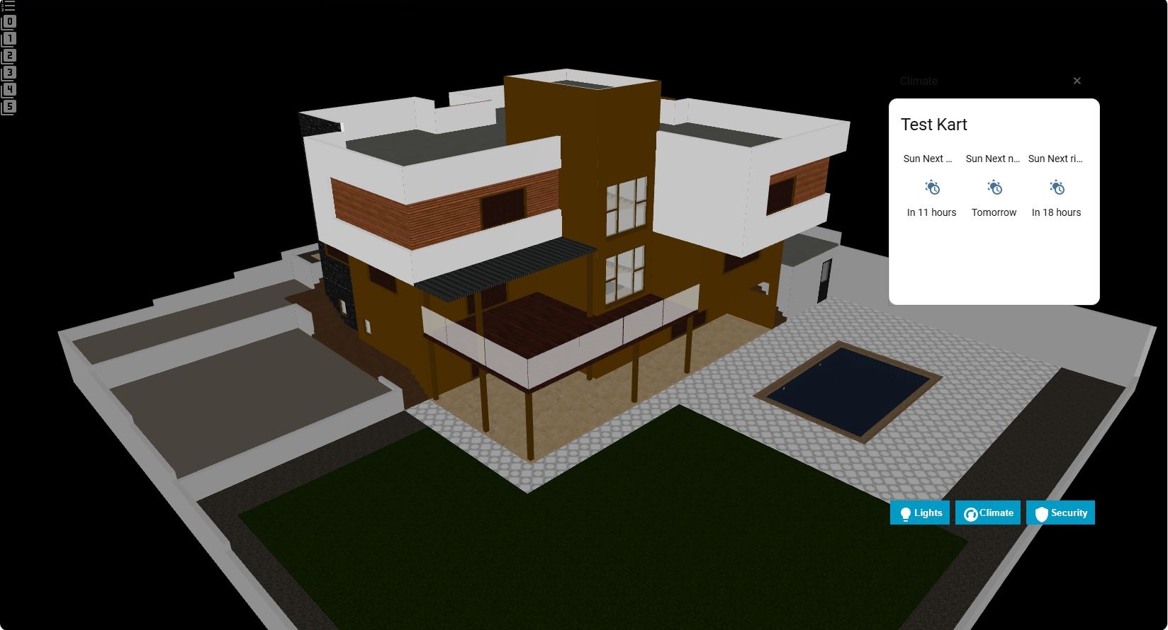
buttons:
- label: Lights # OPTIONAL: Button label
icon: mdi:lightbulb # OPTIONAL: Button icon
target: "001" # REQUIRED: Must match embed_id below *IMPORTANT*
- label: Climate
icon: mdi:thermostat
target: "002"
# ----------------------------
# EMBEDDER POPUPS (REQUIRED)
# ----------------------------
embedders:
- embed_id: "001" # REQUIRED: 3-digit ID (001-999) *IMPORTANT*
dashboard: lovelace # REQUIRED: Source dashboard name/path *IMPORTANT*
show_title: false # OPTIONAL: Hide source card title (default: true)
enable_scroll: true # OPTIONAL: Enable scrolling for long content (default: true)
card_size: 2 # OPTIONAL: Card height scale 1-10 (default: 1)
show_close: true # OPTIONAL: Show close (X) button in header (default: false)
embedder_title: "" # OPTIONAL: Custom popup title string (default: empty)
default_visible: false # OPTIONAL: Initial visibility on load (default: false)
content:
position: # OPTIONAL: Popup CSS style
mode: fixed # OPTIONAL: fixed | absolute (default: fixed)
top: 15% # OPTIONAL: Vertical position (use either top OR bottom). Accepts CSS values: %, px, vh, rem...
right: 5% # OPTIONAL: Horizontal position (use either left OR right). Accepts CSS values: %, px, vw, rem...
width: 380px # OPTIONAL: Popup width
height: 300px # OPTIONAL: Popup height
z_index: 1000 # OPTIONAL: Popup layer priority (default: 1000)
- embed_id: "002"
dashboard: lovelace
show_title: true
enable_scroll: true
show_close: true
embedder_title: "Climate"
default_visible: false
content:
position:
mode: fixed
top: 15%
right: 45%
width: 380px
height: 300px
z_index: 1000Overlay Pro supports two mounting behaviors:
For most dashboards:
Mounts UI layers into document.body.
- Best for true fullscreen overlays
- Works like a system-wide popup engine
portal_mode: globalFor embedded environments (Scene dashboards): Mounts overlay layers inside the card itself.
- Prevents cross-view overlay persistence
- Useful for Scene3D integration or container dashboards
portal_mode: localOverlay Pro supports two popup behaviors:
Single-popup mode: Only one embedder can be open at a time.
- Uses URL hash state (
#embed_001) for deterministic open/close - Works like a classic single-overlay system
multi_mode: falseMulti-popup mode: Multiple embedders can be open at the same time.
- URL hash is used for deterministic state management (
#embed_001,003) - Each
embed_idgets its own isolated popup root - Open popups are restored after a browser refresh / page reload as long as the URL hash is present
multi_mode: trueWhen leaving a dashboard view, Overlay Pro now properly tears down:
- Hash listeners
- Menu layer roots
- Popup content layers
This prevents:
- Ghost menus staying visible
- Home Assistant sidebar becoming unclickable
- UI leftovers after navigation
Visual Editor Notes
Overlay Pro Card uses icon: EMBED#001 as the embed marker
because other custom fields often break the Visual Editor.
CSS Position Units
Position accepts any valid CSS unit:
- %, e.g., top: 15%
- px, e.g., right: 120px
- vh/vw, rem, em, etc.
Use *either* top OR bottom and *either* left OR right to avoid conflicts.
Z-Index Guide
## Z-Index Notes
You can override menu and popup z_index to control stacking.
Menu default: 1100
Popup default: 1000
Overlay Trigger API
window.dispatchEvent(new CustomEvent('overlaypro-card-open', {
  detail: { target: '001' }
}));
## JS API (Optional)
Overlay Pro Card listens for:
- overlaypro-card-open { target: "001" }
- overlaypro-card-close { target: "001" }
Buttons always open the popup with the same ID:
target: "001"
embed_id: "001"
Overlay Pro Card does not auto-match. Manual control is intentional for stability. It only shows status + logs if missing.
-
Source cards MUST include:
icon: EMBED#001 -
Dashboard names are case-sensitive
-
Maximum supported IDs:
001 → 999 -
Hidden overlays use:
display: none
So they do not block clicks behind them.
Found a bug?
Open an issue on GitHub:
https://github.com/levonisyas/overlaypro-card
No embed_id: "Overlay Pro Card requires both embed_id AND dashboard parameters" Dashboard not found: "Dashboard 'dashboard_name' not found or inaccessible" Card not found: "Card with embed ID #XXX not found in dashboard 'dashboard_name'" Invalid embed_id format: "embed_id must be a 3-digit number (001-999)"
"Overlay Pro Card successfully embedded card #XXX" "Dashboard: dashboard_name" "Scroll enabled: true/false"
Add icon to source card: icon: 'EMBED#001' Correctly write dashboard name Make embed_id unique (001-999) Ctrl+F5 + Home Assistant restart
- “Card not found” → check dashboard name (case sensitive)
- “Overlay behind sidebar” → increase z_index
- “Position not applying” → ensure only one of top/bottom and one of left/right are defined
- Verify source card has
icon: EMBED#001(exact format) - Check dashboard name spelling (case-sensitive)
- Ensure embed ID is unique (001-999)
- Verify dashboard exists and is accessible
- Check URL path if using custom dashboard names
- Try with
dashboard: lovelacefor main dashboard
This is normal! Overlay Pro Card uses standard icon: property which Visual Editor fully supports. You can still edit the source card normally.
Works with vertical-stack, horizontal-stack, and grid layouts. Embed ID can be placed in any card within a stack.
- Maximum 999 unique embed IDs per installation (001-999)
- Source card must be in same Home Assistant instance
- Dashboard names are case-sensitive
- Works with all standard and most custom cards
- Not compatible with cards that dynamically change their
icon:property
I build these projects for my own needs and share them so others can benefit.
I don’t use donation links — so please don’t buy me coffee ☕
If you enjoy this project, simply ⭐ star the repository.
Your feedback and contributions matter more than coffee.
This project was developed with a focus on:
- Visual Editor compatibility
- Simple, intuitive configuration
- Maximum compatibility with existing setups
"From blueprints to code - building better solutions for smart homes."