![]()

![]()
Designed for publication-ready GWAS visualization with regional association plots, gene tracks, eQTL, PheWAS, fine-mapping, and forest plots.
Inspired by LocusZoom and locuszoomr.
-
Regional association plot:
- Multi-species support: Built-in reference data for Canis lupus familiaris (CanFam3.1/CanFam4) and Felis catus (FelCat9), or optionally provide your own for any species
- LD coloring: SNPs colored by linkage disequilibrium (R²) with lead variant
- Gene tracks: Annotated gene/exon positions below the association plot
- Recombination rate: Overlay across region (Canis lupus familiaris built-in, or user-provided)
- SNP labels (matplotlib): Automatic labeling of top SNPs by p-value (RS IDs)
- Hover tooltips (Plotly and Bokeh): Detailed SNP data on hover
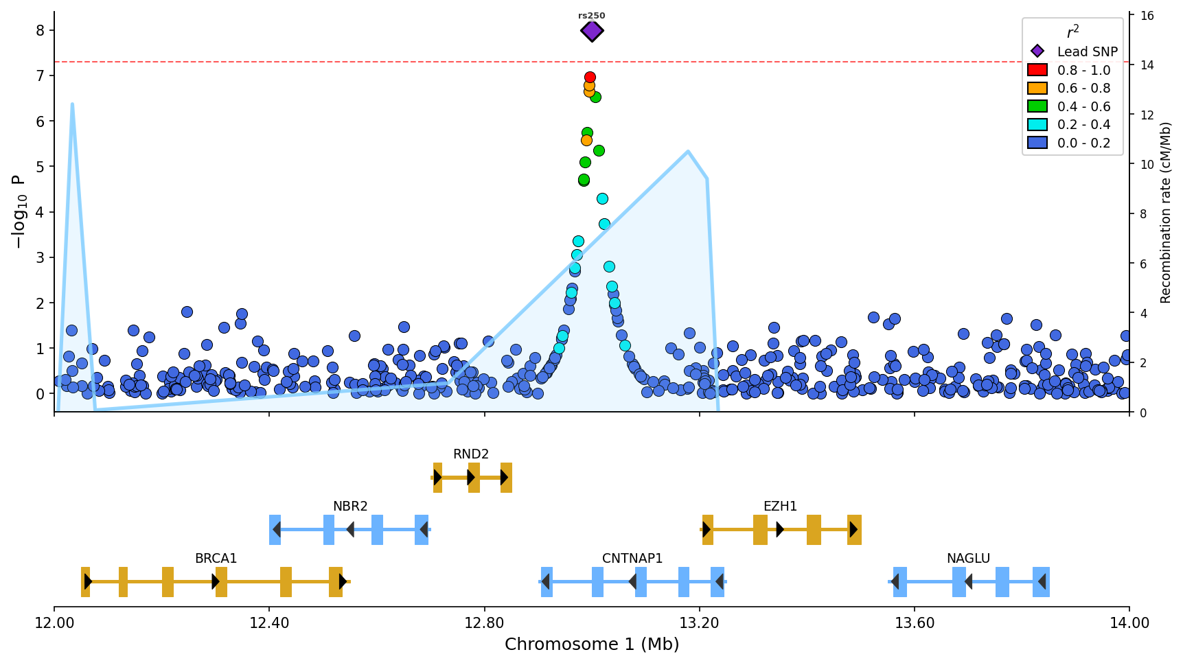 Regional association plot with LD coloring, gene/exon track, recombination rate overlay (blue line), and top SNP labels.
- Stacked plots: Compare multiple GWAS/phenotypes vertically
- Miami plots: Mirrored Manhattan plots for comparing two GWAS datasets (discovery vs replication)
- Manhattan plots: Genome-wide association visualization with chromosome coloring
- QQ plots: Quantile-quantile plots with confidence bands and genomic inflation factor
- eQTL plot: Expression QTL data aligned with association plots and gene tracks
- Fine-mapping plots: Visualize SuSiE credible sets with posterior inclusion probabilities
- PheWAS plots: Phenome-wide association study visualization across multiple phenotypes
- Forest plots: Meta-analysis effect size visualization with confidence intervals
- LD heatmaps: Triangular heatmaps showing pairwise LD patterns, standalone or integrated below regional plots
- Colocalization plots: GWAS-eQTL scatter plots with LD coloring, correlation statistics, and effect direction visualization
- Multiple backends: matplotlib (publication-ready), plotly (interactive), bokeh (dashboard integration)
- Pandas and PySpark support: Works with both Pandas and PySpark DataFrames for large-scale genomics data
- Convenience data file loaders: Load and validate common GWAS, eQTL and fine-mapping file formats
- Automatic gene annotations: Fetch gene/exon data from Ensembl REST API with caching (human, mouse, rat, canine, feline, and any Ensembl species)
pip install pylocuszoomOr with uv:
uv add pylocuszoomOr with conda (Bioconda):
conda install -c bioconda pylocuszoomfrom pylocuszoom import LocusZoomPlotter
# Initialize plotter (loads reference data for canine)
plotter = LocusZoomPlotter(species="canine", auto_genes=True)
# Plot with parameters passed directly
fig = plotter.plot(
gwas_df, # DataFrame with pos, p_value, rs columns
chrom=1,
start=1000000,
end=2000000,
lead_pos=1500000, # Highlight lead SNP
show_recombination=True, # Overlay recombination rate
)
fig.savefig("regional_plot.png", dpi=150)from pylocuszoom import LocusZoomPlotter
plotter = LocusZoomPlotter(
species="canine", # or "feline", or None for custom
plink_path="/path/to/plink", # Optional, auto-detects if on PATH
)
fig = plotter.plot(
gwas_df,
chrom=1,
start=1000000,
end=2000000,
lead_pos=1500000,
ld_reference_file="genotypes", # PLINK fileset (without extension)
show_recombination=True, # Overlay recombination rate
snp_labels=True, # Label top SNPs
label_top_n=5, # How many to label
pos_col="ps", # Column name for position
p_col="p_wald", # Column name for p-value
rs_col="rs", # Column name for SNP ID
figsize=(12, 8),
genes_df=genes_df, # Gene annotations
exons_df=exons_df, # Exon annotations
)The default genome build for canine is CanFam3.1. For CanFam4 data:
plotter = LocusZoomPlotter(species="canine", genome_build="canfam4")Recombination maps are automatically lifted over from CanFam3.1 to CanFam4 coordinates using the UCSC liftOver chain file.
from pylocuszoom import LocusZoomPlotter

# Feline (LD and gene tracks, user provides recombination data)
plotter = LocusZoomPlotter(species="feline")

# Custom species (provide all reference data)
plotter = LocusZoomPlotter(
    species=None,
    recomb_data_dir="/path/to/recomb_maps/",
)

# Provide data per-plot
fig = plotter.plot(
    gwas_df,
    chrom=1,
    start=1000000,
    end=2000000,
    recomb_df=my_recomb_dataframe,
    genes_df=my_genes_df,
)pyLocusZoom can automatically fetch gene annotations from Ensembl for any species:
from pylocuszoom import LocusZoomPlotter

# Enable automatic gene fetching
plotter = LocusZoomPlotter(species="human", auto_genes=True)

# No need to provide genes_df - fetched automatically
fig = plotter.plot(gwas_df, chrom=13, start=32000000, end=33000000)
Supported species aliases: human, mouse, rat, canine/dog, feline/cat, or any Ensembl species name.
Data is cached locally for fast subsequent plots. Maximum region size is 5Mb (Ensembl API limit).
pyLocusZoom supports multiple rendering backends (set at initialization):
from pylocuszoom import LocusZoomPlotter

# Static publication-quality plot (default)
plotter = LocusZoomPlotter(species="canine", backend="matplotlib")
fig = plotter.plot(gwas_df, chrom=1, start=1000000, end=2000000)
fig.savefig("plot.png", dpi=150)

# Interactive Plotly (hover tooltips, pan/zoom)
plotter = LocusZoomPlotter(species="canine", backend="plotly")
fig = plotter.plot(gwas_df, chrom=1, start=1000000, end=2000000)
fig.write_html("plot.html")

# Interactive Bokeh (dashboard-ready)
plotter = LocusZoomPlotter(species="canine", backend="bokeh")
fig = plotter.plot(gwas_df, chrom=1, start=1000000, end=2000000)| Backend | Output | Best For | Features |
|---|---|---|---|
matplotlib |
Static PNG/PDF/SVG | Publication-ready figures | Full feature set with SNP labels |
plotly |
Interactive HTML | Web reports, exploration | Hover tooltips, pan/zoom |
bokeh |
Interactive HTML | Dashboard integration | Hover tooltips, pan/zoom |
Note: All backends support scatter plots, gene tracks, recombination overlay, and LD legend. SNP labels (auto-positioned with adjustText) are matplotlib-only; interactive backends use hover tooltips instead.
Compare multiple GWAS results vertically with shared x-axis:
from pylocuszoom import LocusZoomPlotter
plotter = LocusZoomPlotter(species="canine")
fig = plotter.plot_stacked(
[gwas_height, gwas_bmi, gwas_whr],
chrom=1,
start=1000000,
end=2000000,
panel_labels=["Height", "BMI", "WHR"],
genes_df=genes_df,
)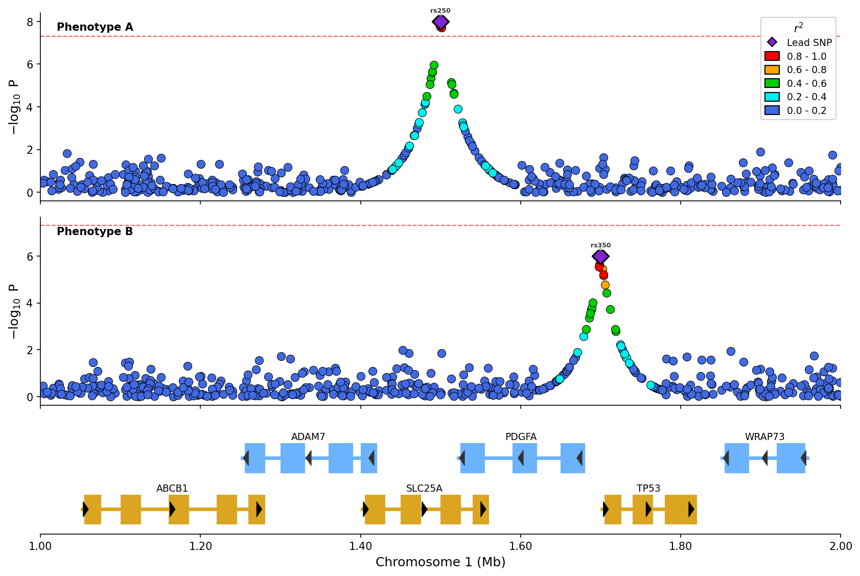 Stacked plot comparing two phenotypes with LD coloring and shared gene track.
Add expression QTL data as a separate panel:
from pylocuszoom import LocusZoomPlotter
eqtl_df = pd.DataFrame({
"pos": [1000500, 1001200, 1002000],
"p_value": [1e-6, 1e-4, 0.01],
"gene": ["BRCA1", "BRCA1", "BRCA1"],
})
plotter = LocusZoomPlotter(species="canine")
fig = plotter.plot_stacked(
[gwas_df],
chrom=1,
start=1000000,
end=2000000,
eqtl_df=eqtl_df,
eqtl_gene="BRCA1",
genes_df=genes_df,
)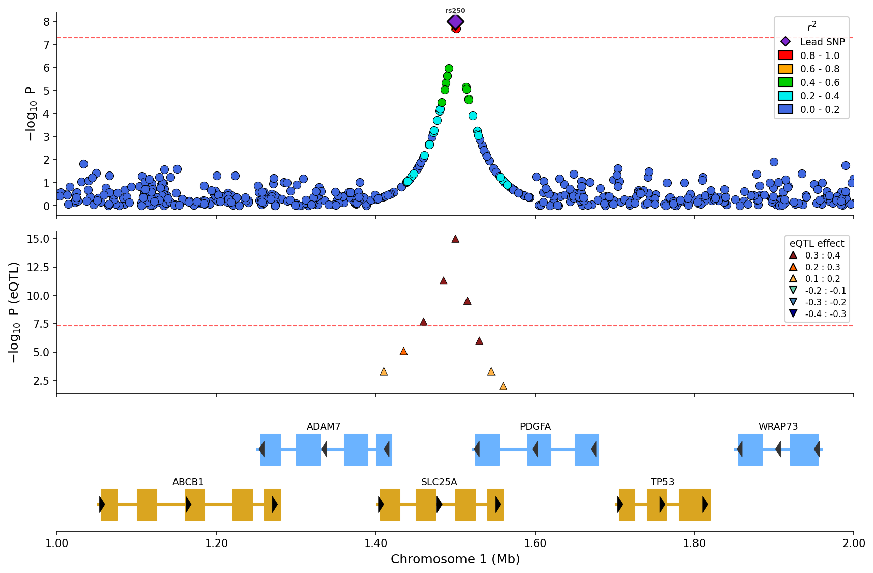 eQTL overlay with effect direction (up/down triangles) and magnitude binning.
Visualize SuSiE or other fine-mapping results with credible set coloring:
from pylocuszoom import LocusZoomPlotter
finemapping_df = pd.DataFrame({
"pos": [1000500, 1001200, 1002000, 1003500],
"pip": [0.85, 0.12, 0.02, 0.45], # Posterior inclusion probability
"cs": [1, 1, 0, 2], # Credible set assignment (0 = not in CS)
})
plotter = LocusZoomPlotter(species="canine")
fig = plotter.plot_stacked(
[gwas_df],
chrom=1,
start=1000000,
end=2000000,
finemapping_df=finemapping_df,
finemapping_cs_col="cs",
genes_df=genes_df,
)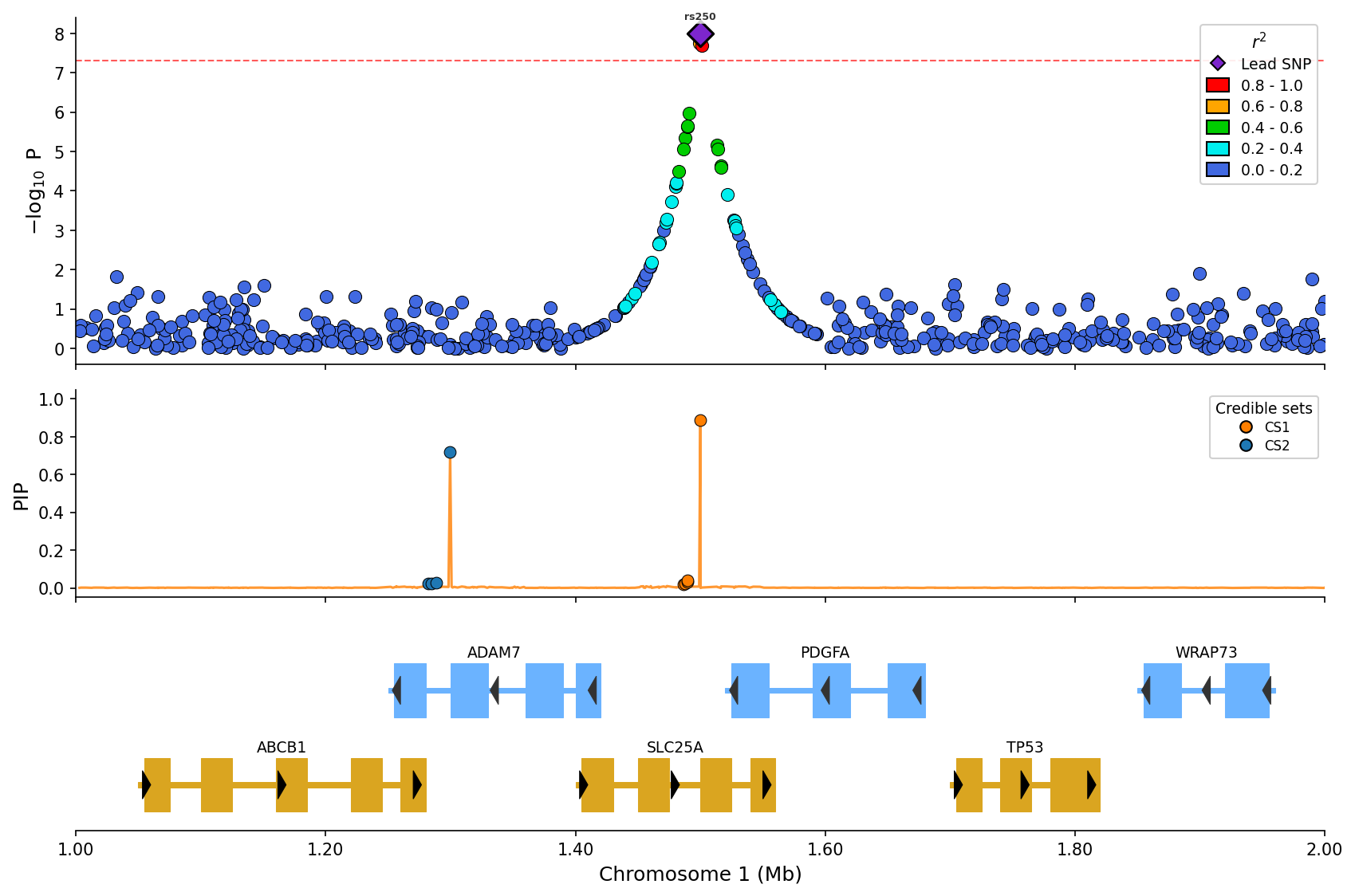 Fine-mapping visualization with PIP line and credible set coloring (CS1/CS2).
Create triangular LD heatmaps showing pairwise linkage disequilibrium patterns:
from pylocuszoom import LDHeatmapPlotter
# ld_matrix is a square DataFrame with SNP IDs as index/columns
# snp_ids is a list of SNP IDs in the matrix
ld_plotter = LDHeatmapPlotter()
fig = ld_plotter.plot(
ld_matrix,
snp_ids,
highlight_snp_id="rs12345", # Highlight lead SNP
metric="r2", # or "dprime"
)
fig.savefig("ld_heatmap.png", dpi=150)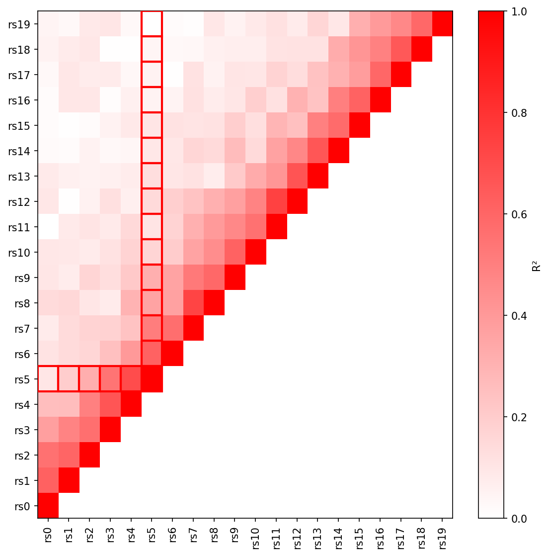 Triangular LD heatmap with R² values and lead SNP highlighted.
Add an LD heatmap panel below a regional association plot:
from pylocuszoom import LocusZoomPlotter
plotter = LocusZoomPlotter(species="canine")
fig = plotter.plot(
gwas_df,
chrom=1,
start=1000000,
end=2000000,
lead_pos=1500000,
ld_heatmap_df=ld_matrix, # Pairwise LD matrix
ld_heatmap_snp_ids=snp_ids, # SNP IDs in matrix
ld_heatmap_height=0.25, # Panel height ratio
)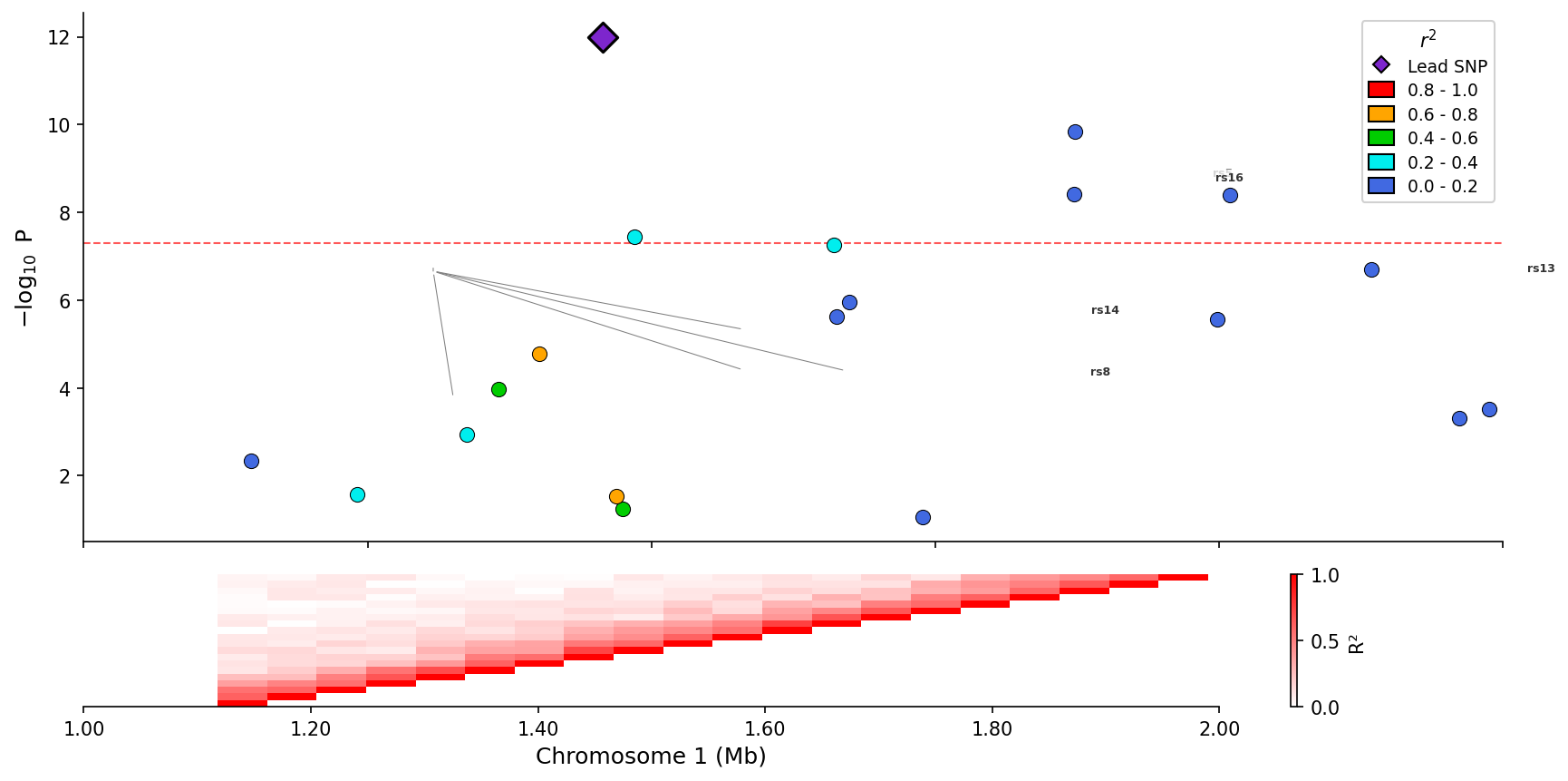 Regional association plot with integrated LD heatmap panel below.
Visualize GWAS-eQTL colocalization by comparing association signals in a scatter plot with LD coloring:
from pylocuszoom import ColocPlotter
# GWAS and eQTL data with matching positions
gwas_df = pd.DataFrame({
"pos": positions,
"p": gwas_pvalues,
"ld_r2": ld_values, # Optional: LD with lead SNP
})
eqtl_df = pd.DataFrame({
"pos": positions,
"p": eqtl_pvalues,
})
plotter = ColocPlotter()
fig = plotter.plot_coloc(
gwas_df=gwas_df,
eqtl_df=eqtl_df,
pos_col="pos",
gwas_p_col="p",
eqtl_p_col="p",
ld_col="ld_r2",
gwas_threshold=5e-8,
eqtl_threshold=1e-5,
)
fig.savefig("colocalization.png", dpi=150)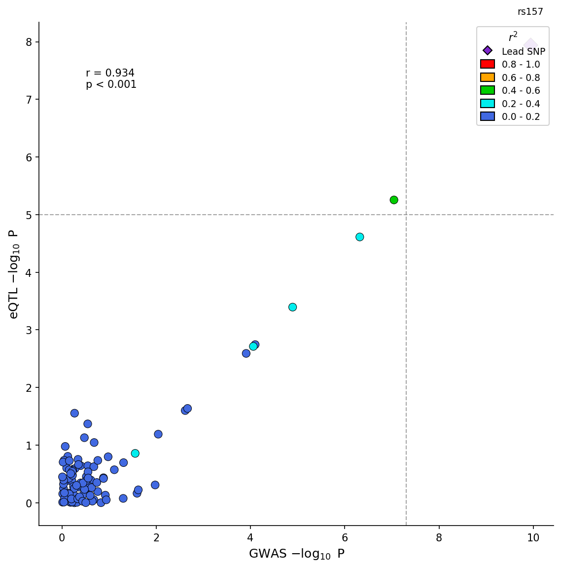 GWAS-eQTL colocalization scatter plot with LD coloring and correlation statistics.
Advanced options include effect direction coloring and H4 posterior probability display:
fig = plotter.plot_coloc(
    gwas_df=gwas_df,
    eqtl_df=eqtl_df,
    pos_col="pos",
    gwas_p_col="p",
    eqtl_p_col="p",
    gwas_effect_col="beta",
    eqtl_effect_col="slope",
    color_by_effect=True,  # Green=congruent, Red=incongruent
    h4_posterior=0.85,     # Display coloc H4 probability
)Visualize associations of a single variant across multiple phenotypes:
from pylocuszoom import StatsPlotter
phewas_df = pd.DataFrame({
"phenotype": ["Height", "BMI", "T2D", "CAD", "HDL"],
"p_value": [1e-15, 0.05, 1e-8, 1e-3, 1e-10],
"category": ["Anthropometric", "Anthropometric", "Metabolic", "Cardiovascular", "Lipids"],
})
stats_plotter = StatsPlotter()
fig = stats_plotter.plot_phewas(
phewas_df,
variant_id="rs12345",
category_col="category",
)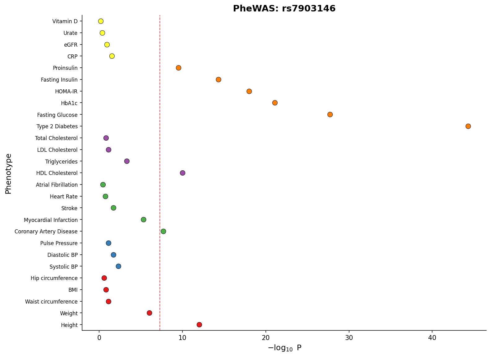 PheWAS plot showing associations across phenotype categories with significance threshold.
Create forest plots for meta-analysis visualization:
from pylocuszoom import StatsPlotter
forest_df = pd.DataFrame({
"study": ["Study A", "Study B", "Study C", "Meta-analysis"],
"effect": [0.45, 0.52, 0.38, 0.46],
"ci_lower": [0.30, 0.35, 0.20, 0.40],
"ci_upper": [0.60, 0.69, 0.56, 0.52],
"weight": [25, 35, 20, 100],
})
stats_plotter = StatsPlotter()
fig = stats_plotter.plot_forest(
forest_df,
variant_id="rs12345",
weight_col="weight",
)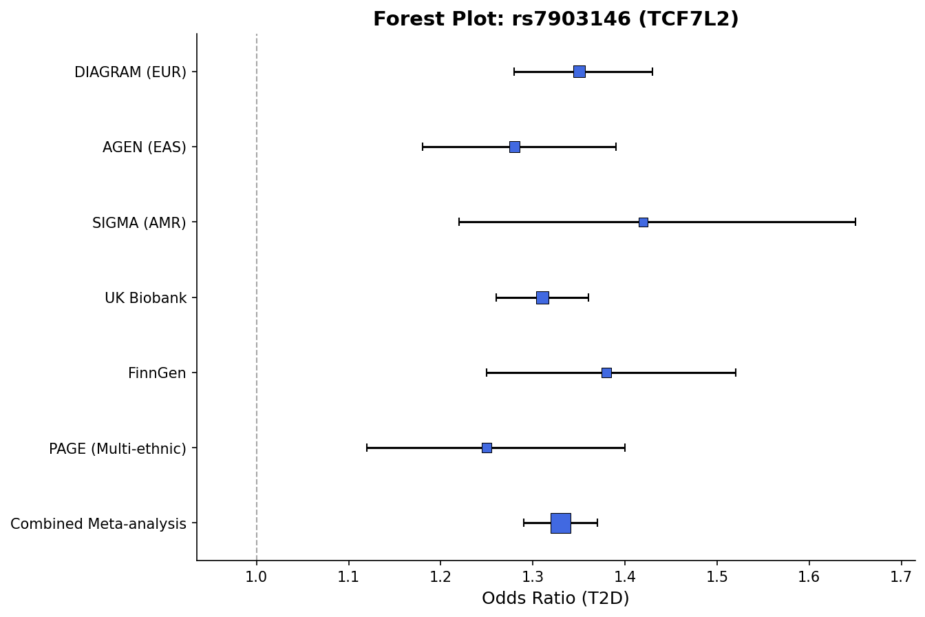 Forest plot with effect sizes, confidence intervals, and weight-proportional markers.
Compare two GWAS datasets with mirrored Manhattan plots (top panel ascending, bottom panel inverted):
from pylocuszoom import MiamiPlotter

plotter = MiamiPlotter(species="human")

fig = plotter.plot_miami(
    discovery_df,
    replication_df,
    chrom_col="chrom",
    pos_col="pos",
    p_col="p",
    top_label="Discovery",
    bottom_label="Replication",
    top_threshold=5e-8,
    bottom_threshold=1e-6,
    highlight_regions=[("6", 30_000_000, 35_000_000)],  # Highlight MHC region
)
fig.savefig("miami.png", dpi=150)
Interactive backends (Plotly/Bokeh) provide hover tooltips showing SNP details:
# Plotly - interactive HTML with hover tooltips
plotter = MiamiPlotter(species="human", backend="plotly")
fig = plotter.plot_miami(discovery_df, replication_df, ...)
fig.write_html("miami_interactive.html")
# Bokeh - dashboard-ready interactive plots
from bokeh.io import output_file, save
plotter = MiamiPlotter(species="human", backend="bokeh")
fig = plotter.plot_miami(discovery_df, replication_df, ...)
output_file("miami_bokeh.html")
save(fig)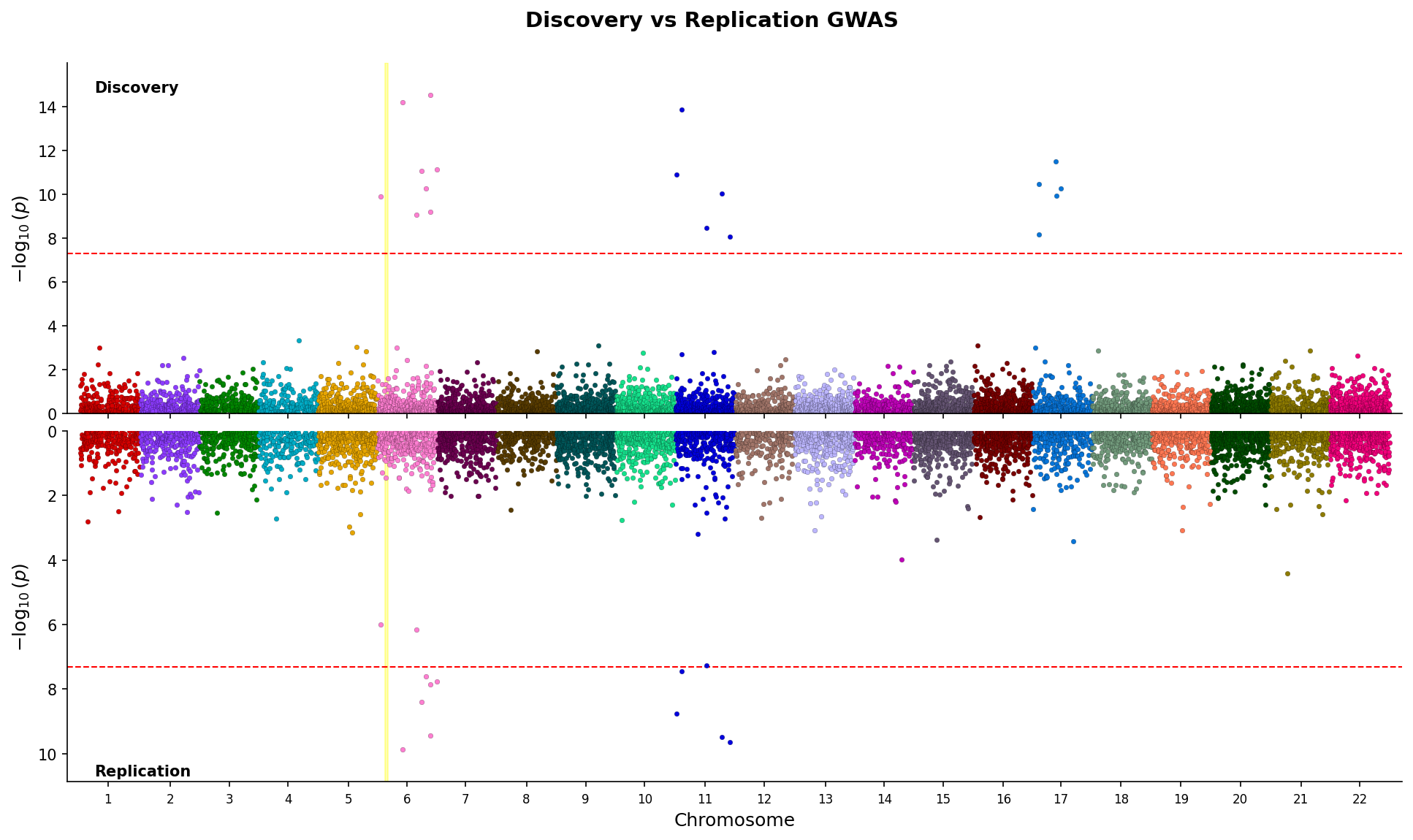 Miami plot comparing discovery and replication GWAS with mirrored y-axes and region highlighting.
Create genome-wide Manhattan plots showing associations across all chromosomes:
from pylocuszoom import ManhattanPlotter
plotter = ManhattanPlotter(species="human")
fig = plotter.plot_manhattan(
gwas_df,
chrom_col="chrom",
pos_col="pos",
p_col="p",
significance_threshold=5e-8, # Genome-wide significance line
figsize=(12, 5),
)
fig.savefig("manhattan.png", dpi=150)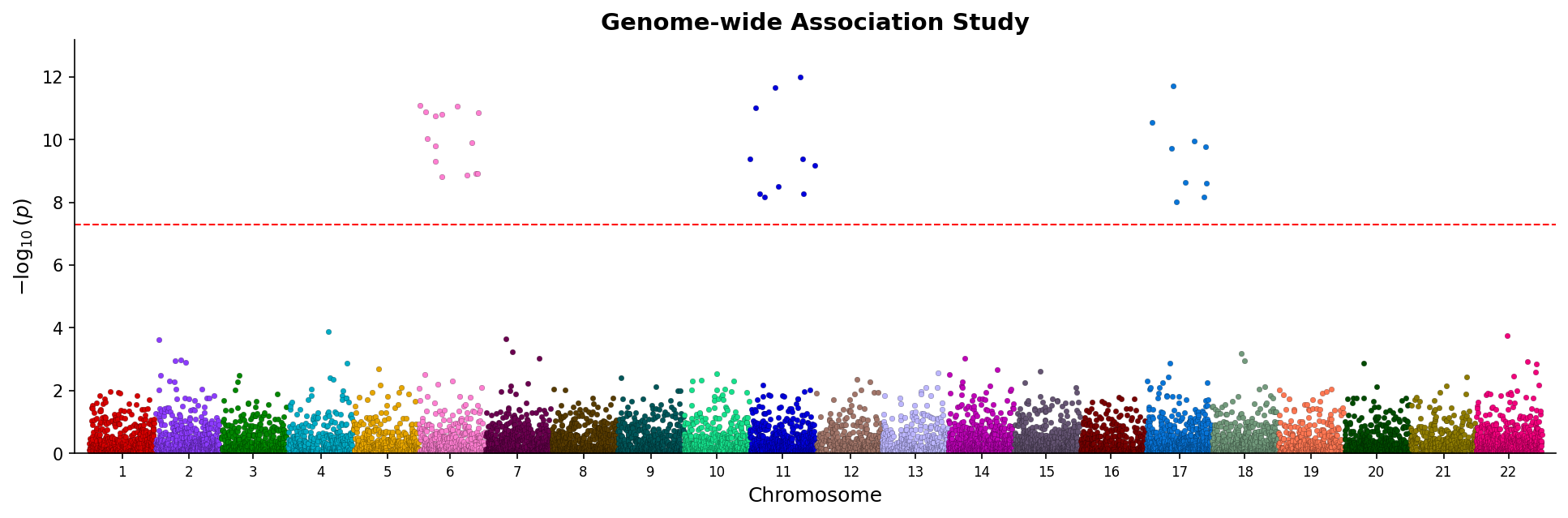 Manhattan plot showing genome-wide associations with chromosome coloring and significance threshold.
Categorical Manhattan plots (PheWAS-style) are also supported:
fig = plotter.plot_manhattan(
    phewas_df,
    category_col="phenotype_category",
    p_col="pvalue",
)Create quantile-quantile plots to assess p-value distribution:
from pylocuszoom import ManhattanPlotter
plotter = ManhattanPlotter()
fig = plotter.plot_qq(
gwas_df,
p_col="p",
show_confidence_band=True, # 95% confidence band
show_lambda=True, # Genomic inflation factor in title
figsize=(6, 6),
)
fig.savefig("qq_plot.png", dpi=150)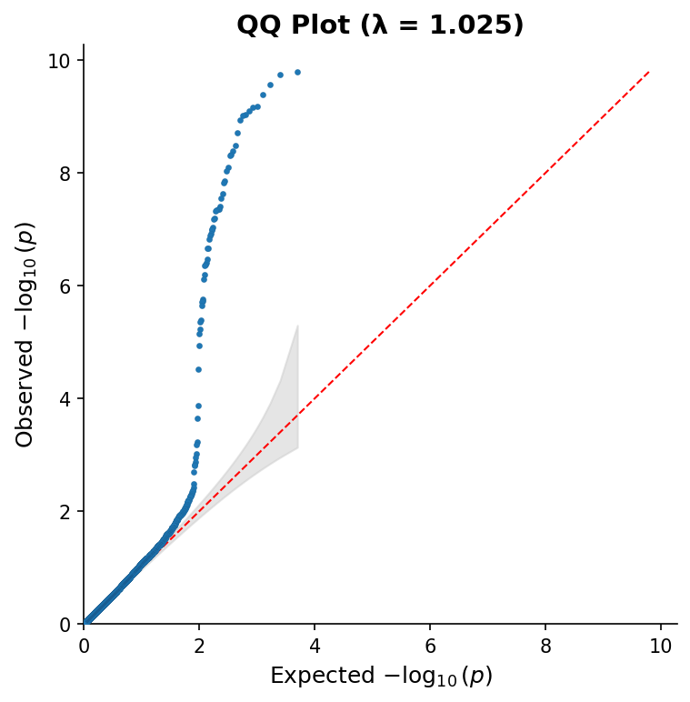 QQ plot with 95% confidence band and genomic inflation factor (λ).
Compare multiple GWAS results in vertically stacked Manhattan plots:
from pylocuszoom import ManhattanPlotter
plotter = ManhattanPlotter()
fig = plotter.plot_manhattan_stacked(
[gwas_study1, gwas_study2, gwas_study3],
chrom_col="chrom",
pos_col="pos",
p_col="p",
panel_labels=["Study 1", "Study 2", "Study 3"],
significance_threshold=5e-8,
figsize=(12, 8),
title="Multi-study GWAS Comparison",
)
fig.savefig("manhattan_stacked.png", dpi=150)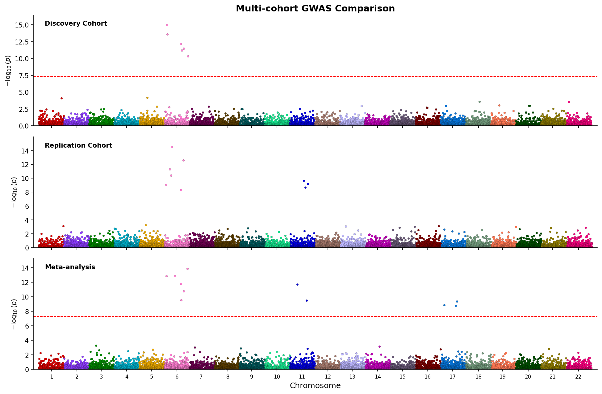 Stacked Manhattan plots comparing three GWAS studies with shared chromosome axis.
Create combined Manhattan and QQ plots in a single figure:
from pylocuszoom import ManhattanPlotter
plotter = ManhattanPlotter()
fig = plotter.plot_manhattan_qq(
gwas_df,
chrom_col="chrom",
pos_col="pos",
p_col="p",
significance_threshold=5e-8,
show_confidence_band=True,
show_lambda=True,
figsize=(14, 5),
title="GWAS Results",
)
fig.savefig("manhattan_qq.png", dpi=150)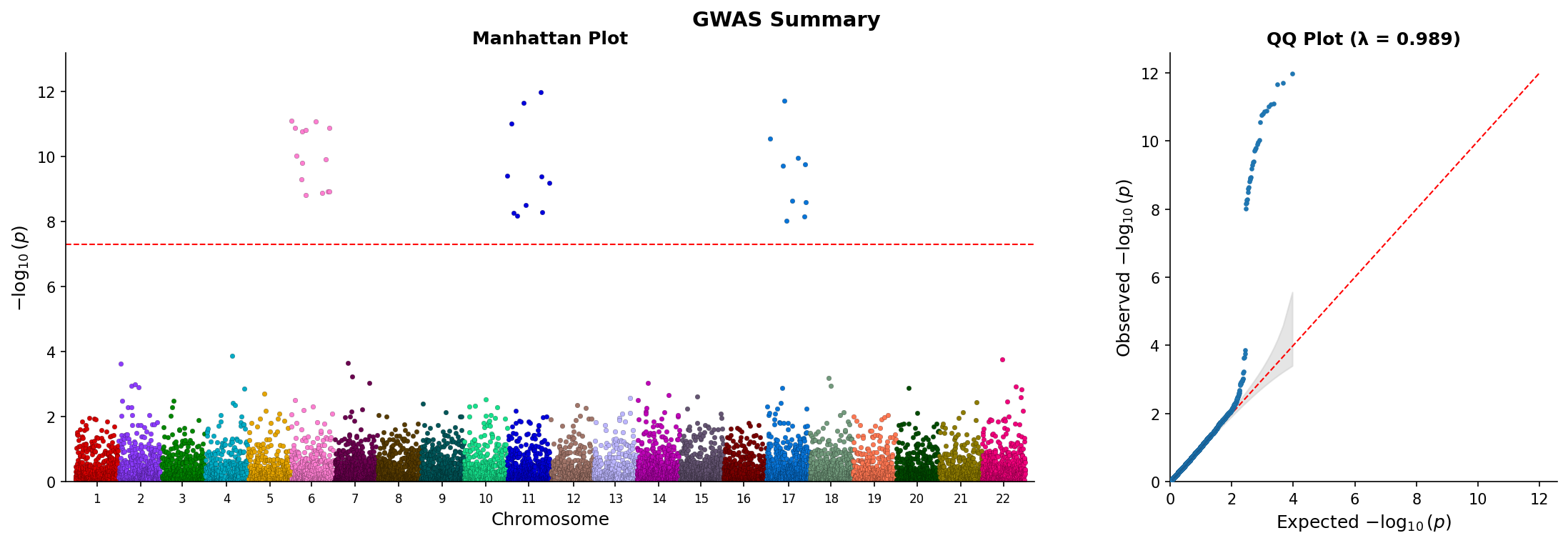 Combined Manhattan and QQ plot showing genome-wide associations and p-value distribution.
For large-scale genomics data, convert PySpark DataFrames with to_pandas() before plotting:
from pylocuszoom import LocusZoomPlotter, to_pandas

# Convert PySpark DataFrame (optionally sampled for very large data)
pandas_df = to_pandas(spark_gwas_df, sample_size=100000)
fig = plotter.plot(pandas_df, chrom=1, start=1000000, end=2000000)
Install PySpark support: uv add pylocuszoom[spark]
pyLocusZoom includes loaders for common GWAS, eQTL, and fine-mapping file formats:
from pylocuszoom import (
    # GWAS loaders
    load_gwas,           # Auto-detect format
    load_plink_assoc,    # PLINK .assoc, .assoc.linear, .qassoc
    load_regenie,        # REGENIE .regenie
    load_bolt_lmm,       # BOLT-LMM .stats
    load_gemma,          # GEMMA .assoc.txt
    load_saige,          # SAIGE output
    # eQTL loaders
    load_gtex_eqtl,      # GTEx significant pairs
    load_eqtl_catalogue, # eQTL Catalogue format
    # Fine-mapping loaders
    load_susie,          # SuSiE output
    load_finemap,        # FINEMAP .snp output
    # Gene annotations
    load_gtf,            # GTF/GFF3 files
    load_bed,            # BED files
)

# Auto-detect GWAS format from filename
gwas_df = load_gwas("results.assoc.linear")

# Or use specific loader
gwas_df = load_regenie("ukb_results.regenie")

# Load gene annotations
genes_df = load_gtf("genes.gtf", feature_type="gene")
exons_df = load_gtf("genes.gtf", feature_type="exon")

# Load eQTL data
eqtl_df = load_gtex_eqtl("GTEx.signif_pairs.txt.gz", gene="BRCA1")

# Load fine-mapping results
fm_df = load_susie("susie_output.tsv")Required columns (names configurable via pos_col, p_col, rs_col):
| Column | Type | Required | Description |
|---|---|---|---|
ps |
int | Yes | Genomic position in base pairs (1-based). Must match coordinate system of genes/recombination data. |
p_wald |
float | Yes | Association p-value (0 < p ≤ 1). Values are -log10 transformed for plotting. |
rs |
str | No | SNP identifier (e.g., "rs12345" or "chr1:12345"). Used for labeling top SNPs if snp_labels=True. |
Example:
gwas_df = pd.DataFrame({
    "ps": [1000000, 1000500, 1001000],
    "p_wald": [1e-8, 1e-6, 0.05],
    "rs": ["rs123", "rs456", "rs789"],
})| Column | Type | Required | Description |
|---|---|---|---|
chr |
str or int | Yes | Chromosome identifier. Accepts "1", "chr1", or 1. The "chr" prefix is stripped for matching. |
start |
int | Yes | Gene start position (bp, 1-based). Transcript start for strand-aware genes. |
end |
int | Yes | Gene end position (bp, 1-based). Must be >= start. |
gene_name |
str | Yes | Gene symbol displayed in track (e.g., "BRCA1", "TP53"). Keep short for readability. |
Example:
genes_df = pd.DataFrame({
    "chr": ["1", "1", "1"],
    "start": [1000000, 1050000, 1100000],
    "end": [1020000, 1080000, 1150000],
    "gene_name": ["GENE1", "GENE2", "GENE3"],
})Provides exon/intron structure. If omitted, genes are drawn as simple rectangles.
| Column | Type | Required | Description |
|---|---|---|---|
chr |
str or int | Yes | Chromosome identifier. |
start |
int | Yes | Exon start position (bp). |
end |
int | Yes | Exon end position (bp). |
gene_name |
str | Yes | Parent gene symbol. Must match gene_name in genes DataFrame. |
| Column | Type | Required | Description |
|---|---|---|---|
pos |
int | Yes | Genomic position (bp). Should span the plotted region with reasonable density (every ~10kb). |
rate |
float | Yes | Recombination rate in centiMorgans per megabase (cM/Mb). Typical range: 0-50 cM/Mb. |
Example:
recomb_df = pd.DataFrame({
    "pos": [1000000, 1010000, 1020000],
    "rate": [0.5, 2.3, 1.1],
})When using recomb_data_dir, files must be named chr{N}_recomb.tsv (e.g., chr1_recomb.tsv, chrX_recomb.tsv).
Format: Tab-separated with header row:
| Column | Description |
|---|---|
chr |
Chromosome number (without "chr" prefix) |
pos |
Position in base pairs |
rate |
Recombination rate (cM/Mb) |
cM |
Cumulative genetic distance (optional, not used for plotting) |
chr	pos	rate	cM
1	10000	0.5	0.005
1	20000	1.2	0.017
1	30000	0.8	0.025
Canine recombination maps are downloaded from Campbell et al. 2016 on first use.
To manually download:
from pylocuszoom import download_canine_recombination_maps

download_canine_recombination_maps()
Logging uses loguru and is configured via the log_level parameter (default: "INFO"):
# Suppress logging
plotter = LocusZoomPlotter(log_level=None)

# Enable DEBUG level for troubleshooting
plotter = LocusZoomPlotter(log_level="DEBUG")- Python >= 3.10
- matplotlib >= 3.5.0
- pandas >= 1.4.0
- numpy >= 1.21.0
- loguru >= 0.7.0
- plotly >= 5.0.0
- bokeh >= 3.8.2
- kaleido >= 0.2.0 (for plotly static export)
- pyliftover >= 0.4 (for CanFam4 coordinate liftover)
- PLINK 1.9 (for LD calculations) - must be on PATH or specify
plink_path
Optional:
- pyspark >= 3.0.0 (for PySpark DataFrame support) -
uv add pylocuszoom[spark]
- User Guide - Comprehensive documentation with API reference
- Code Map - Architecture diagram with source code links
- Architecture - Design decisions and component overview
- Example Notebook - Interactive tutorial
- CHANGELOG - Version history
GPL-3.0-or-later