Animated, framework-agnostic SVG energy-flow diagram.
Live power flow between solar, grid, home, battery and configurable consumer slots — with dots whose speed is proportional to the actual power.




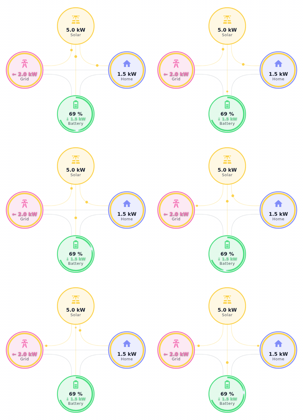
Same component, four looks — each one stacking several appearance options at once. Click any of these to open that exact combination in the live playground:
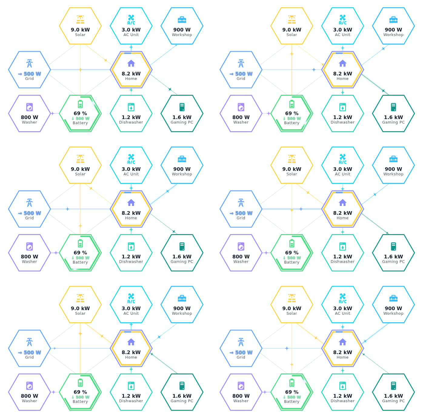
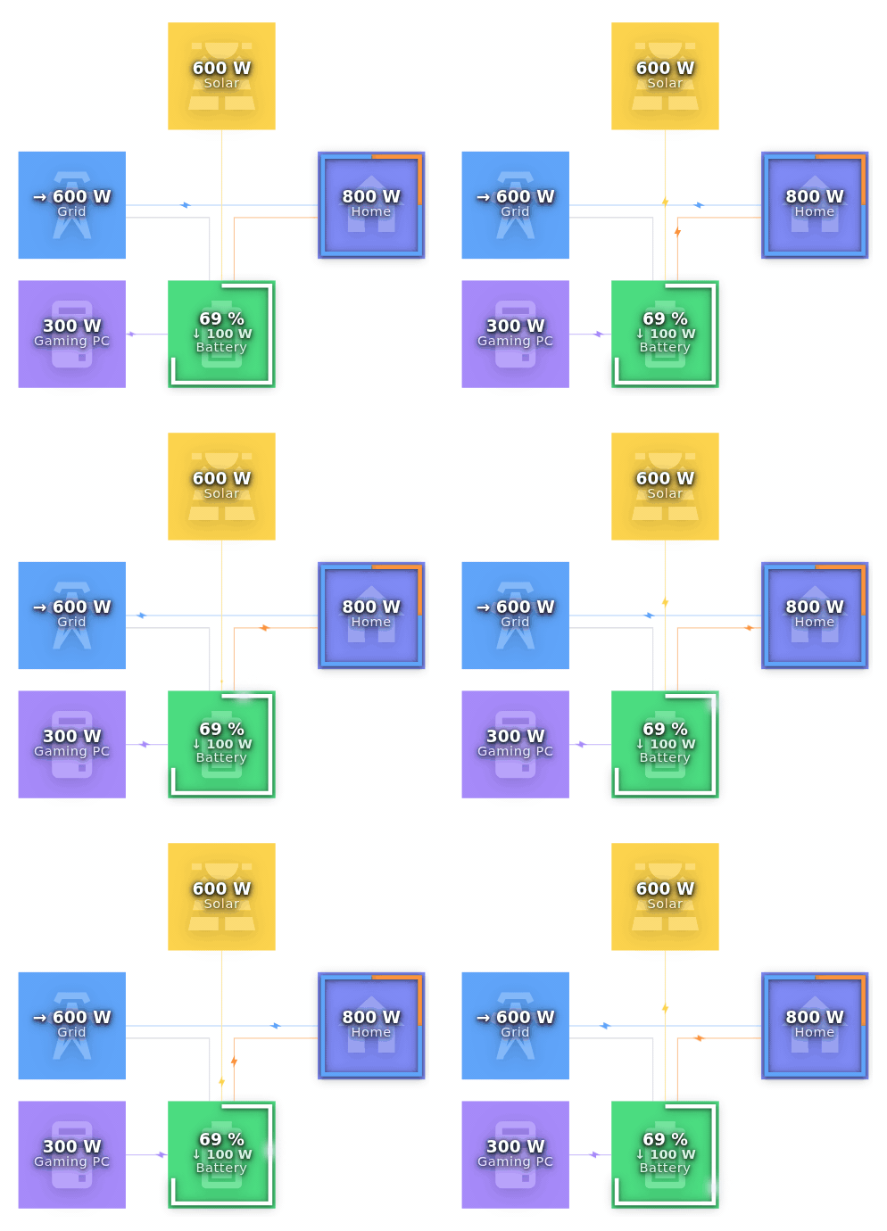
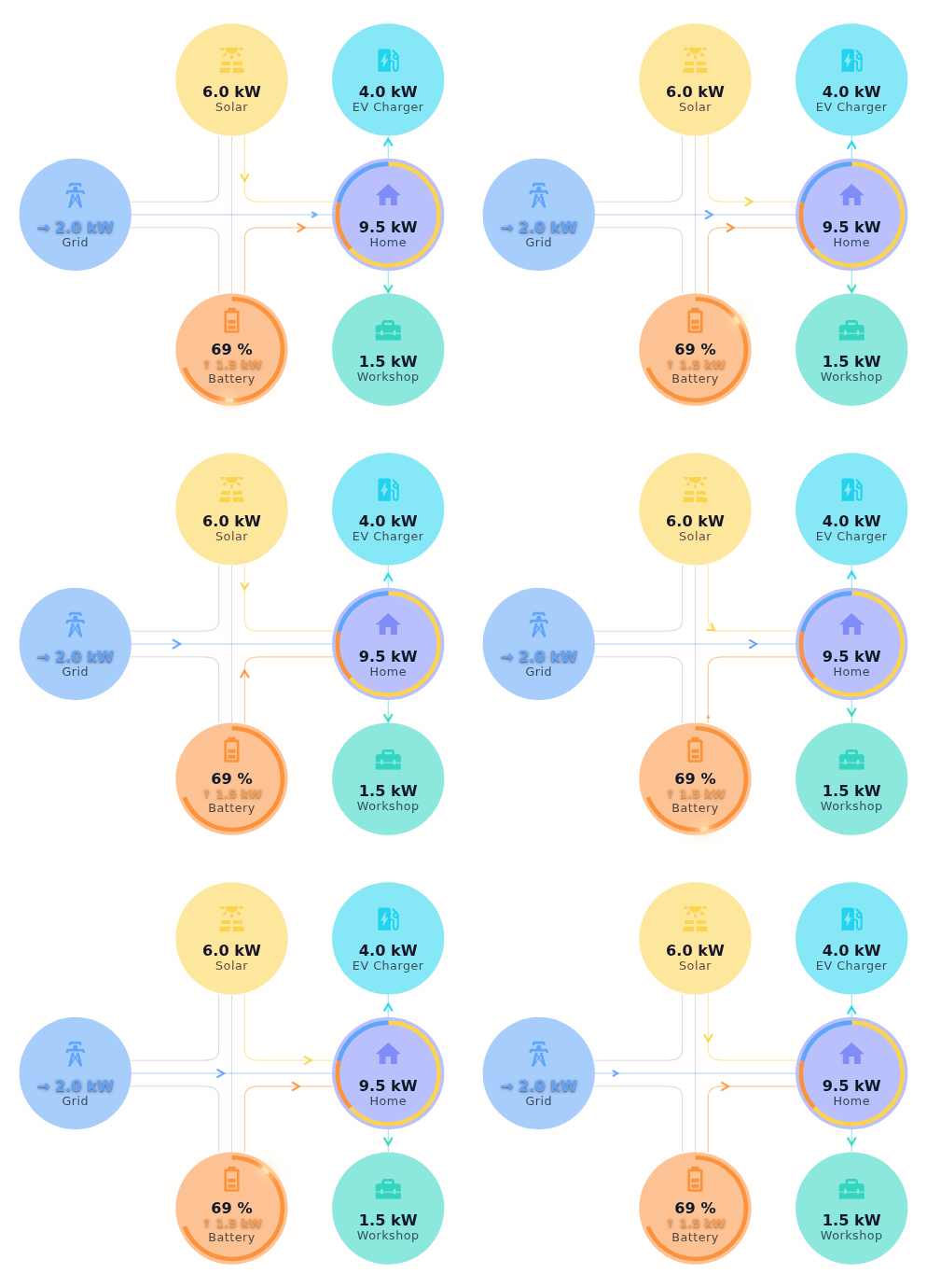
It ships as a <power-flow> Web Component, so it works natively in React,
Angular, Vue, Svelte or plain HTML — plus a tiny vanilla API. No canvas, just
crisp scalable vectors; no runtime framework dependency.
- Optional nodes — solar, battery, up to four home consumer slots and two battery-fed direct loads appear automatically when you pass their values; empty rows are trimmed so there's no dead space.
- Configurable topology — disable individual built-in connections (e.g. a
PV source wired only to the battery, never to the house/grid) via
topology, without touching anything else. - Power-proportional animation — dot speed scales with watts and stays smooth (no jumping) as values update live.
- Active-leg highlighting — the thin track a dot travels on lights up in the dot's own color while it's carrying power, fading back to a dim outline once the flow stops.
- Consistent flow math — each source is split across its sinks with no double-counting, modelled after Home Assistant's power-flow-card-plus.
- Coverage rings — home ring shows load sources (solar / battery / grid); grid ring shows export sources; battery ring shows state of charge.
- Battery charge/discharge highlight — a bright comet spins around the
battery's state-of-charge ring while charging or discharging, color-coded
by direction; toggleable via
options.batteryChargeHighlight. - Pulsing active tracks — toggle
options.trackPulseto have every actively-carrying track pulse in brightness, tempo scaled to that flow's own speed. - Themeable — every node colour (including separate charge/discharge colours for battery and grid), every label, and every node icon is overridable.
- Four node styles — soft, tonal, outline or filled, switchable live via
options.nodeStyle(see the examples above). - Three node shapes — circle, square or hexagon via
options.nodeShape; circle↔square morphs smoothly, and the coverage/SoC/charge-highlight rings follow whichever shape is active. - Adjustable animation — dot speed multiplier lets you slow down or speed up the flow independently of the power values.
- Configurable look — full-size background icons, five flow-dot shapes
(circle, triangle, bolt, chevron, spark), multiple evenly-spaced dots per
flow, and adjustable curve bend are all opt-in via
options.iconStyle/options.dotShape/options.dotCount/options.curveBend. - Tiny & isolated — zero runtime deps (see the min+gzip badge above for the current size), shadow DOM so its styles never leak into your app.
npm install powerflow…or straight from a CDN, no build step:
<script type="module" src="https://unpkg.com/powerflow"></script><script type="module">
import 'powerflow'; // registers the <power-flow> element
</script>
<power-flow id="pf"></power-flow>
<script type="module">
const pf = document.getElementById('pf');
pf.data = {
solar: 3000, // PV production (W); omit/null hides the node
grid: -600, // grid power: positive = import, negative = export
load: 2400, // total house consumption (W)
battery: 500, // positive = charging, negative = discharging; omit/null hides
batterySoc: 72, // state of charge in % (optional, shows SoC ring)
consumer1: 3600, // generic house consumer, drawn above the house (optional)
consumer2: 3600, // second house consumer, drawn below the house (optional)
};
</script>data and options (colors, labels, icons, topology and the presentation
tuning knobs — see API) are set as JS properties. In plain HTML
you can also pass both as JSON attributes:
<power-flow data='{"solar":2400,"grid":-600,"load":1800}' options='{"colors":{"solar":"#f90"}}'></power-flow>.
React
import 'powerflow';
import { useRef, useEffect } from 'react';

export function Energy({ data }) {
  const ref = useRef(null);
  useEffect(() => {
    ref.current.data = data;
  }, [data]);
  return <power-flow ref={ref} />;
}
React ≥ 19 also lets you pass data={data} directly.
Angular
Add CUSTOM_ELEMENTS_SCHEMA to your module/component, import "powerflow";
once, then:
<power-flow [data]="data" [options]="options"></power-flow>Vue 3
import "powerflow"; once, tell Vue the tag is a custom element
(compilerOptions.isCustomElement), then (Options API):
<template>
  <power-flow :data="data" :options="options" />
</template>

<script>
import 'powerflow';

export default {
  props: ['data'],
  data() {
    return {
      options: { labels: { home: 'Haus' } },
    };
  },
};
</script>
Vanilla (no custom element)
import { createPowerFlow } from 'powerflow';

const pf = createPowerFlow(document.getElementById('box'), { data });
pf.update({ data: nextData }); // cheap, call as often as you like
pf.destroy();
The diagram renders into a shadow root on the host element, so its styles never leak into your app.
<power-flow> takes just two properties: data (live readings) and options
(everything about how the diagram looks/behaves).
| Property | Type | Description |
|---|---|---|
data |
FlowData |
Live power readings (watts). |
options |
Partial<PowerFlowSettings> |
Colors, labels, icons, topology and presentation tuning — see below. |
| Field | Type | Description |
|---|---|---|
colors |
Partial<FlowColors> |
Override any accent colour. |
labels |
Partial<FlowLabels> |
Override node labels (i18n). |
icons |
Partial<FlowIcons> |
Override node icons (any SVG <path d=""> string). |
topology |
Partial<FlowTopology> |
Enable/disable individual built-in connections. All default true. |
speedScale |
number |
Dot speed multiplier. 1 = default, 2 = twice as fast. |
nodeStyle |
'soft' | 'tonal' | 'outline' | 'filled' |
How each node's background/ring/icon/text are painted. Default 'soft'. |
nodeShape |
'circle' | 'square' | 'hexagon' |
Shape of every node's own background/ring — the coverage/SoC/charge-highlight rings drawn on top follow suit. Default 'circle'. Hexagon is a true regular hexagon (equal side lengths), so it's wider than the other two shapes. |
iconStyle |
'default' | 'full' |
'full' draws each icon large behind its value/label text. Default 'default'. |
dotShape |
'circle' | 'triangle' | 'bolt' | 'chevron' | 'spark' |
Shape of the animated flow dots — 'triangle'/'bolt'/'chevron'/'spark' all orient themselves along their direction of travel. Default 'circle'. |
dotCount |
number |
Number of dots animated per active flow line, evenly spaced along the path. Default 1. Clamped to 1–8; the short home↔consumer1/2 and battery↔batteryLoad1/2 connections always cap at 2. |
curveBend |
number |
Corner radius of the diagram's curved connections. 0 = sharp 90° corner, 2.5 (max) = direct straight line, 1 = the standard curve (default). |
rowGap |
number |
Vertical spacing (px) between the middle row (grid/home) and the top/bottom rows. Default 125. Clamped to 110–180. |
columnGap |
number |
Horizontal spacing (px) between adjacent columns. Default 145. Clamped to 110–180. |
batteryChargeHighlight |
boolean |
Whether the battery's SoC ring shows an animated highlight while charging/discharging. Default true; set false for a plain static ring. |
trackPulse |
boolean |
Whether an actively-carrying track pulses in brightness on top of its traveling dot(s), tempo scaled to that flow's own speed. Default false. |
options is set as a whole (pf.options = { iconStyle: 'full' }) rather than
merged automatically — pass along whatever previous fields you want to keep,
e.g. pf.options = { ...pf.options, iconStyle: 'full' }.
| Field | Type | Description |
|---|---|---|
solar |
number | null |
Solar / PV production (≥ 0). Optional. |
grid |
number |
Grid power. Positive = import, negative = export. |
load |
number |
Total house consumption (≥ 0). |
battery |
number | null |
Positive = charging, negative = discharging. Optional. |
batterySoc |
number | null |
Battery state of charge in percent. Optional. |
consumer1 |
number | null |
Home consumer 1, drawn top-left of the house. Optional. |
consumer2 |
number | null |
Home consumer 2, drawn bottom-left of the house. Optional. |
consumer3 |
number | null |
Home consumer 3, drawn top-right of the house. Optional. |
consumer4 |
number | null |
Home consumer 4, drawn bottom-right of the house. Optional. |
batteryLoad1 |
number | null |
Load fed directly from a battery output port, bypassing the house (e.g. an AC unit wired straight to the battery). Optional. |
batteryLoad2 |
number | null |
Second battery-fed direct load, same as batteryLoad1. Optional. |
Only
gridandloadare required. Omitting (or passingnullfor)solar/battery/consumer1/consumer2/consumer3/consumer4/batteryLoad1/batteryLoad2hides that node, and the diagram trims the now-empty row so there's no dead space. All fourconsumer*fields are generic — not necessarily EV chargers, uselabels/iconsto relabel one for whatever appliance it actually is — and are sub-consumers ofload, not extra load on top of it. Likewise,batteryLoad1andbatteryLoad2are sub-consumers ofbattery's discharge — already included in it, drawn as a separate leg, not extra discharge on top.batteryLoad1/batteryLoad2only render whenbatteryis also set. See Consumer slot layout below for exact positions and a caveat aboutconsumer2andbatteryLoad2sharing a grid cell.
The diagram sits on a 3×4 grid (columns 1–4, rows 1–3). Home and battery each get their own configurable consumer slots within it:
| Position | Field | Notes |
|---|---|---|
| (3,1) | consumer1 |
Home consumer 1, top-left |
| (4,1) | consumer3 |
Home consumer 3, top-right |
| (3,3) | consumer2 |
Home consumer 2, bottom-left — shares this cell with batteryLoad2 |
| (4,3) | consumer4 |
Home consumer 4, bottom-right |
| (1,3) | batteryLoad1 |
Battery-fed direct load 1 |
| (3,3) | batteryLoad2 |
Battery-fed direct load 2 — shares this cell with consumer2 |
Home has four slots and battery has two, but the grid only has room for five
distinct positions between them, so consumer2 and batteryLoad2 are pinned to
the same cell (3,3). This is deliberate: which one you actually use depends on
your wiring (a load hanging off the house vs. one wired straight to the
battery), so in practice at most one of them is ever set for a given
installation. If your data ever sets both at once — e.g. two independent
data sources feeding the same pf.data object — that's a misconfiguration
powerflow can't resolve on your behalf, so instead of guessing it renders a
red conflict indicator at (3,3) in place of either value, and logs a
console.warn once. Fix it by ensuring only one of consumer2 /
batteryLoad2 is set (non-null) at a time.
Some installations don't have every connection the default layout assumes —
e.g. a balcony/plug-in PV system wired so it can only ever charge the battery,
never feed the house or grid directly. topology lets you disable individual
built-in connections; everything defaults to true, so a fully-connected
system needs no topology at all:
pf.options = {
  ...pf.options,
  topology: {
    solarToHome: true,
    solarToGrid: true,
    solarToBattery: true,
    batteryToHome: true,
    batteryToGrid: true,
  },
};
A disabled connection's power is simply not drawn further (curtailed) rather
than rerouted — e.g. with solarToHome/solarToGrid both false, any solar
production left over after charging the battery just isn't shown going
anywhere else. battery ↔ grid is a single shared physical path in both
directions, so batteryToGrid: false also hides the grid → battery charging
dot.
Balcony-PV example — a PV source with no direct link to the house/grid:
pf.data = { solar: 600, grid: 200, load: 900, battery: 300 };
pf.options = { ...pf.options, topology: { solarToHome: false, solarToGrid: false } };pf.options = {
...pf.options,
colors: {
solar: "#fcd34d", // amber-yellow
home: "#818cf8", // periwinkle
gridIn: "#60a5fa", // sky blue — importing from grid
gridOut: "#f472b6", // pink — exporting to grid
batteryIn: "#4ade80", // lime green — charging
batteryOut: "#fb923c", // orange — discharging
consumer1: "#22d3ee", // cyan
consumer2: "#2dd4bf", // teal
consumer3: "#38bdf8", // sky blue
consumer4: "#0d9488", // deep teal
batteryLoad1: "#a78bfa", // violet — battery-fed direct load 1
batteryLoad2: "#c084fc", // purple — battery-fed direct load 2
},
};Defaults are English. Override per language, e.g.
pf.options = { ...pf.options, labels: { grid: "Netz", home: "Haus", battery: "Akku" } }.
Each value is a valid SVG <path d="…"> string. The defaults use
Material Design Icons, but any
SVG path drawn in a 24×24 viewBox works:
import { mdiSolarPanel, mdiFlash } from '@mdi/js';

pf.options = {
  ...pf.options,
  icons: {
    solar: mdiSolarPanel, // swap the default solar-power-variant icon
    grid: mdiFlash, // swap the transmission tower
    // home / battery / consumer1 / consumer2 / consumer3 / consumer4 / batteryLoad1 / batteryLoad2 — all optional
  },
};Multiplies the base dot speed for all animated legs. The base speed is already
proportional to power, so speedScale lets you tune the visual intensity
without changing the underlying data:
pf.options = { ...pf.options, speedScale: 0.5 }; // half speed — calmer animation
pf.options = { ...pf.options, speedScale: 2 }; // twice as fast — more energetic feelHow every node's background/ring/icon/text are painted, from a soft tint up to a fully-colored badge:
pf.options = { ...pf.options, nodeStyle: 'soft' }; // light tint + colored ring (the default)
pf.options = { ...pf.options, nodeStyle: 'tonal' }; // opaque, muted fill, no ring
pf.options = { ...pf.options, nodeStyle: 'outline' }; // transparent, just a colored ring
pf.options = { ...pf.options, nodeStyle: 'filled' }; // accent-colored background, white icon/text
filled always paints icon/text a uniform white — never a different color
per node — and relies on a drop shadow (not a per-node contrast pick) to
stay legible against whatever accent color that node happens to have.
Known issue: in Firefox/Waterfox, that drop shadow can render visibly pixelated on the home/grid coverage rings and the battery SoC ring when
nodeStyle: 'filled'is combined with a large rendered size (e.g. the diagram filling a big container). Firefox rasterizes SVG CSS filters at a resolution tied to the diagram's internal coordinate space rather than its final on-screen size, so the effect shows up whenever that gap is large — whether the diagram is loaded at that size directly or grows into it later. Not currently reproducible in Chrome/Chromium-based browsers. Workaround: use a differentnodeStyleat large sizes in Firefox/Waterfox.
Shape of every node's own background/ring. Every node keeps the same 104px footprint regardless, so track routing/fan-out is unaffected — only the outline changes:
pf.options = { ...pf.options, nodeShape: 'circle' }; // rounded, the default
pf.options = { ...pf.options, nodeShape: 'square' }; // sharp corners
pf.options = { ...pf.options, nodeShape: 'hexagon' }; // regular hexagon'circle'↔'square' morph smoothly (an animated corner radius); switching
to/from 'hexagon' snaps instantly instead, since it's a separate shape
rather than a rounded corner. The coverage/SoC/charge-highlight rings drawn
on top of solar/grid/home/battery always match the selected shape.
'hexagon' is a true regular hexagon — every side the same length — which
makes it wider than the circle/square footprint; the diagram's viewBox
widens automatically to keep it from clipping at the edge, and both the
straight and curved tracks that enter a hexagon node pull back further so
they don't clip into its slanted sides. See the second and third GIFs at the
top of this README for 'hexagon' and 'square' in action.
pf.options = { ...pf.options, iconStyle: 'full' }; // large, dimmed icon behind the value/label text
pf.options = { ...pf.options, iconStyle: 'default' }; // small icon above the text (the default)pf.options = { ...pf.options, dotShape: 'circle' }; // plain circles (the default)
pf.options = { ...pf.options, dotShape: 'triangle' }; // small arrowheads that point in their flow direction
pf.options = { ...pf.options, dotShape: 'bolt' }; // a small lightning bolt
pf.options = { ...pf.options, dotShape: 'chevron' }; // a slim "›" pointing in the flow direction
pf.options = { ...pf.options, dotShape: 'spark' }; // a small 4-point sparkle'triangle', 'bolt' and 'chevron' all orient themselves along their current direction of travel, the same way 'triangle' always has. 'spark' rotates along too, but being symmetric it looks the same regardless.
pf.options = { ...pf.options, dotCount: 1 }; // one traveling dot per flow (the default)
pf.options = { ...pf.options, dotCount: 4 }; // 4 dots, evenly spaced along each active flow line
The short direct connections between grid-adjacent nodes (home↔consumer1/2,
battery↔batteryLoad1/2) always cap at 2 dots regardless of dotCount — their
path is too short for more to read as separate dots rather than a blur.
Behaves like a corner radius for the diagram's curved connections (e.g. solar/battery's fan-out to home and grid):
pf.options = { ...pf.options, curveBend: 0 }; // sharp, un-rounded 90° corner
pf.options = { ...pf.options, curveBend: 1 }; // the standard, moderately-rounded curve (the default)
pf.options = { ...pf.options, curveBend: 2.5 }; // the maximum — a plain direct line, corner gone entirely
0 is two straight segments meeting at a point, each running in the
connection's fixed departure/arrival direction (e.g. "leaves solar straight
down, arrives at home straight across"). 2.5 is so large a "radius" that
the corner disappears and the connection becomes a direct line between the
two nodes. Both ends are the natural limit of the same continuous shape, not
a special case, so there's no jump anywhere in between — low values round
the sharp corner into an ever-wider arc, and higher values then flatten that
same arc smoothly into the final straight line. Clamped to 0–2.5.
Changed in 1.2.0:
curveBendused to work the other way around —0was a direct line and higher values sharpened the corner. If you setcurveBendexplicitly (to anything other than the default1), upgrading will change your diagram's geometry; see the changelog.
The diagram sits on a grid: columns run left-to-right columnGap px apart
(grid/batteryLoad1 → solar/battery → home → consumer3/consumer4), and rows sit
rowGap px above/below the fixed middle row (grid/home). Home's own column
and grid/home's shared row are always fixed — only the other rows/columns
move:
pf.options = { ...pf.options, rowGap: 125 }; // the default — slightly tighter than the column gap
pf.options = { ...pf.options, rowGap: 145 }; // matches the column gap exactly, for a fully even grid
pf.options = { ...pf.options, columnGap: 145 }; // the default
Both are clamped to 110–180.
pf.options = { ...pf.options, trackPulse: false }; // dots only, no track pulse (the default)
pf.options = { ...pf.options, trackPulse: true }; // actively-carrying tracks also pulse in brightness
The pulse tempo scales with that flow's own speed, the same way dot speed does, so a higher-load flow pulses faster than a lightly-loaded one. See the first GIF at the top of this README, which has it enabled across several simultaneously active flows at different loads.
Meters only tell you the net at each node, so powerflow decomposes them into
the individual legs by priority — every source is split across the sinks it
feeds, with nothing double-counted:
batteryLoad1/batteryLoad2(direct loads on the battery, not the house) are folded into the battery's charge/discharge need first — sincebatteryis only ever a single net reading, a direct load pulls that reading toward discharge, so more gross charging may actually be needed than the net figure alone suggests (e.g. a battery netting +100 W while also feeding 1150 W of direct loads needs 1250 W of gross charge in, not 100 W),- a charging battery is fed from solar first (the rest from the grid),
- remaining solar serves the house, then exports,
- any battery discharge left over after step 1 covers the house's remaining demand, then exports,
- the grid covers whatever the house still needs.
Each of these legs additionally honours topology: a disabled connection is
forced to zero and whatever power it would have carried is not drawn on that
leg. It isn't simply discarded, though — e.g. if solar's only enabled route
is the battery, all of it is pushed in, and any excess beyond what's needed
is reconstructed as extra battery discharge rather than vanishing.
This mirrors the priority order
power-flow-card-plus uses
(its exact sign convention for battery differs — see FlowData above), so
e.g. solar 1000 W, load 1000 W, battery charging 100 W, grid +100 W correctly
shows solar→battery 100, solar→home 900 and grid→home 100 — not a single
solar→home line.
npm install
npm run dev           # playground at localhost:5173 — sliders, test cases, simulate day
npm test               # unit tests (vitest) for the flow-allocation math
npm run test:watch     # same, in watch mode

npm run build         # build:lib + build:site
npm run build:lib     # → dist/      publishable library (JS bundles + .d.ts)
npm run build:site    # → dist-site/ static playground (GitHub Pages)

npm run capture:gif   # re-generate all docs/preview*.gif shown above (requires ffmpeg + chromium)
# -- --test "<label>" --node-style <style> --out <path> for a one-off captureInspired by
power-flow-card-plus by
@flixlix — the excellent Home Assistant card.
powerflow reuses its flow-allocation conventions but is a standalone,
framework-agnostic Web Component with no Home Assistant dependency.
MIT © Thomas Mihailovits