AngularJS image gallery
See demo/index.html or online demo
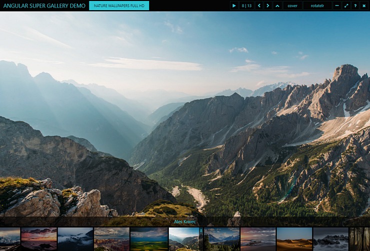
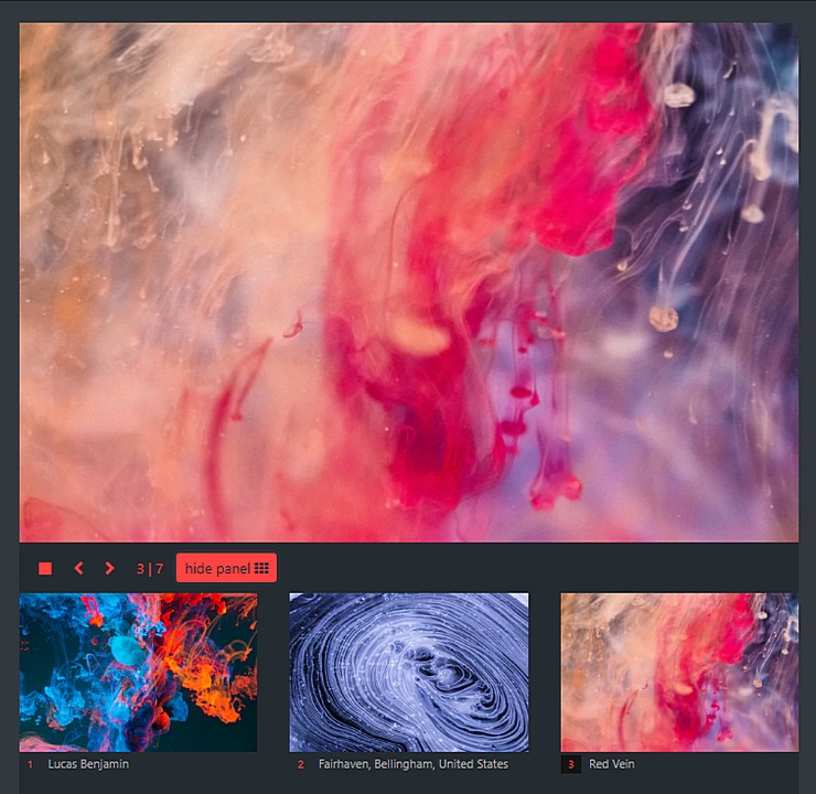


- jQuery ^3.2.1
- angular 1.6.6
- angular-animate 1.6.6
- angular-touch 1.6.6
- screenfull 3.3.2
- bootstrap 3.3.7
- separated Angular components (image, modal, thumbnails, panel, info and controls)
- highly configurable
- image display mode (cover, contain, auto, stretch)
- multiple image sizes / thumbnail (for panel) , medium (for image), original (for modal)
- responsive and 3 built-in themes
- 11 image transitions (CSS3 3D)
- configurable keyboard shortcuts in modal window (keyCodes)
- events (config load, image load, modal open/close, autoplay start/stop, etc.)
- touch support (swipe)
npm install --save angular-super-galleryoryarn add angular-super-gallery
import 'bootstrap/dist/css/bootstrap.min.css';
import 'angular-super-gallery/dist/angular-super-gallery.css';
import 'jquery';
import 'angular';
import 'bootstrap';
import 'angular-animate';
import 'angular-touch';
import 'screenfull';
import angularSuperGallery from 'angular-super-gallery';

angular.module("app", [angularSuperGallery]);
<asg-image
       data-options='{"baseUrl" : "https://wallpaperscraft.com/image/"}'
       data-items='[
        "porsche_panamera_rear_view_white_auto_96846_1920x1080.jpg",
        "subaru_brz_subaru_cars_sunset_93895_1920x1080.jpg"
       ]'>
    <asg-modal>
        <asg-thumbnail></asg-thumbnail>
    </asg-modal>
</asg-image>
setup in controller
this.showModal = false;
this.nature1Options = {
    baseUrl: "https://",
    fields: {
        source: {
            modal: "link",
            image: "medium",
            panel: "thumbnail"
        }
    },
    modal: {
        transition: 'zoomInOut'
    },
    panel: {
        thumbnail: {
            class: "col-md-4"
        },
    },
    image: {
        transition: 'fadeInOut'
    }
};


this.nature1 = [
    {
        "link": "wallpaperscraft.com/image/nature_waterfall_summer_lake_trees_90400_1920x1080.jpg",
  		"thumbnail": "i1.wallpaperscraft.com/image/nature_waterfall_summer_lake_trees_90400_300x168.jpg",
  		"medium": "i1.wallpaperscraft.com/image/nature_waterfall_summer_lake_trees_90400_602x339.jpg",
  	}, {
  		"link": "wallpaperscraft.com/image/summer_mountains_nature_lake_river_grass_93164_1920x1080.jpg",
  		"thumbnail": "i1.wallpaperscraft.com/image/summer_mountains_nature_lake_river_grass_93164_300x168.jpg",
  		"medium": "i1.wallpaperscraft.com/image/summer_mountains_nature_lake_river_grass_93164_602x339.jpg",
  	}
];
in HTML
<asg-image data-id="nature" data-options="ctrl.nature1Options" data-items="ctrl.nature1">
    <asg-thumbnail></asg-thumbnail>
    <asg-modal data-visible="ctrl.showModal"></asg-modal>
</asg-image>
<asg-panel data-id="nature"></asg-panel>
or (without thumbnails)
<asg-image data-options="ctrl.nature1Options" data-items="ctrl.nature1">
    <asg-modal data-visible="ctrl.showModal"></asg-modal>
</asg-image>
debug: false, // image load, autoplay, etc. info in console.log
baseUrl: '', // url prefix
fields: {
    source: {
        modal: 'url', // required, image url for modal component (large size)
        panel: 'url', // image url for panel component (thumbnail size)
        image: 'url' // image url for image (medium or custom size)
    },
    title: 'title', // title field name
    description: 'description', // description field name
},
autoplay: {
    enabled: false, // slideshow play enabled/disabled
    delay: 4100 // autoplay delay in millisecond
},
theme: 'default', // css style [default, darkblue, whitegold]
preloadDelay: 770,
preload: [], // preload images by index number
modal: {
    title: '', // modal window title
    subtitle: '', // modal window subtitle
    caption: {
        disabled: false, // disable image caption
        visible: true, // show/hide image caption
        position: 'top' // caption position [top, bottom]
    },
    header : {
        enabled : true, // enable/disable modal menu
        dynamic : false // show/hide modal menu on mouseover
        buttons: ['playstop', 'index', 'prev', 'next', 'pin', 'size', 'transition', 'thumbnails', 'fullscreen', 'help', 'close'], // visible buttons setup
    },
    help: false, // show/hide help
    arrows: true, // show/hide arrows
    click: {
        close: true // when click on the image close the modal
    },
    thumbnail: {
        height: 50, // thumbnail image height in pixel
        index: false, // show index number on thumbnail
        enabled : true, // enable/disable thumbnails
        dynamic: false, // if true thumbnails visible only when mouseover
        autohide: true, // hide thumbnail component when single image
        click: {
            select: true, // set selected image when true
            modal: false // open modal when true
        },
        hover: {
            select: false // set selected image on mouseover when true
        },
    },
    transition: 'slideLR', // transition effect
    size: 'cover', // contain, cover, auto, stretch
    keycodes: {
        exit: [27], // esc
        playpause: [80], // p
        forward: [32, 39], // space, right arrow
        backward: [37], // left arrow
        first: [38, 36], // up arrow, home
        last: [40, 35], // down arrow, end
        fullscreen: [13], // enter
        menu: [77], // m
        caption: [67], // c
        help: [72], // h
        size: [83], // s
        transition: [84] // t
    }
},
thumbnail: {
    height: 50, // thumbnail image height in pixel
    index: false, // show index number on thumbnail
    dynamic: false, // if true thumbnails visible only when mouseover
    autohide: true, // hide thumbnail component when single image
    click: {
        select: true, // set selected image when true
        modal: false // open modal when true
    },
    hover: {
        select: false // set selected image on mouseover when true
    },
},
panel: {
    visible: true,
    item: {
        class: 'col-md-3', // item class
        caption: false, // show/hide image caption
        index: false, // show/hide image index
    },
    hover: {
        select: false // set selected image on mouseover when true
    },
    click: {
        select: false, // set selected image when true
        modal: true // open modal when true
    },
},
image: {
    transition: 'slideLR', // transition effect
    size: 'cover', // contain, cover, auto, stretch
    arrows: true, // show/hide arrows
    click: {
        modal: true // when click on the image open the modal window
    },
    height: null, // height in pixel
    heightMin: null, // min height in pixel
    heightAuto: {
        initial: true, // calculate div height by first image
        onresize: false // calculate div height on window resize
    }
}
- no
- fadeInOut
- zoomIn
- zoomOut
- zoomInOut
- rotateLR
- rotateTB
- rotateZY
- slideLR
- slideTB
- flipX
- flipY
- RIGHT / SPACE : forward
- LEFT : backward
- UP / HOME : first
- DOWN / END : last
- ESC : exit
- ENTER : toggle fullscreen
- p : play/pause
- t : change transition effect
- m : toggle menu
- s : toggle image size
- c : toggle caption
- h : toggle help
- CONFIG_LOAD:
ASG-config-load-[gallery id], - AUTOPLAY_START:
ASG-autoplay-start-[gallery id], - AUTOPLAY_STOP:
ASG-autoplay-stop-[gallery id], - PARSE_IMAGES:
ASG-parse-images-[gallery id], - FIRST_IMAGE:
ASG-first-image-[gallery id], - LOAD_IMAGE:
ASG-load-image-[gallery id], - CHANGE_IMAGE:
ASG-change-image-[gallery id], - MODAL_OPEN:
ASG-modal-open-[gallery id], - MODAL_CLOSE:
ASG-modal-close-[gallery id], - THUMBNAIL_MOVE:
ASG-thumbnail-move-[gallery id],
npm installtypings installgulp devgulp prod(minified javascript and css file)gulp watch(automatic build under development)
- control component custom buttons
- header component with controls = modal header?
- exit button must be visible on modal when menubar hidden
- selectable modal controls
- indicator component
- preload on image or thumbnail hover to options
- load images from API endpoint
- slideshow mode (fullscreen, hide menu and arrows, start autoplay)
- options and info menu in modal
- image zoom / drag / rotate
- image info (original width and height / bytes)
- npm and gulp -> yarn and webpack
- transitions fix in Microsoft Edge (or fix Edge :)
MIT