A structured collection of Jupyter Notebooks exploring statistical data visualization using the Seaborn library. Each notebook focuses on a specific plot type, demonstrating best practices for data exploration and analysis through clean, expressive visualizations.
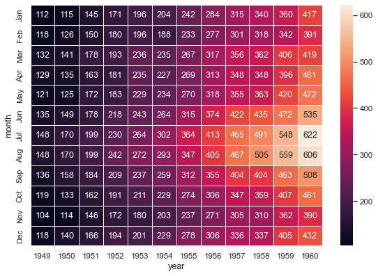
Heatmap |
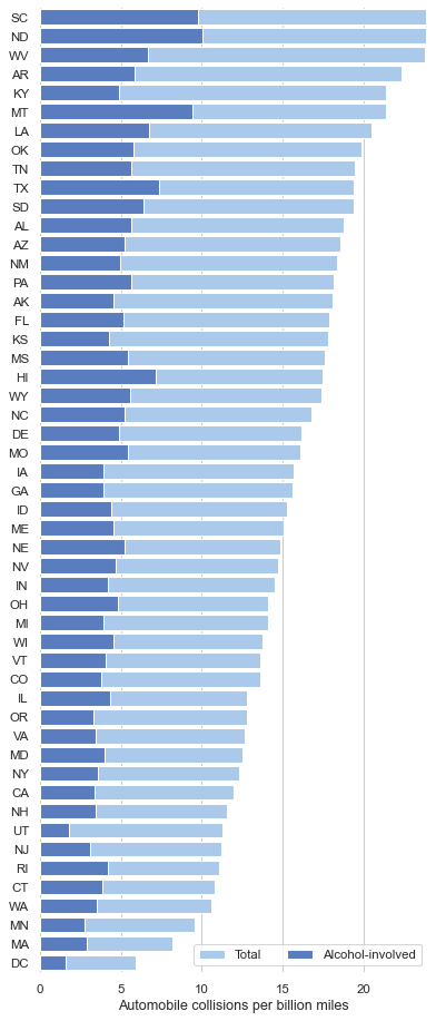
Bar Plot |
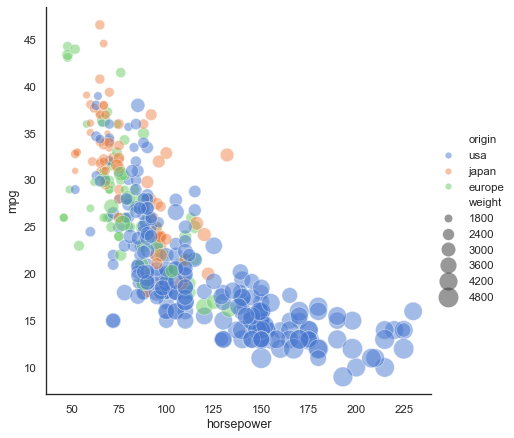
Scatter Plot |
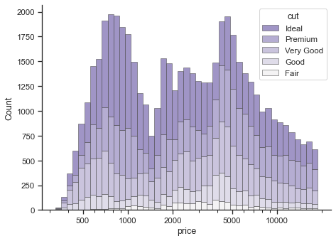
Histogram |
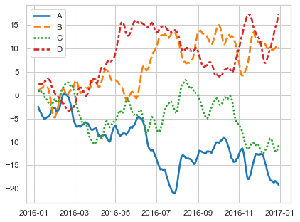
Line Plot |
Seaborn/
├── 01_Seaborn_barplot.ipynb        # Categorical comparisons with bar charts
├── 02_Heatmap Seaborn.ipynb        # Correlation matrices and grid-based visuals
├── 03_ Histogram Seaborn.ipynb     # Distribution analysis with histograms
├── 04_Line plot Seaborn.ipynb      # Trend analysis with line plots
└── 05_Scatter Plot Seaborn.ipynb   # Relationship exploration with scatter plots
| # | Notebook | Plot Type | Key Concepts |
|---|---|---|---|
| 01 | Seaborn_barplot |
Bar Plot | Categorical aggregation, confidence intervals, grouped bars |
| 02 | Heatmap Seaborn |
Heatmap | Correlation matrices, annotation, color mapping |
| 03 | Histogram Seaborn |
Histogram | Frequency distributions, bin control, KDE overlay |
| 04 | Line plot Seaborn |
Line Plot | Time-series trends, multi-line comparison, styling |
| 05 | Scatter Plot Seaborn |
Scatter Plot | Variable relationships, hue encoding, regression lines |
|
High-level statistical visualization built on Matplotlib |
Low-level plot rendering and figure customization |
Data loading, wrangling, and DataFrame operations |
Numerical operations and array manipulation |
Interactive notebook environment for exploration |
seaborn>=0.12.0
matplotlib>=3.5.0
pandas>=1.4.0
numpy>=1.22.0
jupyter>=1.0.0
If you find this project useful, consider starring the repository.